Today marks the fifth anniversary of the opening of OMA’s Prada Transformer. This fantastical temporary structure, erected in 2009 adjacent to Gyeonghui Palace in Seoul, Korea, is one of Rem Koolhaas’ most popular projects to date. Composed of a stark white membrane stretched across four steel frame shapes, The Transformer was often referred to as an "anti-blob" --a hexagon, a rectangle, a cross, and a circle leaning against each other to create a tetrahedron-like object reminiscent of a circus tent. The name Transformer came from the idea that any one of the pavilion's sides could serve as the building's floor, allowing for four unique spaces in one building devoted to exhibitions of modern art, fashion and design.
The Prada Transformer played host to four such events, being lifted up and repositioned onto a different face each time via crane. The first was a garment exhibition, displayed using the hexagonal floor plan. The second, a film festival that took place on the rectangular floor plan. A fashion show was staged using the Transformer's circular floor plan, and an art installation was shown using the cruciform floor plan. As patron Miuccia Prada stated in an interview with The New York Times, “In my mind they [the arts] may be mixed but I want to keep them separate… So the Transformer concept was not for a generic space, but to be very specific, with all things separate in one building.”
We asked OMA's Vincent McIlduff to tell us more about this project. See his answers, a photo gallery and a time-lapse video of the transformation after the break!
Amanda Burden, former animal behaviorist turned New York’s chief city planner, has discovered what makes cities desirable: great public spaces. During her time with the Bloomberg administration, Burden oversaw the fruition of the city’s most transformative public projects, including New York’s beloved High Line. In the video above, she reveals the many unexpected challenges of planning (and maintaining) parks people love, and why it is so important for cities to have great public spaces.
In response to this criticism, I spoke to Rodrigo Nino, the founder of Prodigy Network, the company behind 17 John, who offered to counter my argument. Read on after the break for his take on the benefits of tapping into the 'wisdom of crowds.'
In 2009 we wanted to find out where our readers work and create. We asked, you responded, and the results gave us a fascinating insight into your daily lives. And so, a few weeks ago, we once again asked our readers to send us pictures of their workspaces. We received submissions from all over the world – from beachside desks to a stark warehouse space to a stunning gallery.
Take a look at these creative spaces - you may even recognize your own workplace, or one quite like it - and keep following and participating by using the #wherewework hashtag on Facebook or Twitter. Thanks for your help!
Andrew Carnegie once said, “Aim for the highest.” He followed his own advice. The powerful 19th century steel magnate had the foresight to build a bridge spanning the Mississippi river, a total of 6442 feet. In 1874, the primary structural material was iron — steel was the new kid on the block. People were wary of steel, scared of it even. It was an unproven alloy.
Nevertheless, after the completion of Eads Bridge in St. Louis, Andrew Carnegie generated a publicity stunt to prove steel was in fact a viable building material. A popular superstition of the day stated that an elephant would not cross an unstable bridge. On opening day, a confident Carnegie, the people of St. Louis and a four-ton elephant proceeded to cross the bridge. The elephant was met on the other side with pompous fanfare. What ensued was the greatest vertical building boom in American history, with Chicago and New York pioneering the cause. That’s right people; you can thank an adrenaline-junkie elephant for changing American opinion on the safety of steel construction.
So if steel replaced iron - as iron replaced bronze and bronze, copper - what will replace steel? Carbon Fiber.
In honor of Earth Day, we have complied a preview of the top ten most sustainable exemplars of U.S. architecture selected by the American Institute of Architects (AIA) and its Committee on the Environment (COTE). Each project featured will be honored with a COTE Top Ten Award for “sustainable design excellence” at the 2014 National Convention in Chicago. View them all, after the break...
The Graduate Architecture, Landscape, and Design Student Union (GALDSU) at the University of Toronto recently published the results of its first mental health survey, which asked students to reflect on their experience at the John H. Daniels Faculty of Architecture, Landscape, and Design. Many past and present students have met the findings, which paint a blatantly bleak picture of the architecture student experience, with little to no surprise. The report brings the issue of poor mental and physical health in architecture schools to the forefront of our consciousness; however, the cool response it has elicited undercuts the initiative and raises important questions. If we were already aware of the problem, why hasn't change already been initiated? Will this always be the accepted, brutal reality of architecture education?
In honor of those celebrating Easter Sunday, we’ve compiled a list of the most breathtaking places of worship from our Religious Architecture Pinterest board. From vast, open halls, to intimate places of prayer and contemplation, these works are sure to spark your appreciation for divine architecture. See them in all their glory, after the break...
Mies van der Rohe with smoke, 1957; photographed for Life magazine. Image Courtesy of Frank Scherschel/Time & Life Pictures/Getty Images
This review of Detlef Mertins' book "Mies" - by Thomas de Monchaux - originally appeared in Metropolis Magazine as "Mies Reconsidered". According to de Monchaux, Mertins reveals the modernist master as a voracious reader who interpreted a wide variety of influences to arrive at his stripped-down style.
The quintessential page of the 528 that make up Detlef Mertins’s monumental new monograph on Ludwig Mies van der Rohe—entitled simply Mies (Phaidon, 2014)—is 155. There, you will find a reproduction, a page within a page, of page 64 of Romano Guardini’s 1927 book Letters from Lake Como—a book about modernity and human subjectivity—with Mies’s own annotations penciled in the margins, in a surprisingly ornate and delicate hand.
And there, you will find Mertins’s notes on Mies’s notes on Guardini: “Of all the books in Mies’s library, Guardini’s Letters is the most heavily marked. Mies highlighted passage after passage with bold and rapid margin strokes and wrote key words diagonally and in large script across the first pages of many of the chapters: Haltung (stance), Erkenntnis (knowledge), Macht (power).” Mertins’s vivid marginality, his attention to the divine details along edges, recalls the experience of reading the Talmud, that commentary on Jewish law and scripture in which, by marking and emending earlier readers’ marks and emendations, generations of rabbis enacted an intimate conversation across time and space.
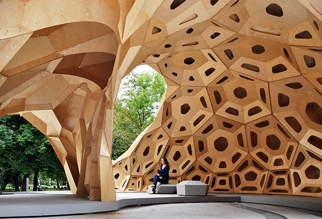
In this article, originally appearing on the Australian Design Review as "Tolerance and Customisation: a Question of Value", Michael Parsons argues that the complex forms made possible by digital fabrication may soon be victims of their own popularity, losing their intrinsic value as they become more common and the skill required to make them decreases.
The idea of tolerance in architecture has become a popular point of discussion due to the recent mainstreaming of digital fabrication. The improvements in digital fabrication methods are allowing for two major advancements: firstly, the idea of reducing the tolerance required in construction to a minimum (and ultimately zero) and secondly, mass customisation as a physical reality. Digital fabrication has made the broad-brushstroke approach to fabrication tolerance obsolete and now allows for unique elements and tolerance specific to each element. The accuracy that digital fabrication affords the designer, allows for the creation of more complex forms with greater ease and control. So far, this has had great and far reaching implications for design.
Read on to find out how this ease of form-making could diminish the success of complex forms.
One of the earliest built works of Richard Meier, The Saltzman House, completed in 1969, is one of several Meier-designed residences that exhibits his signature style: absolute whiteness, geometric composition, and the prominence of light. With a heavy early-Modernist influence, the Saltzman House captures the purity of form and space seen in the projects of Le Corbusier.
The early phases of the Walled City were characterised by predictable building typologies and the buildings were constructed on the principle of squatters’ rights, with random construction on spots of available land by whoever got there first. Alleyways and passages evolved – unplanned – into the established ‘map’ of the City, which would remain until it came down. A basic electric supply existed, increasingly burdened by illegal connections that frequently overloaded the system, and the few standpipes supplied the only water. As the need to accommodate the ever growing residential and commercial populations forced it to in the 1960s, the building typology of the Walled City made the leap from two- to three-storey residential structures to taller, six- to seven-storey ones. This represented an important threshold, because at these greater heights the buildings unavoidably became more complex and required greater labour to realise, reinforced concrete, more investment, and so on. They also required a different way of living. Water had to be transported up to the higher floors by hand. Likewise the propane gas canisters that furnished fuel to cook or heat water.
Our friends at Mecanoo have shared a fascinating mini-documentary exploring the complex brickwork on display in their latest project in Boston's Dudley Square, the Dudley Municipal Center (nearing completion).
Called "Boston Bricks with a Dutch Touch," this documentary features interviews with everyone involved in the project - from construction workers to architects - and focuses on the difficulty of using brick in this elaborate manner. Enjoy the video above and check out some fantastic images after the break.
The first season of Nic Pizzolatto’s True Detective, the product of creator/writer Nic Pizzolatto and director Cary Fukunaga, focuses on Detective Rustin Cohle (Matthew McConaughey) and Detective Martin Hart (Woody Harrelson) as they search for clues on a grisly murder case. The series takes place in Louisiana in three distinct time periods; 1995, 2002 and 2012. Each time period has a distinct look, as characters and their surroundings change and evolve over time.
Cary Fukunaga, who comes from feature films such as Sin Nombre (2009) and Jane Eyre (2011), has always employed a distinct visual style in his work. In The Guardian, he discussed his approach to the direction of the show, noting that “one of my priorities as director was to defend craft despite the constraints on my time and budget.” In addition, he notes that he looked for specific moments in which he would treat the visual side of the medium with the same importance as the dialogue.
In the fourth episode, “Who Goes There,” he does just that, as he employs a lengthy, complex shot that brings the audience closer to the characters’ experience. This edition of INTERIORS will spatially break down that shot, revealing just how complex it was.
"The Skyline" on "The Electric Boulevard" / Foster + Partners. Image Courtesy of Battersea Power Station
As phase three of London’s Battersea Power Station regeneration, Foster + Partners has collaborated with Gehry Partners to design the 42-acre development’s primary entrance. Together, the duo has envisioned “The Electric Boulevard” - a massive gateway connecting the Northern Line Extension station to the Power Station, which will be formed by an undulating Foster-designed tower known as “The Skyline” and Gehry’s five-building “Prospect Place.”
Housing more than 1,300 homes and over 350,000 square feet of retail and restaurant space, the boulevard is expected to become one of London’s most distinguished high streets.
MASS has just released the third video in their Beyond the Building series, which examines how architecture and design can positively impact our world, beyond buildings (check out the first video here and the second here). The latest - "Ilima: Beyond Sustainability" - explores MASS's collaboration with the African Wildlife Foundation as well as local masons to build a primary school in the rural Congolese village of Ilima, where, due to its remote location, practically all materials must be sourced locally.
"the architectural establishment continues to ignore indigenous building cultures and the human value of what they represent. For example, traditional building and urban geometry in sub-Saharan Africa is now revealed to be essentially fractal, thus revising our customary (and totally erroneous) conception of those cultures as mathematically under-developed." Image of El Molo Hut, Lake Turkana, Kenya.. Image Courtesy of shutterstock.com
As you may have seen, ArchDaily has been publishing UNIFIED ARCHITECTURAL THEORY, by the urbanist and controversial theorist Nikos A. Salingaros, in serial form. However, in order to explain certain concepts in greater detail, we have decided to pause this serialization and publish three excerpts from another of Salingaros’ books: A THEORY OF ARCHITECTURE. The first excerpt explained the difference between “Pattern Language” and “Form Language,” while the second established how these languages can combine to form the “Adaptive Design Method.” The following, final, excerpt distinguishes between viable, complex form languages that have evolved over time and primitive, “non-languages” that have come to dominate the 20th century due to their iconic simplicity (and despite their non-adaptive characteristics).
Independently of their technological achievements, all groups of human beings have developed a richly complex spoken language. Differences arise in specificities, in the breadth of vocabulary for concepts important to that culture, and in their transition to a written language, but those do not affect the general richness of the language. Every language’s internal structure has to obey general principles that are common to all languages. A primitive language or non-language, by contrast, is characterized by the reduction or absence of such internal complexity and structure. The complexity of human thought sets a rather high threshold for the complexity that any language has to be able to express through combinatoric groupings.
Turning now to architecture, a viable form language is also characterized by its high degree of internal complexity. Furthermore, the complexity of different form languages has to be comparable, because each form language shares a commonality with other form languages on a general meta-linguistic level. A primitive form language severely limits architectonic expression to crude or inarticulate statements.