Color of the Year 2026 "Cloud Dancer". Image Courtesy of Pantone
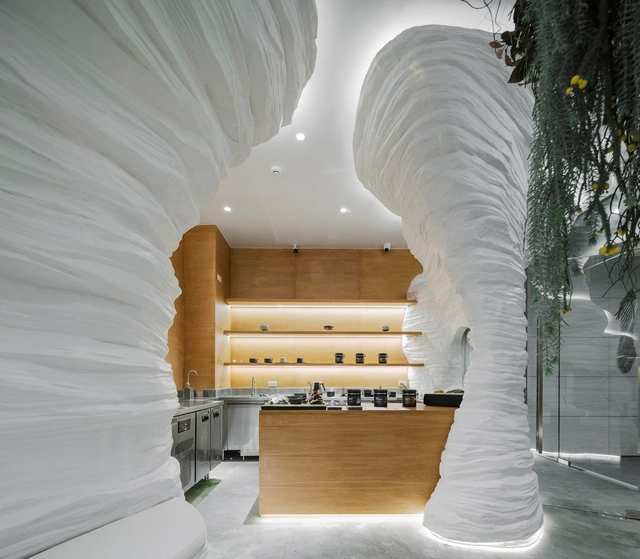
PantoneColor Institute has introduced PANTONE 11-4201 Cloud Dancer as the Color of the Year 2026, a soft white selected for its understated presence and sense of visual calm. The hue, described as balanced and airy, appears against a broader cultural context in which designers and creatives are reassessing the role of clarity, simplicity, and spatial quietude. Framed as a color that resembles a blank canvas, Cloud Dancer signals a renewed interest in environments that support reflection and measured creativity rather than constant acceleration.
Amid questions, reflections, and debates, the work of Clorindo Testa embodies an innate connection between artistic and architectural experimentation, reflected in many of his built projects, sketches, models, and plans. From the Mariano Moreno National Library to the former Bank of London building in Buenos Aires, his production is of such scope, diversity, and complexity that it constitutes a major source of study, one that also includes unbuilt projects that deserve visibility and recognition on a global scale. In his final years of professional activity, two unbuilt projects of religious architecture highlight Testa’s work not only as an architect but also as a visual artist.
The use of primary colors, pure forms, and concrete represent some of the most distinctive characteristics of Clorindo Testa’s architecture, which is inseparable from his visual art. Reflecting on themes such as living in large cities or the conditions of life in urban spaces, the powerful expressiveness and plasticity of his works, together with the character of the line, his typical color palette, and the frequent presence of the human figure, reveal the importance and meaning he attributed to scales, uses, and perceptions as an architect who never settled for the first idea.
Gallaudet University was established in 1864, becoming the first American educational institution for the deaf and hard of hearing. The university is officially bilingual, with American Sign Language (ASL) and written English used throughout the educational programs. Over the years, the university has grown, adapting both its teaching methods and its spaces to the needs of its students, in turn learning from them how to counter the challenges they face and create a safer and more comfortable environment. These lessons turned into design guidelines, created to educate the architectural community about the strategies they can employ to create more accessible spaces for all.
In recent years, pink has evolved beyond its traditional associations to become a sophisticated and versatile element in architecture and interior design. Defined by a broad spectrum of shades, pink encompasses both warm and cool tones, ranging from pure red tints (R) to blends with yellow (Y80R, Y90R) or blue (R10B, R20B, R30B), as classified by the Natural Color System (NCS). While difficult to define by a single shade, this color balances vibrancy and softness, making it adaptable across different materials and contexts. As pink continues to gain prominence in contemporary interiors, its role extends beyond being a mere color choice—it is a design strategy. The recent transition from the bold, playful pinks of the "Barbiecore" trend to softer, powdery hues seen in fashion and design in 2025 fashion collections, highlights the color's adaptability. Its presence in Pantone's 2025 color palettes, also reinforces its appeal across disciplines. When applied thoughtfully, pink can transform spaces, making them feel inviting, expansive, or timeless.
Unlike the 2024 Color of the Year selections, the 2025 picks reveal more commonalities among the colors chosen by major paint industry leaders. Each year, designers and enthusiasts from various fields gather within companies worldwide to reignite the conversation about color and its connection to contemporary culture. For the 2025 forecast, earth tones seem to be the big winners: Pantone's Mousse Chocolate is joined by cinnamon, brown, and burgundy shades from Benjamin Moore, Graham & Brown, Behr, and C2 Paint. Companies like AkzoNobel, Valspar, and Comex opted for more vibrant colors to celebrate optimism and joy, while Sherwin-Williams and Jotun didn't limit themselves to a single color. Instead, they introduced entire palettes centered on tranquility and relaxation. These concepts appear to be the guiding themes for 2025.
Pantone Color Institute has selected PANTONE 17-1230 Mocha Mousse as the Color of the Year 2025. The warm, brown hue, reminiscent of chocolate mousse and latte coffee, aims to bring a sense of comfort, intimacy, and elegance. This represents a versatile hue that can be combined in a multitude of pallets, from monochromatic earthy shades to mixtures of soft pastels, or even exotic combinations of vibrant colors balanced out with the rich yet subdued tone of Mocha Mousse.
Urban apartments are frequently praised for their clever use of space, but what of their approach to color? Thoughtfully incorporating color is more than an aesthetic decision; it has the potential to shape emotional responses, influence mood, and create spatial illusions. Research in color psychology shows that colors affect our social, cultural, and psychological reactions, making them powerful design tools. Variations of blue, for instance, have been shown to slow melatonin production, keeping people more awake and alert, while shades of green relieve strain on our nervous systems, helping us feel calmer and more grounded. Color in architectural spaces can even alter our perception, creating illusions of depth, movement, and texture that influence how we experience space. Warmer hues like oranges and reds tend to make a room feel more intimate and cozy, while cool whites and blues lend a sense of openness, making spaces appear taller and more expansive.
When a brief to design a new office space asks for something fresh, energetic, and modern – a space where employees enjoy being and, crucially, enjoy working in, which helps them to focus on individual tasks but also to relax, collaborate, and create – there are few better places to begin than a color wheel. As the world of work and the varied environments it takes place in become less formal and restricted in their design, architects, designers, and, more importantly, their clients are handing the boring, monotone office its redundancy papers and looking outside the establishment at more expressive colorful options.
While blue’s ability to improve concentration, stimulate thinking, and provide mental clarity helps to increase productivity, the human body needs regular periods of rest and relaxation, too. For this, warm colors like yellows provide relaxation through warmth and comfort – perfect for break-out areas. Meanwhile, reds and oranges promote creativity and expression, meaning they can be useful for areas designated for social collaboration, whilst green encourages a calmer, more balanced approach, for a different kind of meeting.
Known internationally as the world’s foremost voice on all things color, Pantone’s Color of the Year program has been predicting and even directing color trends for 25 years – reflecting the cultural environment across multiple creative sectors that use the language of color and color psychology such as branding, marketing, fashion, and product design to name a few, as well as architecture and design.
But color trends aren’t just about what’s hot and what’s not. Color plays an important role in stimulating the senses, evoking memories or feelings based on past experiences and collective influences around the world. In the color psychology of retail design, for example, specific hues have been found to alter consumers’ comfort and energy levels, ultimately dictating shoppers’ preferences and behavior. In medical environments, combining a neutral base with calming accent colors has been shown to reduce stress and anxiety.
Pantone has just just announced “Peach Fuzz” or PANTONE 13-1023,” the 2024 Color of the Year. Known for its color standards and digital solutions in the design community, Pantone announced the color aiming to move towards empathy and understanding. A hue between pink and orange, the color is soft and inviting and offers “tenderness and communicating a message of caring, community, and collaboration.”
Choosing how to paint your apartment can significantly impact its atmosphere and visual appeal. While it may be tempting to stick with the comfort of white walls, considering different colors can enhance your everyday life and make your home more vibrant. To help you navigate the many possibilities, we've gathered some tips for creating a more colorful and personalized living space.
The year 2024 brings forth an intriguing array of Color of the Year selections from renowned paint manufacturers, each offering a unique perspective on the hues that will influence our living spaces. Striving to capture the moods and aspirations of the coming year, color experts have veered towards soft and calming shades, hoping to bring a sense of serenity to counter the hectic and tumulus passing year. Countering the bold color chosen by Pantone in 2023 as their previous Color of the Year, Benjamin Moore embraces a softly saturated and nuanced shade, AkzoNobel emphasizes calmness and stability, Sherwin Williams aims to inspire mindfulness, Graham & Brown fosters warmth and tranquility, and C2 Paint focuses on freshness and sustainability.
Colors have played an essential role in the history of modern architecture - from Le Corbusier's theory of polychromy to the aesthetic conceptions of the Bauhaus. However, we find ourselves at the beginning of an era where the interpretation and implementation of colors in architecture are undergoing a transformation based on their impact on the built environment.
Throughout the month, we conducted an open call to listen and learn from our readers, exploring their predictions and thoughts related to the future of colors in architecture. After reviewing an immense number of comments and opinions, it was surprising to discover commonalities regarding the importance of considering energy efficiency in color choices. Check out the main viewpoints below.
One way to employ color is through monochrome, a design technique that involves using a single tone or color in a space. In architecture, monochrome is a powerful tool where different shades can be created through the play of lights and shadows, generating spaces that offer unique experiences to their inhabitants.
Our daily lives involve constant communication with the city. As we move through different spaces, we ask ourselves questions like "Where am I now?", "Where am I headed?", "What am I looking for?", "What is this building for?", and "How do I experience this space?" While spatial encounters may feel intuitive, environmental graphic design (EGD) provides the answers by serving as an important interface between us and the built environment. It involves the design of graphic elements that merge with architectural, landscape, urban, and interior designs to make spaces more informative, easier to navigate, and memorable. EDG comprises three major elements: text, shape, and color. Text and shapes typically encapsulate the graphic information, but color projects it, amplifies it, and helps communicate it within the packed scenes of the city. In spatial experiences, we perceive colors first, since our senses mostly register visual sensations. Therefore, the strategic use of color is critical for environmental graphics to provide a layered experience of identity imagery, sense of place, and emotional connection.
African societies' cultures are intrinsically linked to color. From fabrics to clothing, products, sculptures, and architecture, various societies explore rich and vibrant colors that are vivid, expressive, and joyful. Through different shades, hues, contrasts, motifs, and ornamentations, colors are embraced as an unspoken language, a palette for storytelling, and a sense of cultural identity. Although the use of color in African societies may seem decorative on the surface, it is extremely symbolic, with a deep sense of history behind it. Traditional African architecture is a prime example. Ethnic societies have endowed their homes with color through ornaments and motifs, expressed it with religious and cultural patterns, employed it on facades to tell familial stories, and created labyrinths of communal architecture that not only celebrate color but explore its ethnic meaning.