As the technical requirements of building envelopes have evolved, fire performance has become a key criterion in the design of ventilated facades. Given this situation, analyses no longer focus solely on the individual reaction of materials, but also on the joint response of the entire building envelope under possible scenarios of external fire propagation.
Fired clay has been used in construction for over 9,000 years, evolving from vernacular craft into one of the most widely applied materials in the built environment. Its durability, water resistance, thermal performance, and adaptability have made it a staple for facades, sanitaryware, flooring, architectural surfaces, and structural systems. Today, new manufacturing technologies are extending these possibilities as architects and manufacturers confront the environmental implications of material extraction and production.
Lu Wenyu—co-founder of Amateur Architecture Studio with Pritzker laureate Wang Shu—has shaped many of the practice's most emblematic works across China, including the Ningbo History Museum and the Xiangshan Campus of the China Academy of Art in Hangzhou. Often working outside the spotlight, her leadership is unmistakable in the discipline of execution and the roles she has assumed: in 2003, together with Wang Shu, she established the Architecture Department at the China Academy of Art, where she also serves as Director of the Sustainable Construction Center. Her practice and teaching form a reciprocal loop: research conducted in studios at the China Academy of Art continually folds back into construction strategies on site, while lessons learned in the field return to the classroom as material intelligence rather than abstract theory.
The new Muskiz Secondary School building (Vizcaya), designed by BAT Architecture studio, has become a leading symbol of sustainable architecture for educational centers. Designed in accordance with Passivhaus criteria and built using cross-laminated timber (CLT), the project combines innovation and comfort with environmental care.
In this equation, Faveker's tiled ventilated facade, tailor-designed using its GA16 system as a basis, plays a key role. This precise, luminous tiled skin enhances the building's energy efficiency and infuses it with a unique architectural personality that harmonizes with the surrounding natural setting.
All materials come from somewhere, embedded in a chain of extraction, supply, production, and disposal that, depending on its scale, leaves more or less significant marks on the environment. In architecture, we usually approach this trajectory through the lens of materials' circularity, considering how they can re-enter production cycles rather than become waste. Yet, broadening our view to unexpected places reveals parallel systems where by-products from one industry become resources for another. This approach has found fertile ground in organic waste transformed into biomaterials, with one of the most recent examples being the work of Fahrenheit Works. Through their installation, "From the Tagus to the Tile", they repurpose oyster shells initially discarded by food systems to create a reinterpretation of Lisbon's iconic tiles.
Renovation Project of Puerta de Arnedo Health Center (La Rioja). Photos: María Natali.
In modern architecture, materials must meet a range of functional, aesthetic, technical, and environmental demands. Gres Aragón offers ceramic tile solutions that respond to all aspects of a project—from façades and interiors to exteriors, pools, staircases, and industrial spaces—while maintaining a consistent design language.
With more than 80 years of experience and deep expertise in the extruded tile manufacturing process, Gres Aragón has established itself as a trusted partner for architects and interior designers. Its product offerings are based on four core principles: visual continuity, extreme durability, high-tech performance, and a strong commitment to sustainability.
Pools have always symbolized luxury, leisure, and social interaction. Beyond their aesthetic appeal—where water dances across textures, movements, and reflections—they also serve functional purposes, providing relaxation, exercise, and entertainment. Their history dates back over 5,000 years to the Great Bath of Mohenjo-Daro in the Indus Valley (modern-day Pakistan), possibly used for rituals and communal practices. Later, the Greeks and Romans refined the concept, creating elaborate pools for bathing, sports, and social gatherings. The famous Roman baths, often heated and adorned with intricate mosaics, laid the foundation for modern spa and wellness culture, reinforcing the relationship between architecture, water, and quality of life.
During the Renaissance, pools were primarily associated with elite properties, but by the late 19th and early 20th centuries, public pools became more common, driven by urbanization and the promotion of hygiene. The rise of Olympic swimming competitions in the early 1900s further popularized the concept, leading to increased construction of both private and competitive pools worldwide. Today, pools continue to evolve, incorporating advanced materials and designs that enhance safety and sustainability. Whether for recreation, aesthetics, or well-being, pools remain a central element of modern architecture and lifestyle.
Serapool, a leading brand in porcelain pool tiles and complementary porcelain products, has been innovating and producing sustainable design solutions for residential, spa and wellness centers, hotels, water parks, and Olympic-size pools globally for 40 years. The brand's holistic approach to pool design has led to a comprehensive porcelain collection that includes pool tiles, stair nosings, pool copings, porcelain pool grates, infinity tiles, concealed overflow handles, terrace nosings, and rain channels. With years of expertise in the industry, the company stands as a leading example of innovation, consistently delivering safe and long-lasting products.
Pietra Tiburtina - Campidoglio. Image Courtesy of Casalgrande Padana
Travertine —known as lapis tiburtinus by the ancient Romans— has endured for centuries as one of the most iconic materials in Italian design heritage. This limestone has left a lasting mark on architectural history, from the monuments of the Roman Empire to contemporary works like the Church of 2000 and the Ara Pacis Museum. Over time, its aesthetic has evolved alongside art and design, adapting to technical advancements while preserving its essence and relevance in modern architecture.
https://www.archdaily.com/1022299/carving-pietra-tiburtina-a-contemporary-approach-to-classic-travertineEnrique Tovar
Plastic Island. Image Courtesy of Emily-Claire Goksøyr
As you read this, you may notice that you are surrounded by several items made of plastic. This omnipresence is no coincidence; the versatility of plastic has made it suitable for a variety of applications, and was described by its inventor—Leo Baekeland— as “the material of a thousand uses.” However, when it comes to environmental impact, the problem lies in its very qualities: it is so durable, adaptable, and easy to produce (430 million tons per year) that, according to UN data, the equivalent of 2,000 garbage trucks full of plastic are dumped into the oceans, rivers, and lakes every day.
In the built environment, plastic has been incorporated into various materials, products, and construction systems, contributing to an environmental crisis that seriously affects the well-being of millions of living beings. Faced with this problem, one possible direction is to shift away from utilizing it. The search for plastic-free alternatives is marking a path toward a future where architecture is progressively disassociating itself from these polluting materials, promoting sustainable solutions that reduce our dependence on it and contribute to preserving the environment.
https://www.archdaily.com/1016334/making-the-case-for-plastic-free-architecture-innovative-solutions-for-the-present-and-futureEnrique Tovar
3D printing holds vast potential due to its ease of large-quantity manufacturing, its flexibility in terms of material exploration, and its ability to materialize all kinds of geometries. This year, architects and designers have looked at 3D printing technology to decarbonize construction materials, integrate contemporary aesthetics with traditional construction methods, and add a layer of craft and artistry to interiors and facades.
Designer pools bring status to luxury homes and five-star hospitality spaces. But adding the cooling, calming, energizing, and environmental benefits of a hyper-local water body to a residence can far outweigh the cost of installation. With a range of long- and short-term landscaping options possible, meanwhile, luxury is available, whatever the budget.
Most pools are built below ground to retain unobstructed visuals above. While all in-ground pools start off the same way – with excavation, then connecting the plumbing and filtration systems – the main difference is in the construction of the pool’s basin. The simplest and quickest method is to lower a pre-fabricated reinforced plastic pool or pre-cast concrete basin into the cavity, before connecting the pipework and backfilling the recess with sand. But this is only suitable for off-the-shelf pools with simple geometries. In order to make the most efficient use of all available space, bespoke pool shapes and sizes are best achieved by pouring or spraying concrete into a rebar or timber frame.
Architects and designers are often looking for ways to make building facades and interior surfaces stand out from the crowd. But sometimes just the smallest change can have the biggest impact once you step back and see the whole picture. By employing an illusionary pattern such as dithering pixels or halftone dots, or by making subtle but intentional changes to the position or orientation of materials, flat surfaces can be transformed into curved, moving forms.
Halftone patterns work by reducing a solid surface of color into dots of decreasing size. As the dots gradually reduce to nothing, they leave nothing behind except a background color. The result is a flat surface with a gradient that mimics the shadows or highlights of a three-dimensional curve. Dithering, meanwhile, is the process of feathering multiple shades of the same color to blend them together. The effect allows designers to, on a large enough scale, create images with depth and curves, while using only a single color. Or even to create the illusion of an intermediary color.
Culture reflected in a material. Portuguese tiles narrate historical themes, from the religious to the profane. They shape the Portuguese landscape and scenery when covering buildings, interiors and public spaces. In this way, its expression continues in constant change and adaptation to weave the Moorish ancestry with contemporaneity.
In recent decades, the industrial style has strongly attracted the attention of architects, designers and homeowners. However, few know its true origin. Following the rise of industrialization in the United States during the 1950s, many old industrial spaces, such as warehouses or factories, were abandoned in areas like New York's Soho. As a consequence, prices fell and became affordable housing alternatives for city dwellers. These new repurposed spaces were characterized by an aesthetic that mixed raw and exposed materials with modern elements and technologies, generating a strong aesthetic identity that was as rustic as it was sophisticated.
Today, industrialized-looking interiors are highly appreciated for the character of their materials, providing different shades, textures, brightness and opacity. There are, however, new materials that blend this weathered aesthetic with innovations that facilitate their installation and maintenance. Let's review the case of Aparici's Corten Tile Collection and its possible applications in different spaces of the home.
As we wrap up 2022, we take a look back at how this year introduced new adaptations to the way we live, work, and interact with our built environment, especially after emerging from years of unprecedented changes. One way to describe this year's design identity is that there isn't one. Going through this transitional period, inspiration came from foreign travels, immersive virtual worlds, being one with the planet and the serenity that came with it, platforms that promote expressionism and individuality, and a trend-setting generation known for its bold perspectives.
Mycelium-Grown Bio-Bricks / Evocative Design & The Living. Image Courtesy of The Living
The building industry is one of the biggest generators of carbon emissions, with some estimates suggesting that 38% percent of all CO2 emissions are linked to this field. As a response to the current crisis, architects, designers, and researchers are taking measures to reduce their carbon footprint during and after construction. Many initiatives and research teams are looking at building materials to find low-carbon solutions and reduce the impact of building materials during production.
One of the most prominent fields of research is concerned with biofacture, the type of process that involves using biological organisms to manufacture materials. By understanding the abilities of organisms such as algae of fungi, alternatives to widely used materials can become carbon neutral or even carbon negative. Other initiatives are researching novel ways to use untapped, yet readily available resources such as desert sand, soil, or waste from demolitions.
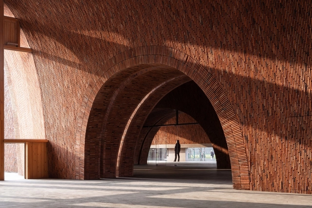
Jingdezhen Imperial Kiln Museum / Studio Zhu-Pei. Image Courtesy of Studio Zhu-Pei
Over the course of the last decade there has been a growing interest in the handcrafted buildings, as well as in the application of local and renewable materials in building construction. Under the concerns about the heavy environmental and economic expenses caused by construction, nowadays urban planners are embracing the concept of sustainability, which refers to “meeting our own needs without compromising the ability of future generations to meet their own needs”.