Doors are part of our daily routine, opening and closing so naturally that we rarely consider how they work. That is why, when discussing innovations in their design, many might think, "If it ain't broke, don't fix it." However, just because something functions well doesn't mean it can't be improved. Doors are no exception—their components can be optimized for better performance without changing their fundamental nature. Instead of sticking to the familiar, why not open the door for enhancement? Pivot doors are a clear example. In addition to offering aesthetic versatility and nearly endless design possibilities, their opening system on a central axis allows for fluid and controlled movement, especially indoors. However, a challenge remains in their design: making them hold steady at different angles.
https://www.archdaily.com/1026629/and-yet-it-holds-a-pivot-hinge-system-that-keeps-doors-at-every-90-degrees-angleEnrique Tovar
In recent years, pink has evolved beyond its traditional associations to become a sophisticated and versatile element in architecture and interior design. Defined by a broad spectrum of shades, pink encompasses both warm and cool tones, ranging from pure red tints (R) to blends with yellow (Y80R, Y90R) or blue (R10B, R20B, R30B), as classified by the Natural Color System (NCS). While difficult to define by a single shade, this color balances vibrancy and softness, making it adaptable across different materials and contexts. As pink continues to gain prominence in contemporary interiors, its role extends beyond being a mere color choice—it is a design strategy. The recent transition from the bold, playful pinks of the "Barbiecore" trend to softer, powdery hues seen in fashion and design in 2025 fashion collections, highlights the color's adaptability. Its presence in Pantone's 2025 color palettes, also reinforces its appeal across disciplines. When applied thoughtfully, pink can transform spaces, making them feel inviting, expansive, or timeless.
From January 24 to May 11, 2025, the Danish Architecture Center (DAC) will host an exhibition dedicated to the work of designer Nanna Ditzel. Crowned "The Grand Dame of Danish Design," Ditzel remains a significant figure in the field, known for her iconic creations such as the Hanging Egg Chair, Hallingdal Fabric, and the Trinidad Chair. Born in 1923, she established herself as a pioneer in furniture design, experimenting with unconventional materials, including the then-untested foam rubber, polyester, and fiberglass. She also transformed traditional materials such as wicker, laminated wood, and silver into innovative furniture and jewelry pieces that became icons of modern design, many of which will be showcased in this retrospective exhibition.
On a slope, along the banks of a river, among trees, or on an expansive hillside, each territory serves as a living testament to its local traditions. Through its architecture, the experimentation, appreciation, and use of certain materials, construction techniques, local crafts, and site-specific tools aim to preserve stories and pass on the discoveries and learnings that have shaped many of the practices still used in construction today. In Chile, the language of wooden shingles evokes a reflection rooted in history and an understanding of relationships, timelines, and life networks.
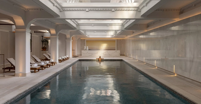
Bathrooms play a significant role in our daily lives, serving multiple functions beyond basic hygiene. Research highlights their importance as relaxation, introspection, and personal wellness spaces. A bathroom's design and comfort can profoundly influence how we begin and end our day, framing our routines with a sense of ease or disruption. When traveling, hotel bathrooms often leave a lasting impression, as a well-designed and thoughtfully executed bathroom can significantly elevate the overall experience of a stay.
Unlike the 2024 Color of the Year selections, the 2025 picks reveal more commonalities among the colors chosen by major paint industry leaders. Each year, designers and enthusiasts from various fields gather within companies worldwide to reignite the conversation about color and its connection to contemporary culture. For the 2025 forecast, earth tones seem to be the big winners: Pantone's Mousse Chocolate is joined by cinnamon, brown, and burgundy shades from Benjamin Moore, Graham & Brown, Behr, and C2 Paint. Companies like AkzoNobel, Valspar, and Comex opted for more vibrant colors to celebrate optimism and joy, while Sherwin-Williams and Jotun didn't limit themselves to a single color. Instead, they introduced entire palettes centered on tranquility and relaxation. These concepts appear to be the guiding themes for 2025.
The evolution of bathrooms into their modern configuration traces back to ancient civilizations like the Ottoman and Roman, where sanitation held significant cultural importance. During the Middle Ages, however, personal hygiene practices declined, setting back developments in sanitation until the Renaissance revived interest in cleanliness. This shift paved the way for key innovations in the 18th century, including modern plumbing systems that enabled the widespread adoption of modern sanitation spaces. Today, it's unimaginable to design an architectural project without incorporating these facilities, highlighting the essential role of hygiene and well-being, now closely tied to technological advancements.
https://www.archdaily.com/1023022/beyond-the-basics-innovations-transforming-bathroom-hand-dryer-technologyEnrique Tovar
As we close the chapter on 2024, a review of ArchDaily's extensive database projects highlights a few standout interior design trends that defined the year. Among these is the use of stainless steel, often paired with concrete and shades of grey, creating interiors with a refined, industrial elegance. This article delves into the increasing prominence of stainless steel as an interior element, exploring its applications, pairings, and growing appeal despite lingering perceptions of its cold, industrial nature.
The post-pandemic world has undergone transformations in various aspects, including urban tourism and new modes of travel. With the rise of remote and freelance work, many people now have the freedom to move between cities without needing to establish a permanent residence. This has turned bars, restaurants, and cafés into more than just spaces for consumption: they are now temporary offices and, in many cases, settings for a variety of activities.
On the other hand, shops and retail spaces have evolved to offer more than just the sale of products or services. They have become part of a holistic consumer experience, fostering an emotional connection with users.
As 2024 comes to an end, a dynamic year that questioned knowledge, tradition, and innovation, we take a look at how global events and trends influenced the design of interior spaces. Last year, architecture practices sparked worldwide discussions, challenging norms and tradition, and embracing overlooked regions. Interior design, on the other hand, took a more reserved, modest approach, favoring simplicity and individuality. Fast forward a year later, the overall architecture and design themes of 2023 remain the same - reinforced if anything - but have embraced "crafted experimentations" through subtle, acupuncture-like interventions.
Pantone Color Institute has selected PANTONE 17-1230 Mocha Mousse as the Color of the Year 2025. The warm, brown hue, reminiscent of chocolate mousse and latte coffee, aims to bring a sense of comfort, intimacy, and elegance. This represents a versatile hue that can be combined in a multitude of pallets, from monochromatic earthy shades to mixtures of soft pastels, or even exotic combinations of vibrant colors balanced out with the rich yet subdued tone of Mocha Mousse.
The world certainly looks different through the eyes of a young child; enormous, intriguing, and somewhat overwhelming, and it has long been believed that what we encounter as children shapes our perspective of the world. When asked about his childhood memories in Switzerland, Peter Zumthor shared that the memories of his youth contain the deepest architectural experience, which has become reservoirs of the architectural atmospheres and images that he explores in his work as an architect today.
Having a complete understanding of how children change and grow physically and psychologically throughout their childhood requires an in-depth observation of different factors, such as their hereditary traits and genetics, the interactions they have with other children and adults, as well as the environment they are living, playing, and learning in. In celebration of World Children's Day on November 20th, we look at how architects and designers stimulated children's autonomy and promoted their mental and physical well-being through architecture and interior design. This initiative aligns with the theme of World Architecture Day 2024: "Mobilizing the Next Generation for Urban Transformation," emphasizing the crucial role that thoughtful design plays in shaping a sustainable and inclusive future for our cities and the communities within them.
The evolution of new technologies, innovative applications, and a shift towards sustainable solutions are central to contemporary hotel architecture. These developments aim to raise awareness about environmental care while enhancing indoor comfort and well-being. From expansive resorts and tourist complexes to cabins and remote retreats, the design of common areas incorporates essential furniture for effective activities, proper climate control equipments, and wall and floor finishes that align with specific needs.
PRACTICE is a Seoul-based studio founded in 2020 by designers Sisan Lee and Sehou Ahn, and one of ArchDaily's 2024 Best New Practices. With backgrounds in architecture and interior design, they explore a wide range of creative fields, from spatial and exhibition design to custom furniture, art objects, and material experimentation, and had been highlighted last year due to their fast design approach which "matches the fast-evolving iterations at the world's bustling hub of fashion and design". The studio brings a unique depth to each project by creating custom-designed elements, furniture, and objects that reflect their diverse creative capacities. Pieces within their projects are crafted from a deep understanding of its purpose and materiality, demonstrating the studio's commitment to thoughtful, integrity-driven design.
Urban apartments are frequently praised for their clever use of space, but what of their approach to color? Thoughtfully incorporating color is more than an aesthetic decision; it has the potential to shape emotional responses, influence mood, and create spatial illusions. Research in color psychology shows that colors affect our social, cultural, and psychological reactions, making them powerful design tools. Variations of blue, for instance, have been shown to slow melatonin production, keeping people more awake and alert, while shades of green relieve strain on our nervous systems, helping us feel calmer and more grounded. Color in architectural spaces can even alter our perception, creating illusions of depth, movement, and texture that influence how we experience space. Warmer hues like oranges and reds tend to make a room feel more intimate and cozy, while cool whites and blues lend a sense of openness, making spaces appear taller and more expansive.
Pietra Tiburtina - Campidoglio. Image Courtesy of Casalgrande Padana
Travertine —known as lapis tiburtinus by the ancient Romans— has endured for centuries as one of the most iconic materials in Italian design heritage. This limestone has left a lasting mark on architectural history, from the monuments of the Roman Empire to contemporary works like the Church of 2000 and the Ara Pacis Museum. Over time, its aesthetic has evolved alongside art and design, adapting to technical advancements while preserving its essence and relevance in modern architecture.
https://www.archdaily.com/1022299/carving-pietra-tiburtina-a-contemporary-approach-to-classic-travertineEnrique Tovar
Barragán, Bofill, Graves, and Le Corbusier are architects renowned for their exceptional and sensitive use of color. In their approaches, color takes on an importance comparable almost to functionality, achieved through a nuanced and comprehensive perception of their context. But what is color? From a technical standpoint, it is a visual perception that arises from the interaction of light with our eyes and brain. However, when we explore its meaning on a more emotional and poetic level, it takes on a deeper significance. For Ricardo Bofill, color infuses life into architecture, while for Charles-Édouard Jeanneret, —better known as Le Corbusier—, it serves as a powerful tool to evoke emotions and create spatial illusions.
In 'Polychromie Architecturale' Le Corbusier argues that color is not only a decorative element but also a fundamental tool for creating environments and enhancing the functionality of architectural spaces. This idea, developed between 1931 and 1959, is articulated around a system composed of a range of colors, where each tone has its relevance and contributes to creating atmospheres that transcend mere architectural design. An example is JUNG's LS 1912 toggle switch range, which combines classic design with advanced control options and showcases the diverse hue variants of the 63 colors in Le Corbusier's color system.
https://www.archdaily.com/1021935/smart-and-retro-advanced-toggle-switches-harmonized-with-le-corbusiers-color-systemEnrique Tovar
At ‘The Thai Silk Company’, Jim Thompson blends heritage with modernity in craftsmanship. Image Courtesy of Jim Thompson
Today, there are only a handful of names in the contemporary world of textiles that have a significant historical legacy and an incredible biography woven into their backstory. Jim Thompson is rich in romance. The Delaware native was a serviceman in South Asia and working for the Office of Strategic Services (OSS), the U.S. intelligence agency. When the conflict ended, he found himself in Thailand, building a new life rooted in his fascination with the beauty and craft inherent to the nation. It was a time when silk weaving was threatened by machine-made fabrics and he discovered a community of exceptionally skilled silk weavers in Bangkok. He worked closely with them to develop production and introduced them to other talented weaving communities, including one in Pak Thong Chai, Korat – a province in the North East of Thailand. His efforts were instrumental in reviving Thailand's silk industry, a legacy that endures today.
https://www.archdaily.com/1021734/elevating-interior-spaces-with-modern-textile-craftsmanshipMark C. O'Flaherty


.jpg?1637144526&format=webp&width=640&height=580)


.jpg?1637144526)