UPDATE: In honor of the 100th anniversary of the Bauhaus, we’re re-publishing this popular infographic, which was originally published April 16th, 2012.
From the “starchitect” to “architecture for the 99%,” we are witnessing a shift of focus in the field of architecture. However, it’s in the education system where these ideas really take root and grow. This sea change inspired us to explore past movements, influenced by economic shifts, war and the introduction of new technologies, and take a closer look at the bauhaus movement.
Often associated with being anti-industrial, the Arts and Crafts Movement had dominated the field before the start of the Bauhaus in 1919. The Bauhaus’ focus was to merge design with industry, providing well-designed products for the many.
The Bauhaus not only impacted design and architecture on an international level, but also revolutionized the way design schools conceptualize education as a means of imparting an integrated design approach where form follows function.
How much of our utility bills are devoted to heating and cooling? What is the R Value of fiberglass? In fact, what is an R Value?
Senator Windows answers these questions with a new infographic driven at “reducing heat loss in your home.” Aimed at both designers and home users, the infographic features a blend of statistics, diagrams, and definitions outlining how heat loss occurs, and how to mitigate against it.
We have republished the infographic below, offering a useful introduction to an almost universal issue in both the design and occupation of buildings.
https://www.archdaily.com/902686/this-infographic-offers-a-guide-to-reducing-heat-loss-in-homesNiall Patrick Walsh
A recent survey done by Chicago-based digital marketing firm Digital Third Coast asked 2,000 current or prospective homeowners for their feedback on their realistic dream house, along with their opinions on homeownership in general. Commissioned by an Illinois fireplace company, Northshore Fireplace, the survey presented respondents with a list of multiple choice questions, as well as open response questions to come up with an in-depth analysis of the 'American Dream Home of 2018.' The survey was done via the Amazon Mechanical Turk platform and included people from all across the country and different age groups. The main qualifying criteria for respondents was that they either owned a home currently or were looking to purchase a new home within the next 5 years.
Findings from the survey include ideal exterior and interior styles, most desired luxury, most popular words used to describe a dream home, average square footage, and much more. Based on the survey data, you can even compare design and finance ideas of GenX and Millenial homeowners to that of the Baby Boomers generation.
Read on for the detailed infographic that displays the resulting criteria for the 'American Dream Home of 2018.'
Metro and subway maps can tell us a lot about cities. For example, by comparing metro maps from different cities, you might be able to understand those cities' relative size or level of development. Or, by comparing a metro map to an earlier version from the same city, you can learn about the pace of development being experienced in that city. What these "maps" rarely tell you with any reliability, though, is the actual geography of the city itself.
In a fascinating series of posts over at /r/dataisbeautiful earlier this year, Reddit users created GIFs comparing the official metro maps of cities around the world with the real geography those maps correspond to. The results show the incredible changes that cities are subjected to in the name of visual clarity: in cities such as London, Tokyo, and Berlin, transit maps expand the urban core, masking the density at these regions' centers; in other cities such as Washington DC, shortened lines hide the extent of the city's suburbs; while in some cities, entire neighborhoods are moved to the other side of the city to make the map layout more attractive (we're looking at you, Prague). Read on to see 11 of the best creations by Reddit users.
If you find yourself always looking up the same information, or if you're just starting out and you need to have the basics handy, this post is for you. There are hundreds of these helpful guides floating around on Pinterest—and if you want to venture further into interior design or more towards engineering, you're covered! We selected the best and most useful architecture and interior design infographics so that your next project is on point.
What type of architecture do dictators prefer? What would a subway map of the affairs of famous architects look like? What is the current state of gender and ethnic diversity within the profession? Which architects would win a color war, Dutch or American? Archi-Graphic places architecture on the operating table, using infographics to cut a visual cross-section that answers these questions and many more.
Use the flowchart to find out which software is your perfect fit (click to enlarge). Image Courtesy of ArchSmarter
One of the biggest decisions to make when setting out alone - either as an independent architect or starting your own firm - is which software to use. It can be tempting to simply choose an industry leader, but you may end up paying over the odds for a product which doesn't suit your style. In this post, originally published on ArchSmarter as "Which architectural software is right for me?" Michael Kilkelly works through the factors that should influence your decision, whether you're making it for the first time or reviewing a choice you made long ago.
Which CAD or BIM software should you use? Well, that depends. What functionality to you need? What are your priorities with regard to cost, comparability, interoperability? Are you using a Mac or a PC?
Selected by votes from over 31,000 architects and architecture enthusiasts around the world, the winners of the 2015 Building of the Year Awards represent the best architecture of the past year. By using the intelligence of the crowd to judge over 3,000 entrants the awards provide a refreshing antidote to the decisions of expert juries. As a result the winners include Pritzker Prize winners such as Álvaro Siza, Herzog & de Meuron and Shigeru Ban, but also up-and-coming practices such as OTO, sporaarchitects and EFFEKT, and even dynamic collaborations such as the housing complex designed by a team of CEBRA, JDS, SeARCH and Louis Paillard Architects.
With 14 winners, designed by a total of 18 practices and built in 12 countries across 5 continents, the process of recognizing these stunning buildings was truly a global effort. Learn more about the 2015 BOTY Awards and this year’s winners by checking out our AD original infographic, presented by ArchDaily and our partners at HP, after the break.
Bauhaus, the school of design established by Walter Gropius in Weimar in 1919, has arguably been the most influential of any institution in shaping the trajectory of modern architecture. Out of this single school came an entire movement that would have lasting effects on architectural pedagogy and the design of everything from buildings to road signs. Born out of a larger cultural movement following Germany’s defeat in World War I which left the country ripe for regrowth without the previous constraints imposed by censorship, the core of Bauhaus philosophy were the principles of craftsmanship and mass production, which allowed for the movement’s rapid proliferation and a production model that would later inform contemporary design companies such as Ikea. Check out the infographic from Aram below to learn more about the movement, tracking the school from its origins in Weimar, via its canonical Gropius-designed home in Dessau, to its continuing legacy today.
Courtesy of Ohio University’s Online Masters in Civil Engineering program
With everything from beams, to trusses, to arches and more, bridge technology has informed advanced structural systems used in architecture for centuries. This infographic produced by Ohio University’s Online Masters in Civil Engineering programexamines five historic and contemporary examples of bridge technology, concisely revealing how different structural techniques for bridges have achieved radically different aesthetics - from stone slabs first laid over water in the middle ages to modern-day suspension bridges. To learn more about ten key examples of the five major bridge types, each with additional information on their origins and history, see the full infographic after the break.
With more than 7 billion people now alive, the greatest population growth over the last century has occurred in urban areas. Now, a new series of interactive maps entitled "The Age of Megacities" and developed by software company ESRI allows us to visualize these dramatic effects and see just how this growth has shaped the geography of 10 of the world’s 28 megacities. Defined as areas with continuous urban development of over 10 million people, the number of megacities in the world is expected to increase, and while Tokyo still tops the list as the world’s largest megacity, other cities throughout Asia are quickly catching up. Find out more after the break.
Using information collected from the US Census Bureau’s American Community Survey, the Hamilton Project at The Brookings Institution has created a set of interactive infographics comparing the lifetime earning potential of graduates of 80 majors. With so much debate over the earning potential of architects, the tool provides us with an invaluable insight into the long-range outlook for members of our profession, charting the both the total lifetime earnings of architects and their average earnings per year over a 42-year career.
Read on after the break for analysis of what the infographics tell us
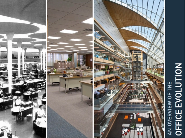
Learn about the evolution of the workplace, from the very first office developed by the De Medici family to today's open collaboration spaces, after the break!
https://www.archdaily.com/517945/infographic-the-evolution-of-the-officeSunica de Klerk
Courtesy of Civil Engineering Program, Norwich University
For time immemorial, humanity has sought to outdo itself architecturally, building longer tunnels, taller towers, and stronger walls. Now, the Master in Civil Engineering program at Norwich University has compiled a definitive top ten list of these impressive structures. In the following infographic, you’ll find some familiar entries - such as the Great Wall of China and the Hoover Dam - as well as some lesser known greats, like the Qingdao Haiwan Bridge. Spanning over 2000 years of architectural ingenuity and invention, this list is sure to teach you something new about the most impressive engineering projects of all time.
Schools and students of architecture are overwhelmingly focused in the North East. At the other end of the scale are the states of the Gulf Coast. Image Courtesy of ACSA
As part of their ongoing ACSA Atlas Project, the Association of Collegiate Schools of Architecture (ACSA) has just released a new set of infographics, showcasing a range of statistics relevant to both architecture students and professionals alike. The 10 images cover a range of issues, including: demographic concerns such as race and gender, economic concerns such as salaries and employment futures, and the number of architects and students in each state. Read on after the break for the full set.
Last week, Frei Otto was announced as the 40th recipient of the Pritzker Prize, the latest in a long line of talented architects (as well as the first architect to ever receive the Prize posthumously). Learn more about the Prize and its winners after the break!
In case you missed it, we're re-publishing this popular post for your material pleasure. Enjoy!
To celebrate AD Materials turning two three (months that is), we decided to dig a bit deeper into the materials we know and love. What's their history? When did they first come to use - and where? How? If you want to know more about the lives - past and present - of concrete, glass, steel, and more, check out our fantastic new infographic after the break!
Six years ago, we had a crazy idea: let's create a platform to give architects exposure, no matter where they come from or how famous they may be. Let's put them side by side with architectural greats. Let's make that platform absolutely free and accessible to whomever wants to be inspired by it. Let's give architects the inspiration, knowledge, and tools they need to make our rapidly urbanizing world a better place.
In six short years, we went from an idea to the most visited architecture web site in the world, with over 300,000 daily readers, a staff of over 50 people working in 9 different countries, and three local versions: ArchDaily Brasil, ArchDaily México and Plataforma Arquitectura (and a fourth coming soon!). This is our story.


.jpg?1416794800&format=webp&width=640&height=580)


-thumb.jpg?1426868224&format=webp&width=640&height=580)

.jpg?1394555093&format=webp&width=640&height=580)