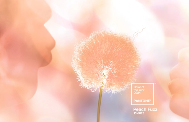
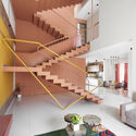
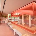
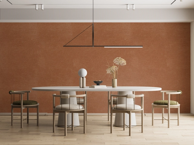
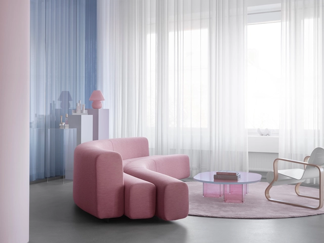
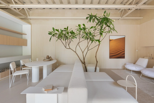
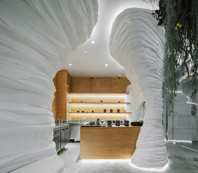
Pantone has just just announced “Peach Fuzz” or PANTONE 13-1023,” the 2024 Color of the Year. Known for its color standards and digital solutions in the design community, Pantone announced the color aiming to move towards empathy and understanding. A hue between pink and orange, the color is soft and inviting and offers “tenderness and communicating a message of caring, community, and collaboration.”
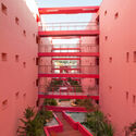
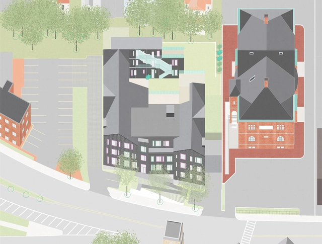
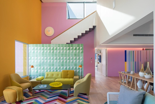
In Greater Boston's city of Malden, Massachusetts, an inter-generational community of thirty households hired an architecture firm and collectively designed their cohousing community. Responding to the cohousing community's request for collective living in an urban setting, French2D designed a typology-challenging building with individual residential units connected by a framework of shared spaces. The result is a 48,700 sqft unique and colorful type of multi-family housing. It is one of a growing number of cohousing projects in the United States.
Videos
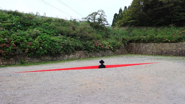
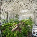
I Was Born Installation / HAJIME YOSHIDA ARCHITECTURE + YOSHIHIRO MIKAMI. Photo: Courtesy of HAJIME YOSHIDA ARCHITECTURE + YOSHIHIRO MIKAMI
A space is much more than just its appearance. Textures, smells, and sounds can strongly affect the user's experience. Based on this, sensory architecture can transform the interaction between people and the built environment into something even deeper.
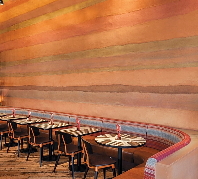
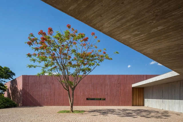
Rammed earth is one of the oldest methods of constructing walls and still holds great potential for modern earth construction. One aspect of this potential is the gift of its colors and layers, which become visible as the formworks are removed, revealing a layered character. As a process that involves the layer-by-layer compression of gravel, sand, silt, and clay, its resulting appearance is a horizontal stratification of earth tones, material content, and curing procedures. This colorful appearance of rammed earth walls can be controlled and explored through patterns, texture, pigmentation, and natural clay colors, offering an opportunity to push its boundaries within architecture.
There’s something about the saturated hues of blossoming springtime flowers and the fiery, warm tones of a sunset descending upon a cityscape that brings us joy. Humans crave color. In fact, we’ve been fascinated by them since the beginning of our existence. So much so that everything from the color of our clothes to the brightly illuminated pixels on this screen is an attempt to recreate –and enhance– the vibrant shades present in nature, finding in them a source of inspiration and vitality. Our brains are wired to link colors with sensations and experiences: the lush greens of a forest evoke feelings of tranquility and renewal, while the deep blues of the ocean stir a sense of mystery and adventure. It is this ability to elicit emotion that makes colors an invaluable tool for architects and designers –and which also explains why trends are moving away from the once-reigning neutral minimalism towards a more maximalist aesthetic that embraces pops of color, dimension and playful texture.
The year 2024 brings forth an intriguing array of Color of the Year selections from renowned paint manufacturers, each offering a unique perspective on the hues that will influence our living spaces. Striving to capture the moods and aspirations of the coming year, color experts have veered towards soft and calming shades, hoping to bring a sense of serenity to counter the hectic and tumulus passing year. Countering the bold color chosen by Pantone in 2023 as their previous Color of the Year, Benjamin Moore embraces a softly saturated and nuanced shade, AkzoNobel emphasizes calmness and stability, Sherwin Williams aims to inspire mindfulness, Graham & Brown fosters warmth and tranquility, and C2 Paint focuses on freshness and sustainability.
The history of 'neutral colors' is a fascinating journey through the evolution of human aesthetics and design sensibilities. Closely related to the makeup of materials organically found in nature, the color chorus of whites, grays, and earthy brown tones has played a pivotal role in artistic expression, fashion, interior design, and architecture for millenia. From the understated hues of early clay, straw, wood, or brick architectural structures to the now prevalent contemporary interior style, neutral colors have transcended cultural boundaries and continue to hold a special place in our visual landscape – offering a sophisticated elegance and versatility that has stood the test of time.
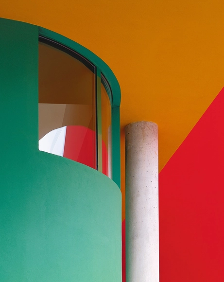
Colors have played an essential role in the history of modern architecture - from Le Corbusier's theory of polychromy to the aesthetic conceptions of the Bauhaus. However, we find ourselves at the beginning of an era where the interpretation and implementation of colors in architecture are undergoing a transformation based on their impact on the built environment.
Throughout the month, we conducted an open call to listen and learn from our readers, exploring their predictions and thoughts related to the future of colors in architecture. After reviewing an immense number of comments and opinions, it was surprising to discover commonalities regarding the importance of considering energy efficiency in color choices. Check out the main viewpoints below.
Color plays a significant role in the world. Partly because of the significance attached to each hue, the use of color in architecture – especially in interiors – changes the ambiance of each project. In commercial establishments, color has a considerable influence on highlighting a given brand, and in homes, it can reflect the resident’s personality and complement the language adopted in the project. This exploration can take place directly in the tectonic object (architecture) through the surfaces that constitute the building, or it can take advantage of mobile elements, easily changeable.
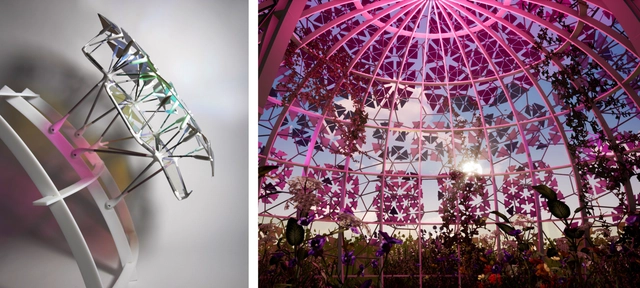
Agrivoltaic Pavilion prototype & designs in 'Sustainable Architecture & Aesthetics.' Transforming BIPVs with custom 3D-printed filters and panels for site-specific solar collection. Courtesy Sabin Design Lab at Cornell College of Architecture, Art, and Planning and the DEfECT Lab at Arizona State University. Image Courtesy of Jenny E. Sabin
Why research and innovate in architecture? In a conversation with architectural designer Jenny E. Sabin, we delve into the critical link between research and practice in architecture. Seeking the development of a new model, her team incorporates an interdisciplinary approach that introduces connections between these areas, fostering collaboration with both scientists and engineers.
Observing nature’s behavior, the proposed method integrates biological and mathematical discoveries into the design process. After undergoing a systematic testing process, these insights are applied in the project’s generative design phase to create adaptive and responsive material solutions. Analyzing her research and design strategies, we showcase how she translates research into architectural practice.
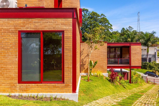
Although the use of color can be employed to hide or disguise a specific characteristic, it can also be used to highlight them. Within the Latin American territory, we can observe that shades of red, green, and blue have predominated in residential architecture, aiming to integrate a language appropriate to the context in which it is implemented.
The use of pigmented concrete in Latin American architecture is growing - and influencing contemporary architectural expression. This can be seen in recent built works ranging from the INES Innovation Center designed by Pezo von Ellrichshausen in Chile to the Teotitlán del Valle Community Cultural Center by PRODUCTORA in Mexico.
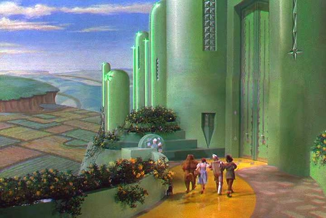
The Wizard of Oz (director Victor Fleming, cinematography Harold Rosson, 1939). Print Screen
Colors evoke specific feelings; therefore, they are used to elicit particular effects on the surface they appear on or in the minds of observers contemplating them. In architecture, color plays a fundamental role in defining shape. Materials in their natural state already possess inherent coloration, which is perceived in a specific manner. However, when dyed, the observer's perception is altered, giving rise to associations between different sensations related to the same object. This transformation brought about by color occurs in various visual mediums, spanning from three-dimensional contexts like architecture to static and mobile two-dimensional forms such as engravings, photographs, paintings, and films.
Videos
Sto distribution centre in Hamburg, Germany. Designed by Michael Wilford & Associates, 1994-1995. Photographed by Richard Bryant, image courtesy of Sto
Contrary to popular belief, Roman buildings were not as monochrome as previously thought. Recent discoveries indicate that statues and structures were, in fact, richly adorned with bright colors and exuberant decorations, following the tradition established by their Greek predecessors. This may be surprising, but it shows the presence of color in architecture much earlier than imagined. Color has always played a significant role in shaping the perception and experience of a space, and was prominent in the works of seminal architects such as Le Corbusier and Luis Barragán, for example. Another master of the use of color was Michael Wilford, who, together with his former partner James Stirling gained international recognition with notable public buildings, art centers, museums, and libraries located worldwide. The volumes present in Wilford's architecture are often remembered for their careful use of color, which highlights certain elements and adds other dimensions to the structures.
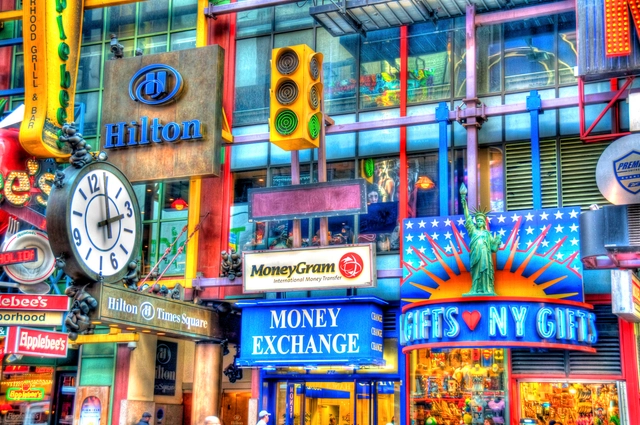
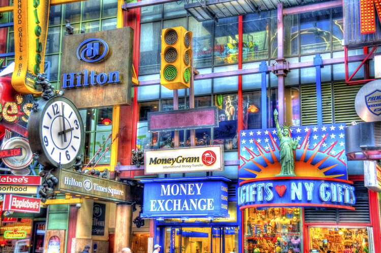
Our daily lives involve constant communication with the city. As we move through different spaces, we ask ourselves questions like "Where am I now?", "Where am I headed?", "What am I looking for?", "What is this building for?", and "How do I experience this space?" While spatial encounters may feel intuitive, environmental graphic design (EGD) provides the answers by serving as an important interface between us and the built environment. It involves the design of graphic elements that merge with architectural, landscape, urban, and interior designs to make spaces more informative, easier to navigate, and memorable. EDG comprises three major elements: text, shape, and color. Text and shapes typically encapsulate the graphic information, but color projects it, amplifies it, and helps communicate it within the packed scenes of the city. In spatial experiences, we perceive colors first, since our senses mostly register visual sensations. Therefore, the strategic use of color is critical for environmental graphics to provide a layered experience of identity imagery, sense of place, and emotional connection.
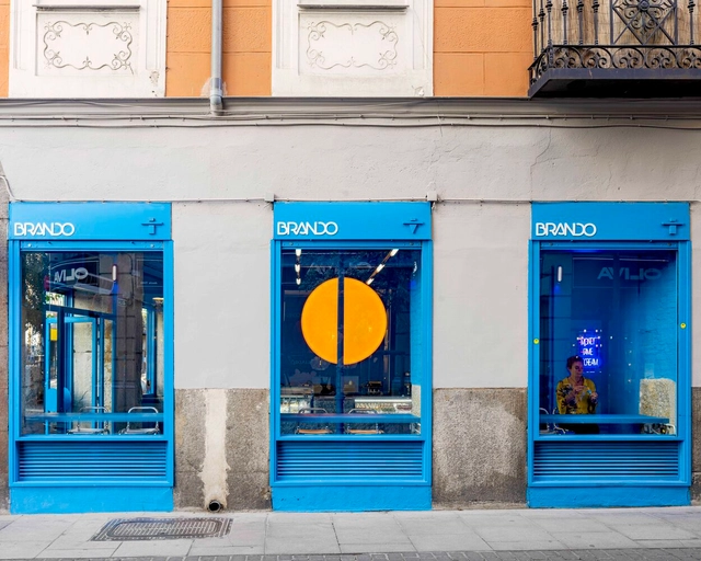
In the world of retail, competition is fierce. Brands find themselves in pursuit of distinguishing their presence and developing intimate connections with their customers. Amidst the array of products they offer, thoughtful brands recognize the value of curating immersive retail environments that empathize with the core of consumers' sentiments and desires. In retail design, color stands as a powerful instrument that affords brands the means to articulate their values, evoke emotions, and carve memorable shopping experiences into the minds of their patrons. Color transforms retail centers into more than spaces for transactions - it positions strategic interior design as a marketing tool to attract and retain customers.
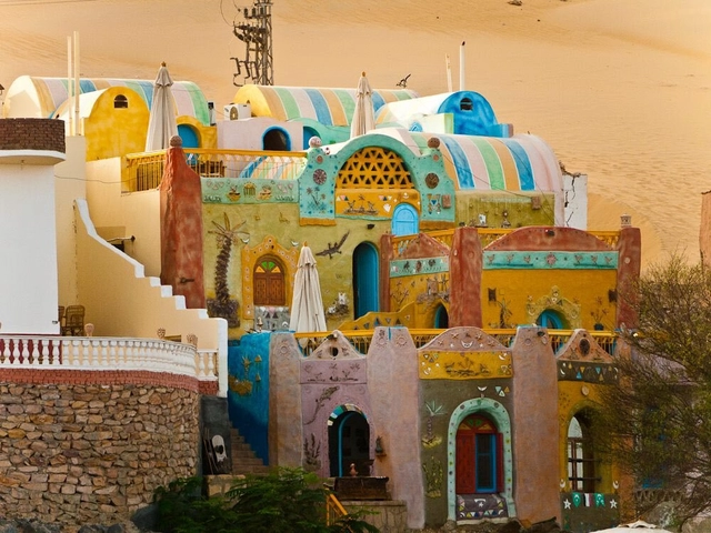
African societies' cultures are intrinsically linked to color. From fabrics to clothing, products, sculptures, and architecture, various societies explore rich and vibrant colors that are vivid, expressive, and joyful. Through different shades, hues, contrasts, motifs, and ornamentations, colors are embraced as an unspoken language, a palette for storytelling, and a sense of cultural identity. Although the use of color in African societies may seem decorative on the surface, it is extremely symbolic, with a deep sense of history behind it. Traditional African architecture is a prime example. Ethnic societies have endowed their homes with color through ornaments and motifs, expressed it with religious and cultural patterns, employed it on facades to tell familial stories, and created labyrinths of communal architecture that not only celebrate color but explore its ethnic meaning.
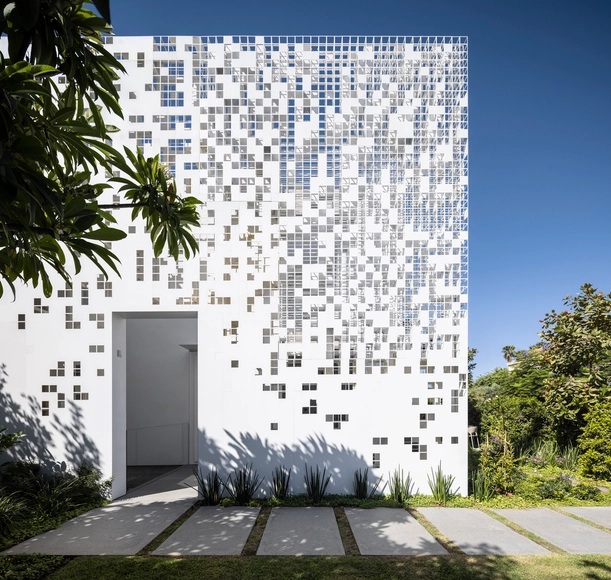
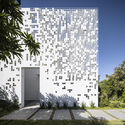
Architects and designers are often looking for ways to make building facades and interior surfaces stand out from the crowd. But sometimes just the smallest change can have the biggest impact once you step back and see the whole picture. By employing an illusionary pattern such as dithering pixels or halftone dots, or by making subtle but intentional changes to the position or orientation of materials, flat surfaces can be transformed into curved, moving forms.
Halftone patterns work by reducing a solid surface of color into dots of decreasing size. As the dots gradually reduce to nothing, they leave nothing behind except a background color. The result is a flat surface with a gradient that mimics the shadows or highlights of a three-dimensional curve. Dithering, meanwhile, is the process of feathering multiple shades of the same color to blend them together. The effect allows designers to, on a large enough scale, create images with depth and curves, while using only a single color. Or even to create the illusion of an intermediary color.