

-
Architects: Atzur Arquitectura
- Year: 2018
More than 5000 new projects published throughout 2021 make ArchDaily the largest online architecture library in the world. ArchDaily Curatorial Team researches, contacts offices, prepares, and delivers the built projects in the world on a daily basis, with the objective of providing inspiration, knowledge, and tools to our users who take part in the creation of better built environments.

Circulation spaces are often challenging for designers as they are intended—as the name implies—for moving from one room to another. While many take advantage of these areas by using them as storage spaces, Mies van der Rohe at the Farnsworth house reduced circulation to a minimum, creating an open floor plan completely free of hallways. When faced with vertical circulation, the issue is similar. Stairs fulfill the purpose of overcoming the height between one floor and another, but rarely constitute indoor living spaces. Bleachers, in turn, play this role in several projects. Until recently, they were only found in sports spaces or amphitheaters; now the use of bleachers has become widespread and is seen in office spaces, public buildings, schools and even homes.



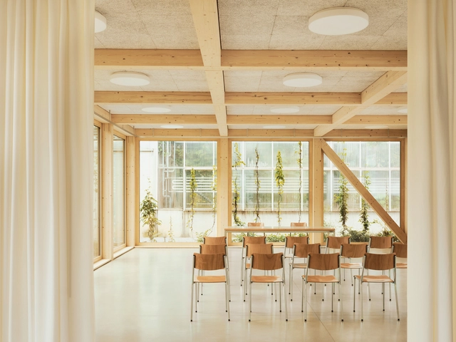
The ceiling is an important element in architecture and interior design, combining functionality with aesthetics through different materials that add layers of texture and color, providing quality and comfort in interior spaces as well as a protective surface for other building systems.
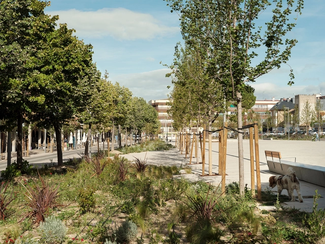

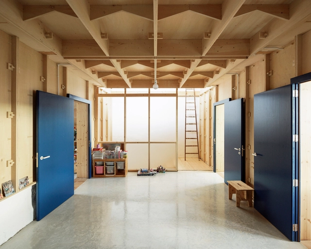
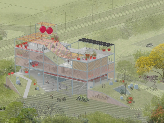
Husos Architects' work advances in an ongoing dialogue between design and research. Founded in 2003 between Spain and Colombia, the architecture and urban planning office stands out for addressing different scales, from the micro to the global, responding to the requirements of specific users but weaving deep contextual networks with the environment and beyond. How do they effectively approach this complexity, in turn promoting social transformation? We spoke with Diego Barajas and Camilo García Barona about their processes of approaching users and other agents involved –not only humans–, about how they address the colonization of the biosphere that has caused climate change, and about their inquiry into activism from a series of battlefields habitually neglected in traditional discourses of architecture.