

-
Architects: ARKITITO Arquitetura
- Area: 290 m²
- Year: 2022
-
Manufacturers: Sherwin-Williams, AutoDesk, Blocos e Lajes Itaim, Deca, Gerdau, +5
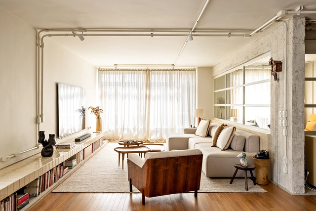

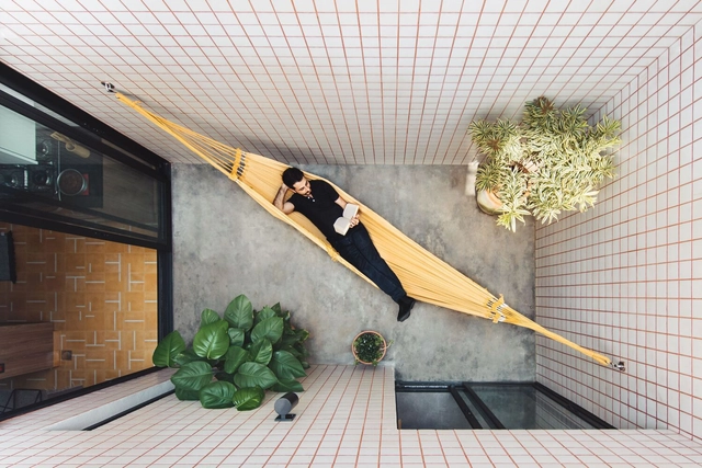
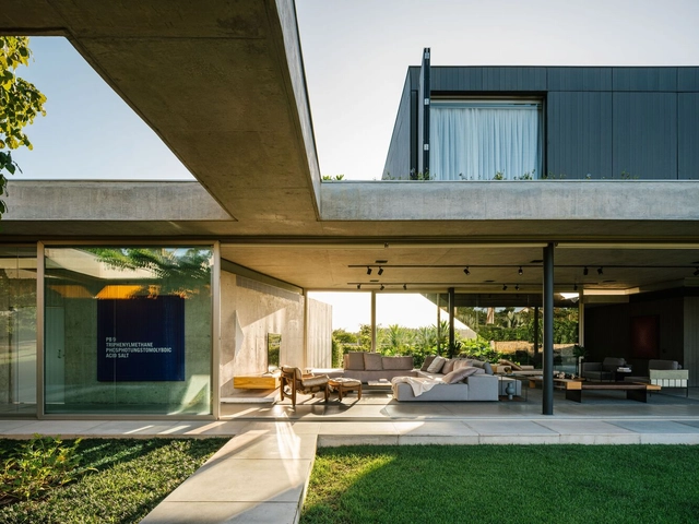
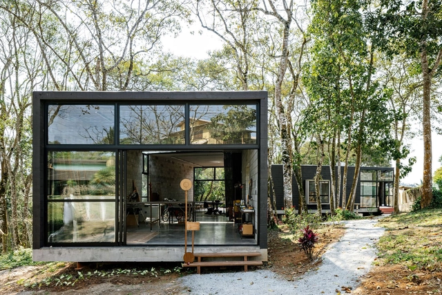
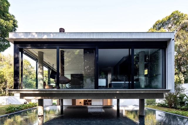
In tropical countries like Brazil, external areas are highly valued in residential projects. The backyards are used differently and configured according to the architectural project. Whether large or small, landscaped, with a pool, or equipped with other features, Brazilian families seek to make the most of their outdoor areas when possible.
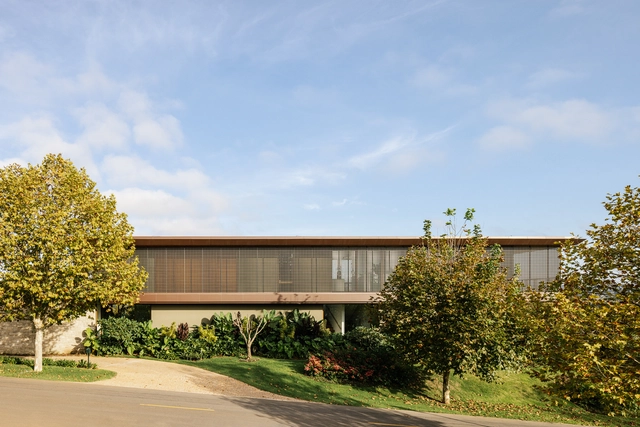
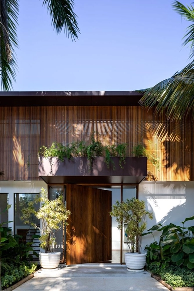
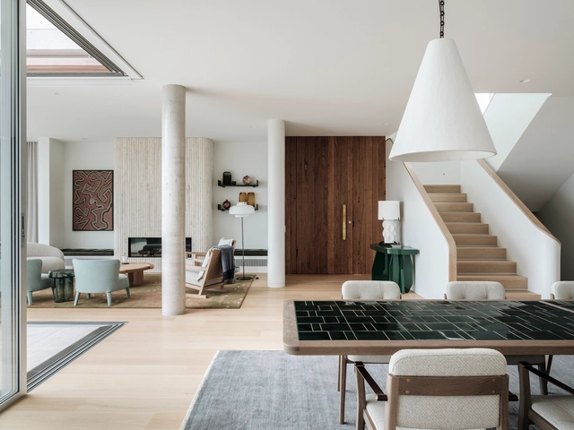
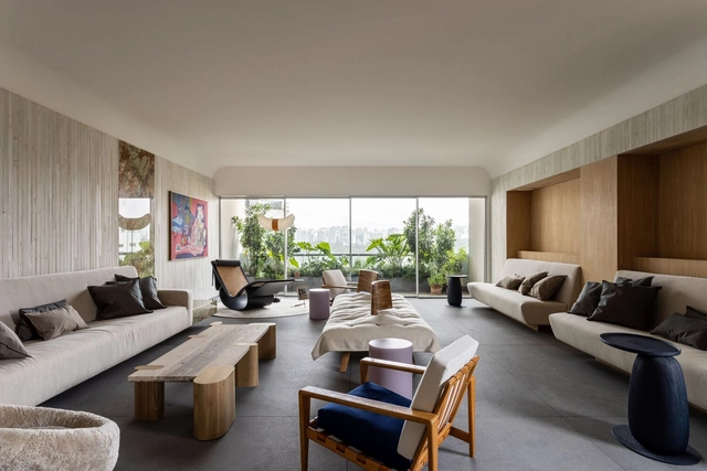
When it comes to forward-thinking interior design, adaptability, and timelessness are two key factors that can guarantee a home will look just as current years from now as it does today. One interior style that makes use of them more than any other is: contemporary. By borrowing elements from several prominent styles and combining them into a harmonic whole, contemporary interiors stay current even as trends move on. But what are the components that remain constant even with this ever-changing fashion? We explore seven evergreen design elements that define contemporary interiors.
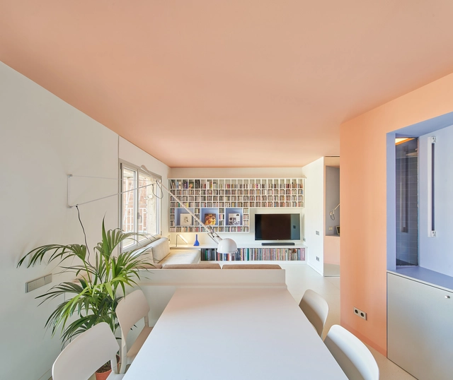
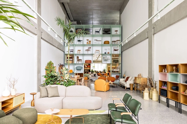
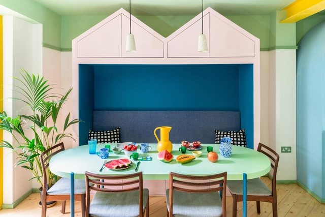
With a high proportion of white mixed with a small amount of colorful pigments, pastel colors provide a range of pale, subdued tones. Related to soothing and calming environments, these colors have a timeless quality and can be seen throughout different architectural styles, such as rococo, art déco or the mid-century modern years. Applied in exteriors, interiors, or both, pastel tones make rooms feel more light, airy and spacious.
From subtle accents to taking the spotlight in a project’s overall strategy, pastel colors are a versatile alternative that can be used in multiple ways and varying degrees. Following Ricardo Bofill’s color proposals, Paulo Mendes da Rocha’s interiors and Michael Graves’ buildings, contemporary architecture plays with soft colors for aesthetic and functional purposes, as well as providing a sensory experience. Analyzing different examples of their application in architecture and design, we showcase how four prevailing colors –mint green, pale pink, lemon yellow and light blue– are currently taking the stage.
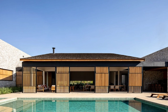
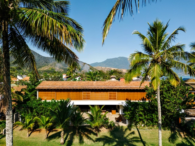
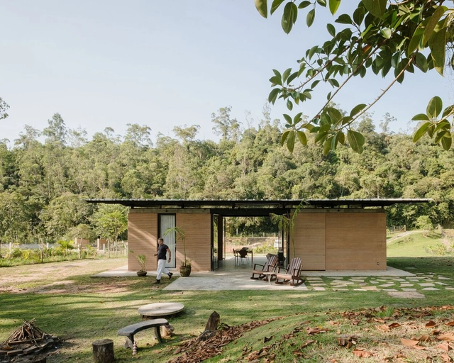
As another year comes to a close, the ArchDaily team gathers the highlights of architecture in a series of retrospectives reflecting on the content featured over the past twelve months. As part of this effort, our curation team turns its attention to one of the most popular categories among our readers, residential architecture, selecting the projects that represent the best of a vast global architectural production, as seen through the eyes of our audience.

Playfulness is a concept often attributed to children and hardly connected with adult life. In architecture, projects dedicated to childhood propose a combination of objects, colors and solutions to encourage imagination and break the rigidity of spaces. In contrast, most conventional projects are limited to regularity and stamp the sobriety of adult life.