
At first glance, it seems that Apple's strong retail design has derived from consistent design. But since Steve Jobs opened the first Apple Store in 2001, the brand has changed its store and lighting design concept five times. Thereby change appears as a central factor when a brand grows and expands internationally. For each period Apple developed sophisticated details and has strived for the perfect sky in their store - a smart strategy to enhance naturalness and sustainability.
_Nigel_Young-_Foster___Partners_Westlake.jpg?1576163568 "Apple Store Westlake, Hangzhou / China. Architecture: Foster + Partners. Image: © Nigel Young")


Sober flush mount luminescence
The first generation of store-in-store concepts started with a grid of square luminous ceiling panels thus introducing the distinctive ceiling appearance for Apple stores. At this stage, the white luminous ceiling panels are reminiscent of a cloudy sky. This design strategy can hardly be interpreted as a visionary for fancy computers, but rather as an expression of retro design, conjuring up memories of the fluorescent lighting when the modern corporate workplace started in America in the 1960s. However, when companies needed to communicate values like sustainability, the lack of daylight turns into a serious problem.

Sunlight underground for natural ambiance
The first remarkable daylight design at Apple appeared with the elegant glass cube on Fifth Avenue in New York (2006) and led to a long-lasting collaboration with Bohlin Cywinski Jackson. What I.M. Pei created with the glass pyramid at the Louvre for the museum world, was translated by Steve Jobs into a glass cube entrance for an immersive retail experience. The aspect of daylight became even more dominant with the redesign of the Palo Alto store (2012) using an arched glass roof for the complete store. Of course, glare from sunlight became an issue. As a consequence, the store in Istanbul with the glass lantern (2014) creates less glare caused by sunlight, and the store in Milan with the stepped profiles of the amphitheater (2018) reveals another detail to reduce glare from the sun. But not all store locations open the chance to include daylight. Therefore, Apple has looked for an alternative way to design a sky experience.
_Nigel_Young-_Foster___Partners_Westlake.jpg?1576163568)
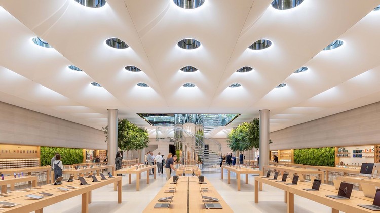
Uniform sky for calm serenity
In 2014, and in collaboration with Foster + Partners, Apple introduced a major relaunch of its stores with seamless luminous surfaces covering the complete ceiling. The soft glow induces a calm atmosphere to relax. In order to add subtly focal glow to ambient luminescence, directional spotlights are mounted on slim parallel channels. The first-of-its-kind store opened in Istanbul in combination with the glass lantern for daylight. The Hangzhou store (2015) extends the luminous ceiling concept over two stories for a striking shop window experience.
A key source of inspiration during the concept phase for the luminous ceiling was the Design Dome in the General Motors Technical Center, designed by Eero Saarinen in collaboration with lighting designer Richard Kelly. Corporate buildings designed by Skidmore Owings & Merrill, such as the Manufacturers Hanover Trust in New York (1954) or the Union Carbide Corporation Headquarters in New York (1960), are among the early examples of extensive luminous ceilings for branding. However, the increasing diffuse light let already to a distinct criticism in the 1970s, as the American architect Der Scott pointed out, "Among all ceiling lighting systems available today, the luminous ceiling is the highlight of visual monotony".

Goodbye International Style - Welcome local style
Apple's worldwide uniform design strategy with patents for its store design has led to a problem similar to the unattractive consequences of International Style, which does not create links to existing regional traditions. With the international growth of the brand, appreciating local cultural values became more essential for Apple's marketing. Stores at Grand Central in New York (2011) or the reconstruction of a former banking hall for the Upper East Side store (2015) belong to the first examples for the direction to include historic architecture and luminaires for a regional brand experience.
Later, the Foster + Partners team received the chance to create new buildings with a regional touch. The shading system in the Dubai Apple store (2017) pays tribute to traditional Mashrabiya patterns. In contrast, the newer Apple store on Champs Élysées in Paris (2018) refers to the ornate Beaux-Arts style and its chandeliers.

Urban expansion
Due to the redesign of Apple stores as so-called "town squares", outdoor lighting and the revival of urban connections received attention for the first time. The soft illumination of the stairs around the store on Chicago River, or the Apple Piazza Liberty in Milan with the dramatic fountain linking water, movement and light, are part of a mission to gather people on the semi-public ground. Clearly Apple has revealed a high interest in concealing the lighting technology in favor of striking light effects.

The reopening of the iconic 5th Avenue store in New York in 2019 illustrates the strategy for a natural sky feeling vividly, as Stefan Behling explained in an interview with Forbes: “So, the whole idea here is, could you actually make the space feel as good as being outside? Like happy white clouds, going through the blue sky, and it feels happy and fresh.” The 5th Avenue store reveals a remarkable mix of daylight with a new grid of sky lenses, large luminous ceilings changing slowly the colour temperature during the day, and outdoor furniture which bring daylight into the underground at day and glow magically in the evening.

In this way, light has been an essential element for Apple's brand communication in order to emphasize qualities like naturalness or individuality. When looking at the history of Apple storefronts, the impression rises that developing new images appear more important for Apple's growth than holding too long to continuity. Recent transparent pavilions with wooden ceilings enhancing sustainability indicate a new direction, where recessed directed light emerges next to the soft glow of luminous ceilings for interior spaces.
The analysis of Apple's lighting design was first presented at the Professional Lighting Design Convention in Rotterdam in October 2019.
Light matters, a column on light and space, is written by Dr. Thomas Schielke. Based in Germany, he is fascinated by architectural lighting and works as an editor for the lighting company ERCO. He has published numerous articles and co-authored the books “Light Perspectives” and “SuperLux”. For more information check www.erco.com, www.arclighting.de or follow him @arcspaces.


