
Have you ever dreamed of crossing from Midtown Manhattan to Brooklyn in just a few leisurely steps? These lofty ambitions are made possible on the New York City Carpet from South African studio Shift Perspective. Not literally though, unfortunately.
Have you ever dreamed of crossing from Midtown Manhattan to Brooklyn in just a few leisurely steps? These lofty ambitions are made possible on the New York City Carpet from South African studio Shift Perspective. Not literally though, unfortunately.

The well-known saying “all roads lead to Rome” seems to be true--at least, that’s what Moovel Lab, a team from Stuttgart dedicated to urban mobility research, points out. Titled "Roads to Rome," the project has mapped out over-land routes across Europe that converge to the city.
From a grid of 26,503,452 square kilometers covering all of Europe, the researchers defined 486,713 starting points that were superimposed on the continent's street map. Then an algorithm was developed for the project that calculated the shortest route between each of the points and the Italian capital.

There is something incredibly satisfying about 3D maps that make you want to follow the streets and rivers with your fingers, navigating your way through the urban landscape. Almost like contours, the CityWood’s minimalist maps are built up through plywood layers, laser cut with precision to one-hundredth of a millimeter and hand assembled for high-quality craftsmanship.

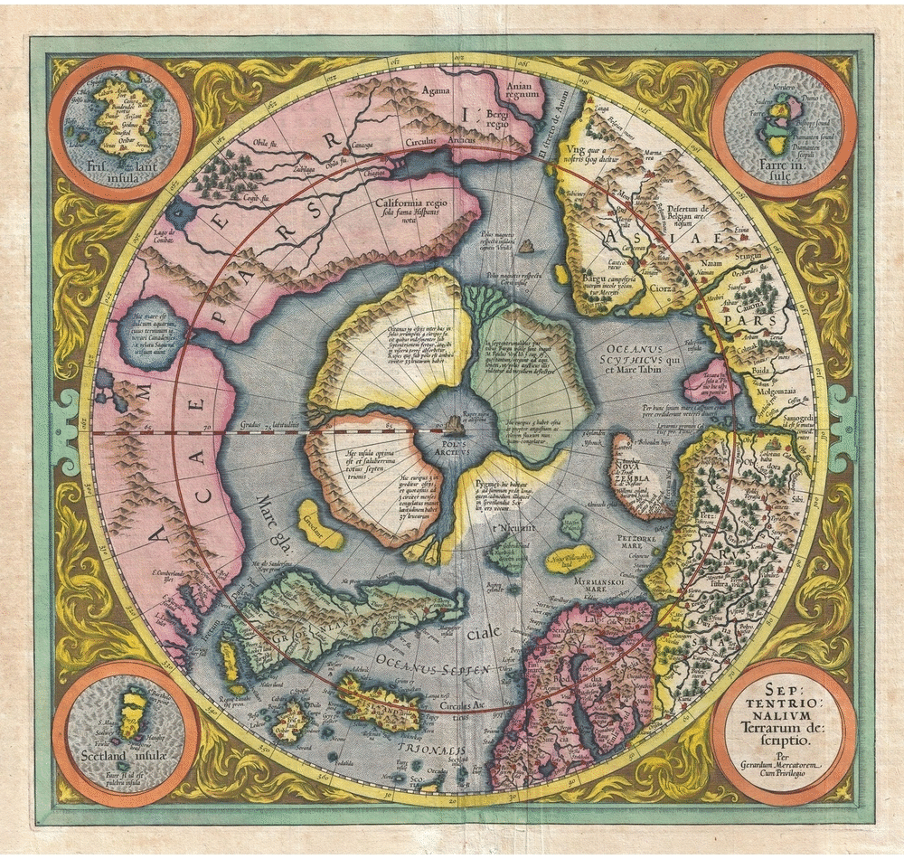
Stanford University experts digitally assembled what is considered the largest world map produced in the 16th-century. The representation of the world of 1587 by the Milanese cartographer Urbano Monte was divided into 60 pages and published in atlas form, but with clear instructions on how to reassemble it.
David Rumsey, director of the university's historical map collection, acquired the map from a historian in 2017. The publication has only one other handwritten copy in the world and has never been assembled in map form.

Home to Frank Lloyd Wright for many years, Oak Park, Illinois is also the site of the greatest concentration of Frank Lloyd Wright-designed homes and buildings than anywhere else in the world. Having designed structures for the neighborhood for nearly four decades, Wright used Oak Park as a place to try out new techniques and evolve his personal style.
Picking up on this, Illustrator Phil Thompson of Cape Horn Illustration has created a new map of Wright’s Oak Park designs. Organized both chronologically and by location, the map allows viewers to make connections between the structures, as their lines evolved from gabled to flat roofs and expanded in scale and in ambition.

Need some data on the world's inhabitants? Population Explorer is an online software that can estimate population information from any region of the world based on the Landscan application and is described as a "high-precision population database produced by the Oak Ridge National Laboratory" in the United States.
The tool is the first and only application of its kind, and instantly displays population and density counts in a user-selected flexible area, allowing you to create and save scenarios based on that data - Developers of Population Explorer.
It is possible to use the platform to know a variety of statistics: how many people live in a certain region, the number of women and men living in a given area, the age pyramid of a given population, and how densely populated a territory is (among other applications) - making the tool useful for both municipal and government authorities around the world.

Released this month, the website Hoodmaps offers a crowd-sourced mapping platform that gives users the ability to walk through a city like a local. By “painting” parts of the city using a palette of six colors that represent “uni”, “hipsters”, “tourists”, “rich”, “suits”, and “normies”, Hoodmaps aims to provide a quick visual representation of a city.
The website features a thousand of the largest cities from around the world and is constantly being edited with new user content that flags Google Maps with information about touristed zones of cities among other information. Creator Pieter Levels noted the need for such a service when traveling and being frustrated by the difficulty in finding culture-rich zones of a city as opposed to its commercialized ones.

How satisfied are you with your city’s garbage service? Its parks? The way it handles pest control? What about homelessness? In the USA’s largest metropolis, which covers a total of 468.484 square miles (1,213.37 km2) and is home to over 8.5 million people, New Yorkers’ perception of their city and the services it provides reveals the “uneven distribution of New York’s opportunities,” according to a survey conducted by The New York Times.
The project also shows relative accord and satisfaction with fire and emergency medical services and agreement that use of tax dollars, public housing and traffic can be improved.
It's difficult to imagine an uncharted world. Today, GPS and satellite maps guide us around cities both familiar and new, while scanning and mapping techniques are gradually drawing the last air of mystery away our planet's remaining unexplored territories. At one time, however, cartography was based on little more than anecdotal evidence and a series of educated guesses. But map-making in the 16th and 17th Centuries was an art nonetheless, even if these examples testify to the fact that just because you're missing important facts, total fabrication may not be the best way forward.

Go on a virtual stroll through century-old London, with this new interactive map produced by Expedia. Named “Historic London,” the app takes you through 14 notable sites throughout the British capital, from Buckingham Palace to a view of St. Paul’s Cathedral from Fleet Street. Archival images of the sites from the late 1800s and early 1900s are overlayed onto the streetview of today, so you can easily compare what has and hasn’t changed over the last 100 years.
Check out the interactive map for yourself below:
Land Lines, a new Chrome Experiment exploiting the satellite image data collated by Google Maps, allows anyone—cartographic aficionado or otherwise—to marvel at the contours of the world through gestures. Intelligently designed to detect dominant visual lines from a dataset of thousands of images, cut down from over 50,000 by using a combination of OpenCV Structured Forests and ImageJ’s Ridge Detection, users can simply "draw" or "drag" on a mobile browser or on a desktop to "create an infinite line of connected rivers, highways and coastlines."
.jpg?1479175112)
Public spaces, squares, and parks in New York City are administered by the city’s Department of Parks & Recreation (NYC Parks).
In recent years, the agency has been responsible for creating new programs to help children, youth and adults be aware of the importance of caring for their urban landscape.
One of these programs is a TreesCount! which in 2015 gathered 2,300 volunteers to learn about the trees in their environment, what state they are in, what care they need, what their measurements are, and how they benefit the surrounding community, etc.
For months, they walked the streets of the five boroughs together with a group of monitors who previously trained them to recognize what trees they were studying and their characteristics.

History and geography lovers rejoice! You can now see and even download incredible maps from the David Rumsey Map Collection database. The website contains more than 71 thousand maps and images that span the 16th to the 21st century and illustrate everything from the seven continents, to the entire world and even celestial bodies.
The maps and images serve as useful historical and artistic references, offering rare cartographic detail and insight into the visual organization of territories. The exceptionally high-resolution images can be filtered by place, author, and date of creation.

City Guide publisher Blue Crow Media and Deane Madsen, Associate Editor of Design at Architect Magazine, have collaborated to produce the Brutalist Washington Map, which features 40 examples of Brutalist architecture in Washington, D.C. This is Blue Crowe's fourth architectural guide map, following their Brutalist London Map, Art Deco London Map, and Constructivist Moscow Map. One can only expect further releases on the horizon.

This article, by David Neustein and Grace Mortlock of Otherothers, explores a key paradox of the 2016 Venice Biennale: the disconnect between the geography of the topics on show and the geography of the Venice Biennale itself. With maps created by their students at the University of Technology, Sydney, they suggest new ways to explore the Biennale with Aravena's theme in mind.
In announcing his theme for the 2016 Venice Architecture Biennale, “Reporting From the Front,” Biennale director Alejandro Aravena declared that “architecture is about looking at reality” and that “any effort to tackle relevant issues has to overcome the increasing complexity of the world.” Aravena has envisioned a sweeping exhibition of architecture’s “frontiers” and “margins,” as if he were a general surveying the global battlefield from above.
The greatest impediment to this admirable ambition is the architecture of the Venice Biennale itself. Marooned on its tourist island, the Biennale is an idealized world-in-miniature, free of the realities, confusions and conflicts of the world-at-large. The environment is timeless, picturesque, serene: hardly representative of the world’s “increasing complexity.” Within the Biennale gardens (Giardini), former Colonial powers occupy prominent permanent pavilions while other countries, including those of present-day significance, are consigned to the periphery, relegated to temporary off-site spaces, or else absent altogether.

It's no secret that architects are often fascinated by maps, and in the age of Google - where access to accurate maps of almost anywhere in the world has become universal - maps have become one of the most powerful ways to understand our cities. Interestingly, Google has in a way enabled a new way to interrogate maps from the past, as historic maps can be more easily overlaid with the Google interface to make comparisons to the present day. That's just what the website Locating London's Past has done, creating a tool to compare three maps: the current version of Google Maps, the first Ordnance Survey map from 1863-80, and John Rocque's 1746 Survey of London, allowing web users to see the growth of the UK capital over the past 270 years.

For most of history, mapmaking has been an incredibly specialized pursuit, the domain of either intrepid explorers or highly skilled cartographers, and the resulting maps were some of society's most important repositories of information. In the 21st century, internet-age services such as Google and Wikipedia have made this system largely obsolete - but that doesn't necessarily mean that mapmaking is dead. In this article from Architecture Boston's Summer 2015 issue, originally titled "Redrawing the Map," William Rankin argues that our age of information has instead sparked a new age of cartography; one that is different, but just as important as what came before.
Given the proliferation of GPS devices and interactive mapping online, it’s easy to declare the traditional map obsolete. Intuitive turn-by-turn directions have replaced road atlases, Google has upgraded the static map with everything from real-time traffic to restaurant reviews, and Wikipedia has taken the place of the hefty geography textbook. Is there any hope for a cartophile? Will the stand-alone map, lovingly produced and custom designed, be only a niche product for rich collectors and Luddites?


UPDATE: Congratulations to Colin from Philadelphia and Guillaume from France - you've been randomly selected as the winners! Thank you everyone for participating.
SuperWarmRed Designs has offered our readers a chance to win Massimo Vignelli’s limited-edition (unsigned) MTA New York City Subway Diagram. Designed in 2012 by Vignelli, in collaboration with Vignelli Associates Beatriz Cifuentes and Yoshiki Waterhouse, the diagram is the first Vignelli subway map to be printed by the MTA since the 1970s and is slated to be made part of the Museum of Modern Art’s permanent collection this year.
Using concepts from Vignelli’s iconic Subway Map design of 1972, the new diagram was informed by satellite data and rebuilt for greater clarity and legibility. Revised to reflect the current subway system, colors and nomenclature, the poster has been printed in vivid Pantone and Hexachrome inks on acid-free archival cover-weight paper.
SuperWarmRed has agreed to giveaway one 36” x 45” Subway Diagram and one 16” x 24” Subway Diagram Detail Series. Read on after the break for the official rules.


