1. ArchDaily
  2. Editor's Choice

Editor's Choice

13 Reasons Why We Love Millennial Pink

Millennial Pink has broken into the design consciousness of more than its named generation. Though hugely successful in fashion and pop-culture (and Instagram), the playful color has established a presence across design products and the built environment like never before. Colour is a fundamental tool in our perception of architecture, with architects like Ricardo Bofill and Luis Barragan having baptized pink into a high-impact contributor through their works. With that in mind, check out these 13 projects showing why pink is here to stay:

19 Emerging Firms Design Prototype Houses for Living Among Nature

19 Emerging Firms Design Prototype Houses for Living Among Nature - Image 1 of 4

As the boundary that separates work and leisure in the 21st Century continues to be blurred by technology, architects Christoph Hesse and Neeraj Bhatia sought out to uncover a tranquil solution. The pair are co-curating an upcoming exhibition at the Kulturbahnhof Kassel in Germany as part of Experimenta Urbana in a show called “Ways of Life,” which opens July 5th.

This international initiative seeks to discover “a new nomaticism.” A gathering of 19 emerging architecture offices each presents a dwelling encompassed in nature. These buildings are often equal parts project and manifesto. The show’s overarching theme is the delicate balance of naturally induced relaxation and programmatically encouraged productivity. Each firm must additionally consider constraints that include limited square footage, integration of rapidly advancing information technology, and a strictly sustainable design.

19 Emerging Firms Design Prototype Houses for Living Among Nature - Image 13 of 419 Emerging Firms Design Prototype Houses for Living Among Nature - Image 22 of 419 Emerging Firms Design Prototype Houses for Living Among Nature - Image 50 of 419 Emerging Firms Design Prototype Houses for Living Among Nature - Image 70 of 419 Emerging Firms Design Prototype Houses for Living Among Nature - More Images+ 74

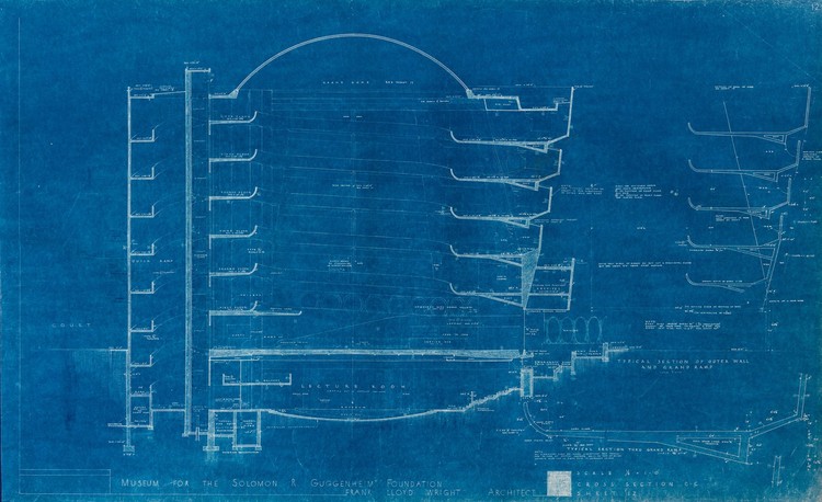
Frank Lloyd Wright's Early Blueprints of the Guggenheim Reveal Design Ideas That Didn't Make It

In a recent blog post from the Solomon R. Guggenheim Museum, curator Ashley Mendelsohn explores unrealized design details from Frank Lloyd Wright’s iconic design in New York City, based on blueprints and drawings from the museum’s archives. From large-scale questions of form to material choices, the 16-year period between the commission and the completion of the museum saw many design iterations. Most notable of these are the circulation paths drawn by Wright in the 1953 blueprints that include a steeper circular ramp—in addition to the "Grand Ramp"—that would allow for expedited access to the floors. Though replaced later with a triangular staircase, the "Quick Ramp" demonstrates Wright’s exploration of overlapping geometries.

Frank Lloyd Wright's Early Blueprints of the Guggenheim Reveal Design Ideas That Didn't Make It - Image 1 of 4Frank Lloyd Wright's Early Blueprints of the Guggenheim Reveal Design Ideas That Didn't Make It - Image 2 of 4Frank Lloyd Wright's Early Blueprints of the Guggenheim Reveal Design Ideas That Didn't Make It - Image 3 of 4Frank Lloyd Wright's Early Blueprints of the Guggenheim Reveal Design Ideas That Didn't Make It - Image 5 of 4Frank Lloyd Wright's Early Blueprints of the Guggenheim Reveal Design Ideas That Didn't Make It - More Images+ 1

NYC Underwater: Video Imagines the Consequences of a Two-Degree Temperature Rise

James Hansen, professor of Earth and Environmental Sciences at Columbia University, former NASA scientist, and the planet’s preeminent climatologist, was among the first to sound the alarm on climate change during his 1988 testimony before Congress. Since then, he has continued to shine a light on the problem through lectures, interviews, TED talks, and his blog. He has warned that a mere 2-degree increase in temperature could result in a sea level rise of five to nine meters by the end of the century, flooding coastal cities and rendering them uninhabitable.

Inspired by Hansen, filmmakers Menilmonde have imagined Manhattan underwater. The French duo's previous videos experiment with subtle subversions of the world we experience, and their latest creation, 2°C New York City, is arguably their most powerful to date.

NYC Underwater: Video Imagines the Consequences of a Two-Degree Temperature Rise - Image 1 of 4NYC Underwater: Video Imagines the Consequences of a Two-Degree Temperature Rise - Image 2 of 4NYC Underwater: Video Imagines the Consequences of a Two-Degree Temperature Rise - Featured ImageNYC Underwater: Video Imagines the Consequences of a Two-Degree Temperature Rise - Image 3 of 4NYC Underwater: Video Imagines the Consequences of a Two-Degree Temperature Rise - More Images

How to Design a "Building that Breathes": A Sustainable Case Study of Colombia's EDU Headquarters

In the Colombian city of Medellin, a new headquarters is being constructed for the Empresa de Desarrollo Urbano (Urban Development Company), combining optimal thermal performance with local urban regeneration. The new EDU headquarters is the result of a three-part collaboration between the public company, the private sector, and Professor Salmaan Craig from the Harvard Graduate School of Design who has family roots in the Colombian capital. 

Constructed on the site of the former EDU headquarters on San Antonio Park, the scheme aims to act as a benchmark for sustainable public buildings in Medellin, embracing the mantra of “building that breath."

As a specialist in materials, thermal design, and building physics, Professor Craig (EngD) voluntarily offered his service to the scheme’s realization. Below, he explains the thermodynamic challenges behind the building’s conception. 

How to Design a "Building that Breathes": A Sustainable Case Study of Colombia's EDU Headquarters - Institutional BuildingsHow to Design a "Building that Breathes": A Sustainable Case Study of Colombia's EDU Headquarters - Institutional BuildingsHow to Design a "Building that Breathes": A Sustainable Case Study of Colombia's EDU Headquarters - Institutional BuildingsHow to Design a "Building that Breathes": A Sustainable Case Study of Colombia's EDU Headquarters - Institutional BuildingsHow to Design a Building that Breathes: A Sustainable Case Study of Colombia's EDU Headquarters - More Images+ 39

"Inspirational" Frank Lloyd Wright Quotes for Every Occasion

It's no secret that Frank Lloyd Wright was among the architecture profession's more colorful characters. Known as an outspoken and often unforgiving egotist, Wright's appreciation of architecture was outshone only by his appreciation for himself—which is perhaps understandable, given that he ranks among the 20th century's great geniuses. For better or worse (probably worse), Wright's reputation has clung to the profession, thanks in large part to Ayn Rand, who used Wright as inspiration for the incorrigible lead character of one of her most famous books, The Fountainhead.

But in truth, most architects have at least a little of Frank Lloyd Wright's personality contained within their own. It's difficult to have self-confidence without a shred of ego, and since design requires a lot of self-confidence, many of us can relate—if only occasionally—to the outrageous attitude of The United States' greatest architect. In honor of Frank Lloyd Wright's 150th birthday today, we've collected some of Wright's most "insightful" comments and turned them into posters that can inspire you no matter what life throws at you. Now, take your humility, lock it in a tiny box deep inside your mind, and join us on a journey through 150 years of wisdom...

Tour Frank Lloyd Wright's Final (Unbuilt) House Design With this 3D Model

The last house designed by Frank Lloyd Wright was never built, with its plans being delivered to the client just days after Wright’s funeral. But the realization of his vision is tantalizingly possible, as those plans, and the parcel of land it was designed for, are still held by the same family—and are for sale, along with the adjoining plot and an existing Wright house.

How Zurich's Understated Night Lighting Strategy Enhances Local Identity

While many cities strive for a spectacular appearance at night, Zurich follows a modest strategy for nocturnal illumination. Numerous urban centers in the world are oversaturated in the evening, with individual buildings calling for attention through bright light, harsh contrasts, or colorful façade lighting. In contrast, the Zurich master plan for lighting has focused on an overall image of sensitive light levels with white light. But this nocturnal presence far from simple design, and is instead based on detailed urban studies and precise, customized projections, where technology is discretely hidden in favor of authentic culture.

How Zurich's Understated Night Lighting Strategy Enhances Local Identity - Image 1 of 4How Zurich's Understated Night Lighting Strategy Enhances Local Identity - Image 2 of 4How Zurich's Understated Night Lighting Strategy Enhances Local Identity - Image 3 of 4How Zurich's Understated Night Lighting Strategy Enhances Local Identity - Image 4 of 4How Zurich's Understated Night Lighting Strategy Enhances Local Identity - More Images+ 7

Freespace: Grafton's 2018 Venice Biennale to Celebrate Generosity, Thoughtfulness, and a Desire to Engage

At a meeting convened today at the Biennale's headquarters at Ca’ Giustinian in Venice, Italy, Grafton ArchitectsYvonne Farrell and Shelley McNamara—revealed the theme and outline for the 2018 Venice Architecture Biennale, which they have titled Freespace. According to the Directors, the forthcoming Biennale will celebrate "generosity and thoughtfulness," and "a desire to engage."

We believe that everyone has the right to benefit from architecture. The role of architecture is to give shelter to our bodies, but also to lift our spirits. A beautiful wall forming a street edge gives pleasure to the passer-by, even if they never go inside.

Freespace will "reveal diversity, specificity, and continuity in architecture. Together," they proposed, "we can reveal the capacity of architecture to connect with history, time, place, and people. These qualities sustain the fundamental capacity of architecture to nurture and support a meaningful impact between people and place." In their closing statement, Farrell and McNamara chose to quote an Ancient Greek proverb: a society grows great when old men plant trees whose shade they know they will never sit in.

A Simple Guide to Using the ADA Standards for Accessible Design Guidelines

Only a special few architects can truly say they enjoy reading building codes. There’s no doubt that it’s daunting and it can certainly pose challenges to your design. Over time you’ll likely become familiar with the types of things you need to look out for on a project, but even the most experienced architects may still need to double-check a code question or two during the design process (or have an intern check it for them.) Unfortunately, many code documents are unwieldy to say the least, and there are few cases in which this is more true than the 279-page ADA Standards for Accessible Design. However, once you understand the layout and how to use a code book or the ADA guidelines, they become more manageable.

This guide aims to describe each chapter in the ADA 2010 guidelines to give a foundation for navigating them. Luckily for designers in United States, the documentation for the ADA Standards for Accessible Design is available online. Keep reading for a quick summary (all information and diagrams are directly from the guidelines). Check out the whole document here if you need it—or for convenience, each subheading in this article links directly to the relevant section in the PDF!

A Simple Guide to Using the ADA Standards for Accessible Design Guidelines - Image 1 of 4A Simple Guide to Using the ADA Standards for Accessible Design Guidelines - Image 2 of 4A Simple Guide to Using the ADA Standards for Accessible Design Guidelines - Image 3 of 4A Simple Guide to Using the ADA Standards for Accessible Design Guidelines - Image 4 of 4A Simple Guide to Using the ADA Standards for Accessible Design Guidelines - More Images+ 11

LEGO's Latest Landmark: Frank Lloyd Wright's Guggenheim Museum in New York

As the 150th Anniversary of Frank Lloyd Wright's birth approaches, LEGO has released the latest kit in their architecture series: Wright's New York masterpiece, the Solomon R. Guggenheim Museum.

The 744-piece set features a new rendition of the building made from the classic plastic blocks, following a 208-piece interpretation released in 2009. The new set provides a much more realistic portrayal of the Wright's original building as well as the 10-story limestone tower added by Gwathmey Siegel & Associates Architects in 1992 (based on Wright's original sketches).

13 Buildings That Have Aged Magnificently

Humanity always cherishes great works of art that stand the test of time. This June, for example, marks the 50th anniversary of The Beatles’ psychedelic Sgt. Pepper's Lonely Hearts Club Band, and the 20th anniversary of Radiohead’s dystopian Ok Computer. These psychologically satisfying birthdays have generated serious appreciation and nostalgia. Similarly, we also love to praise the longevity of innovative architecture. The AIA bestows an annual “Twenty-five Year Award” to acknowledge projects that have "stood the test of time” and “exemplify design of enduring significance.” But one project a year seems stingy. Below are 15 modern classics which, though not always given the easiest start in life, we’ve come to adore:

13 Buildings That Have Aged Magnificently - Image 1 of 413 Buildings That Have Aged Magnificently - Image 2 of 413 Buildings That Have Aged Magnificently - Image 3 of 413 Buildings That Have Aged Magnificently - Image 4 of 413 Buildings That Have Aged Magnificently - More Images+ 9

The Textural, Geometric Surfaces of AL_A's MAAT in Lisbon

After a study of Madrid’s exuberantly geometric architecture, Digital Designer and Creative Director Joel Filipe continues his formal exploration in a series of photos of the MAAT by AL_A that celebrates the delicate impression of its undulating white tile facade against the bright Lisbon sky. Situated on the Tagus River, architect Amanda Levete creates a reunion between the river and the city with MAAT’s walkable rooftop terrace that draws visitors from the nearby streets of Belem, and with the promenade which steps down to meet the water. The roof provides a gathering space during the day and a place to screen films at night. The low-lying gentle arch of the building allows for a clever play of shadows and light, along with a nod to rippling water.

The Textural, Geometric Surfaces of AL_A's MAAT in Lisbon - Image 1 of 4The Textural, Geometric Surfaces of AL_A's MAAT in Lisbon - Image 2 of 4The Textural, Geometric Surfaces of AL_A's MAAT in Lisbon - Image 3 of 4The Textural, Geometric Surfaces of AL_A's MAAT in Lisbon - Image 4 of 4The Textural, Geometric Surfaces of AL_A's MAAT in Lisbon - More Images+ 14

A New Train Station in Cambridge Has Sparked Controversy Among Mathematicians

A new train station in Cambridge is getting a lot of attention from a surprising audience: mathematicians. Cambridge North Station is clad in aluminum panels with a geometrical cutout design. The architecture firm, Atkins, originally claimed that the pattern was derived from Cambridge alumnus John Conway’s “Game of Life,” but eagle-eyed mathematicians soon realized that was incorrect. As the above video points out, the design is in fact based on a mathematical rule studied by Stephen Wolfram, an Oxford alumnus, much to the dismay of rival university Cambridge. Though the firm’s website still references Conway, a Senior Architectural Designer at Atkins, Quintin Doyle, has since confirmed that it was, in fact, Wolfram’s Rule 30 that they used in the design.

A Virtual Look Inside the Case Study House #2 by Sumner Spaulding and John Rex

The second house in Arts & Architecture magazine’s Case Study Houses program shows the hallmarks of the series: an emphasis on light-soaked living areas, indoor-outdoor living, strong horizontal lines dominated by a flat roof, and so on. It is distinguished, though, by particularly creative details linking the indoor and outdoor areas, and by a strong awareness of function.

What Is It Like to Work at MVRDV? A Video Tour with #donotsettle

#donotsettle is an online video project created by Wahyu Pratomo and Kris Provoost about architecture and the way it is perceived by its users. Having published a number of videos on ArchDaily over the past two years, Pramoto and Provoost are now launching an exclusive column, “#donotsettle extra,” which will accompany some of their #donotsettle videos with in-depth textual analysis of the buildings they visit.

“The office has an easy-going mood and relaxing atmosphere. That’s why we call it The House,” says Jacob van Rijs, one of MVRDV's founders, when he brought #donotsettle into his office.

For architecture, an industry that is famous for long workdays, the office can potentially be a stressful environment. Van Rijs explains how the office could have a significant impact upon people's psychology, as they spend a large part of their life there. The MVRDV House has broken the rigid office typology, and made it more entertaining.

What Is It Like to Work at MVRDV? A Video Tour with #donotsettle - Image 1 of 4What Is It Like to Work at MVRDV? A Video Tour with #donotsettle - Image 2 of 4What Is It Like to Work at MVRDV? A Video Tour with #donotsettle - Image 5 of 4What Is It Like to Work at MVRDV? A Video Tour with #donotsettle - Image 12 of 4What Is It Like to Work at MVRDV? A Video Tour with #donotsettle - More Images+ 8

A Library of Downloadable Architecture Drawings in DWG Format

Looking for some quick references or ways to spice up your drawings? Fire up Google Translate or brush the dust off your Italian to take advantage of this comprehensive vector/dwg/architecture drawing resource site! archweb provides a number of free CAD blocks, downloadable CAD plans and DWG files, for you to study or use in precedent research. From furniture to north arrows, road detailing to room layouts, the website boasts a vast collection of plans, sections and elevations for you to pick and choose from, across a variety of categories. And what’s more, many drawings come complete with closed polylines and shapes for you to fill and hatch to your heart’s content.

Check out these 20 blocks to add quick and easy details to your drawings:

Spurred by Privatization, Beirut's Working Class is Colonizing the City's Periphery

27 years after the Lebanese Civil War (1975 – 1990), Beirut finds itself a city of conflicting personalities. A summer night stroll through the recently completed Zaitunay Bay Marina flaunts the capital’s ongoing facelift. What GQ calls “the chosen destination for young rich cool kids across the globe” is now peppered with glitzy glass-clad high rises, world-class nightclubs, droves of foreign tourists, and high-profile architecture. A Steven Holl-designed yacht club is just minutes away from Herzog & de Meuron’s Beirut Terraces, a luxury condominium skyscraper overlooking a seaside promenade that the resort refers to as an “urban beach.” However, this inner-city development has also had extreme consequences on the city's periphery, as shown clearly in this photoset by Manuel Alvarez Diestro.

Spurred by Privatization, Beirut's Working Class is Colonizing the City's Periphery - Image 1 of 4Spurred by Privatization, Beirut's Working Class is Colonizing the City's Periphery - Image 2 of 4Spurred by Privatization, Beirut's Working Class is Colonizing the City's Periphery - Image 3 of 4Spurred by Privatization, Beirut's Working Class is Colonizing the City's Periphery - Image 4 of 4Spurred by Privatization, Beirut's Working Class is Colonizing the City's Periphery - More Images+ 8

You've started following your first account!

Did you know?

You'll now receive updates based on what you follow! Personalize your stream and start following your favorite authors, offices and users.