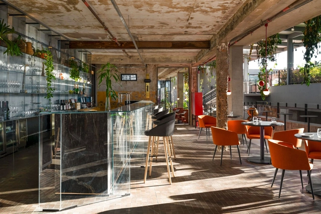
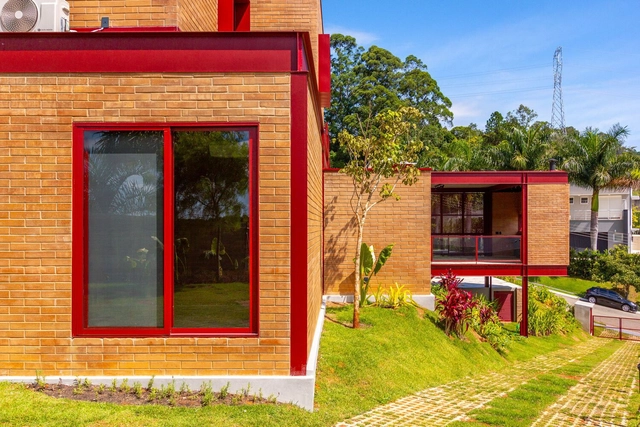
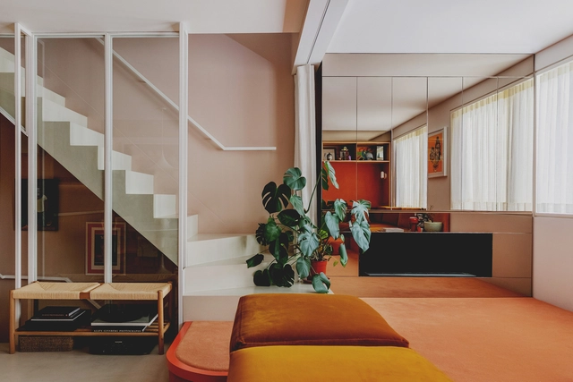
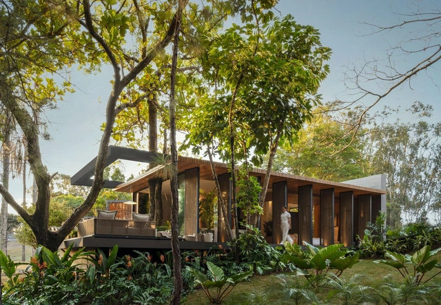
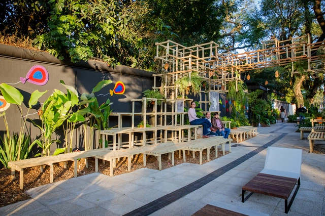
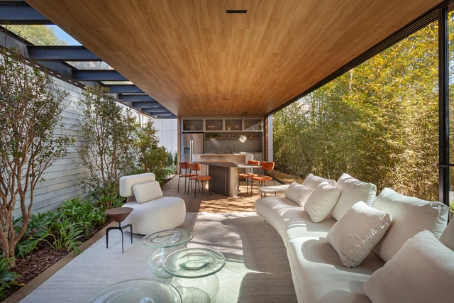
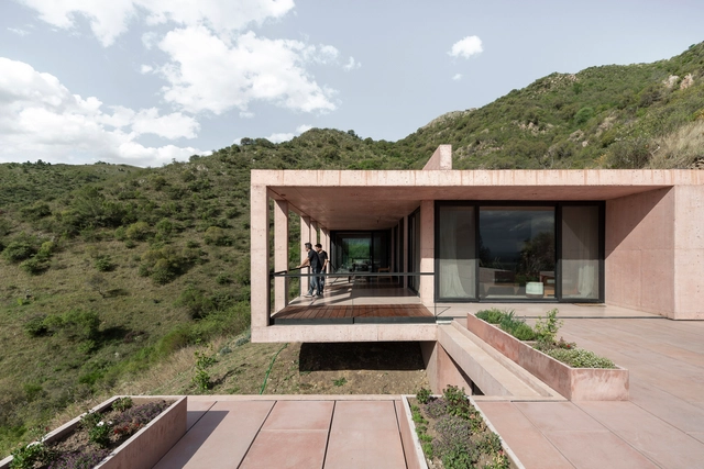
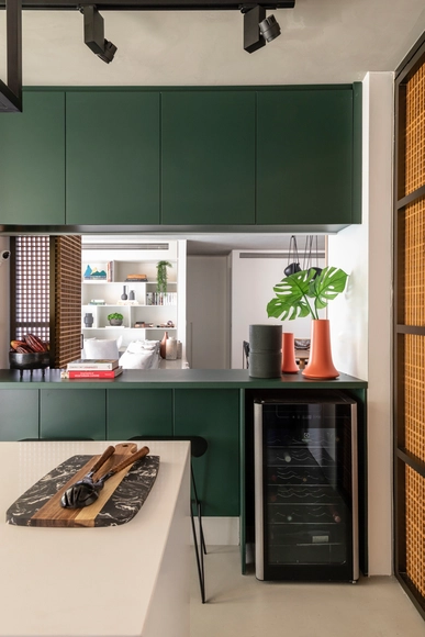
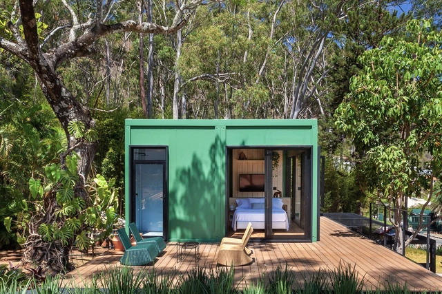
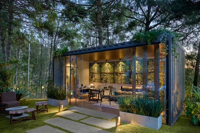
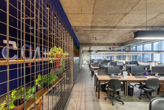
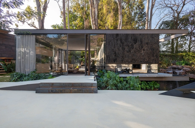
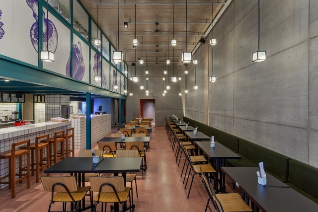
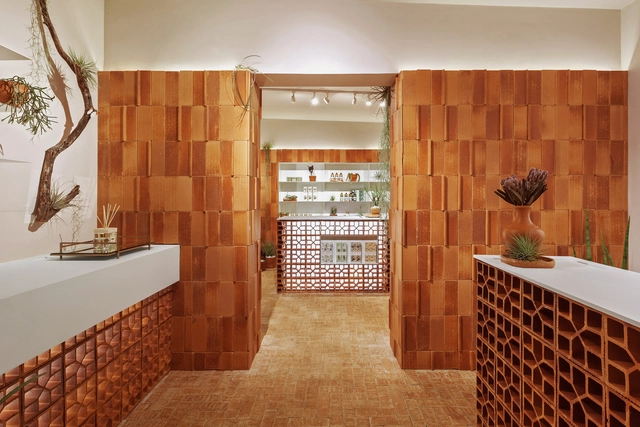
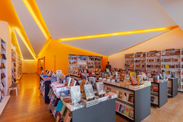
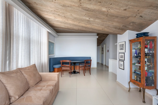
Although the use of color can be employed to hide or disguise a specific characteristic, it can also be used to highlight them. Within the Latin American territory, we can observe that shades of red, green, and blue have predominated in residential architecture, aiming to integrate a language appropriate to the context in which it is implemented.
Despite the initially slow and arduous process of molding glass into shape, mankind has used the material for thousands of years. According to archaeological evidence, the first human-made glass tools and jewelry were found in Eastern Mesopotamia and Egypt around 3500BC — and after the invention of the blowpipe in Syria in the 1st century BC and the Western Industrial Revolution made mass production easier, the material's signature traits of transparency and durability could finally be applied on a large scale in architecture and design.
Fast forward to the present day, and the use of glass for building facades and windows is well documented. But what about once we move inside? By treating glass for different levels of transparency, cleverly positioning it within a room, or employing its reflective surface to their advantage, interiors can benefit just as much from the material as exteriors.
If the pavement of a sidewalk is a key element for the flow organization, the urban furniture chosen to compose the public space is responsible for the qualification of the place, creating more friendly spaces. Dumpsters, flowerbeds, signposts, benches, lighting, bike racks and so many others help transform a space that, despite being just a pass-through, is also the only public space in most cities.
How relevant is the use of color in architecture? Throughout history, we find various scenarios where color takes centre stage in its integration with the architectural work. Nowadays this is no exception. This is because colour is a medium that can be used to provoke deep and immediate emotions and reactions in the person observing. Because of this, colour plays an important role in the architectural reading, as it has the power to clarify the components that make it up or, on the contrary, to change the perception of the work or space.
The following list shows various Latin American housing projects that have had a particular approach to color in their composition. In them, we see the conception of color as the integrator of the work, or as a means of enhancing a particular element, be it interior or exterior.
Although they are not considered long-stay areas in a home, kitchens and bathrooms are spaces where functionality is essential for the daily lives of residents and visitors. Of all the elements in wet areas, the ones that need special attention are the worktops. In this text we will point out some tips for designing functional wet area countertops, easy to maintain and appropriate for their uses.