-
Architects: Dominique Coulon & associés
- Area: 2500 m²
- Year: 2025
-
Professionals: Copreste, DB Silence, E3 Économie, BET Gilbert Jost, Batiserf Ingénierie, +1


In 1968, the furniture designer and RCA professor David Pye published The Nature and Art of Workmanship, a book built around a distinction between "workmanship of risk" and the "workmanship of certainty." Pye was not writing about architecture, and despite how the phrase gets used today, he was not really writing about hands versus machines either. He pointed out that a printing press, entirely mechanical, still depends on someone judging the ink and the register, while a woodturner working a lathe by hand can follow a template closely enough that almost nothing is left to chance.
Workmanship of risk, in Pye's definition, is any process where the outcome is not fixed in advance but depends on the judgment, dexterity, and attention the maker exercises while the work is still underway. Workmanship of certainty is the opposite condition, as the result is settled before production begins, locked into a jig, a mold, or a program, so that everything downstream is execution. Pye was careful to note that neither mode is inherently superior and that a numerically controlled machine, calibrated to leave room for drift, can sit closer to risk than a hand tool run to a fixed template.


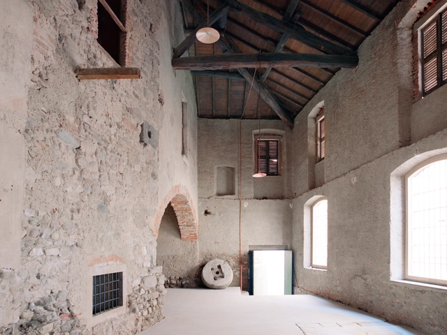
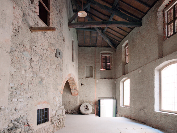
Adaptive reuse is shifting from simple preservation to active revitalization, a process of structurally rescuing and reprogramming architectural typologies whose original functions are no longer relevant. The obsolescence of architectural spaces occurs for varied reasons: sociological shifts, leaving spaces uninhabited; technological advances, phasing out specific machinery; and economic changes, making centralized functions necessary. The strategy of repurposing focuses on achieving spatial and functional longevity through minimal interventions, allowing the original structure to serve as the memory anchor of the project.
This wave of adaptive reuse treats the historic shell as a limited resource, prioritizing structural permanence over surface aesthetics. Designers are engaging in a sort of archaeological process by exposing the original structural essence: the heavy timber, raw concrete, or monumental masonry. Interventions are confined to meeting new programmatic needs, often appearing as an independent insertion within the ancient envelope. This contrast redefines the building's lifespan not as a singular narrative but as a layered story of continuous events.
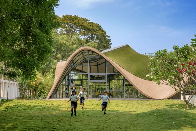
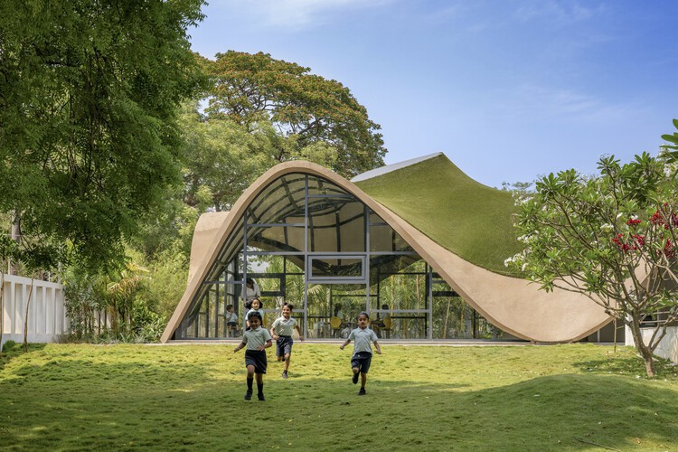
Kindergarten architecture has long stood apart as a realm where design and imagination converge. Unlike most building typologies, these spaces are conceived not only to shelter and function but to shape the earliest experiences of curiosity, play, and social interaction. Throughout history, the design of kindergartens has evolved alongside pedagogical shifts, moving from modest, utilitarian beginnings to highly intentional environments that stimulate both learning and wonder. In this context, architecture becomes more than a backdrop — it becomes a silent educator, capable of nurturing emotional, cognitive, and physical development.
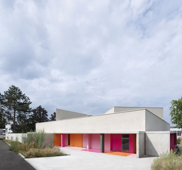
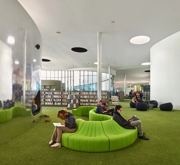
The modern world is disconnected. Online interactions dominate the daily lives of people across the world. This shift is not just a result of the rise of the internet, but also a stark reflection of the decline of public spaces, particularly third places. Third places, once essential for promoting community and social cohesion, have evolved drastically over the past few decades. In today's commercialized landscape, third places face plenty of demands from users and designers alike, calling for a need to reconsider their accessibility and purpose.
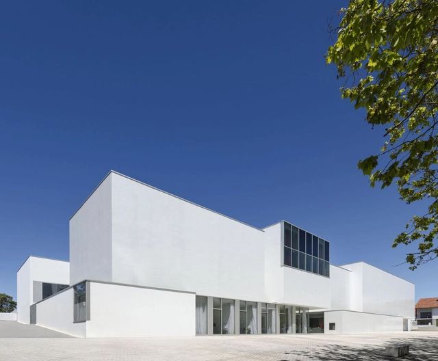
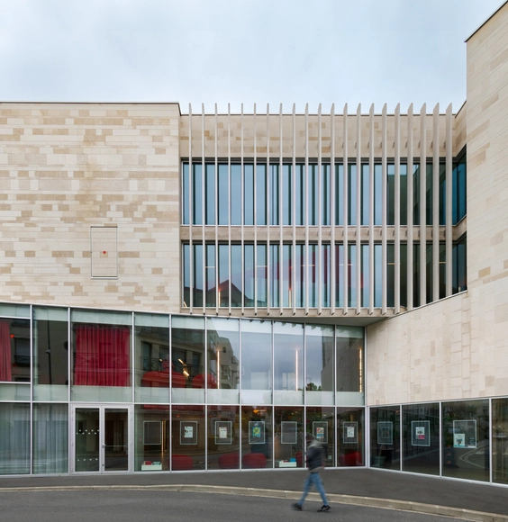
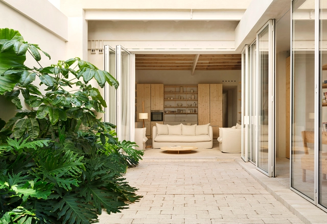
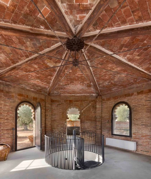
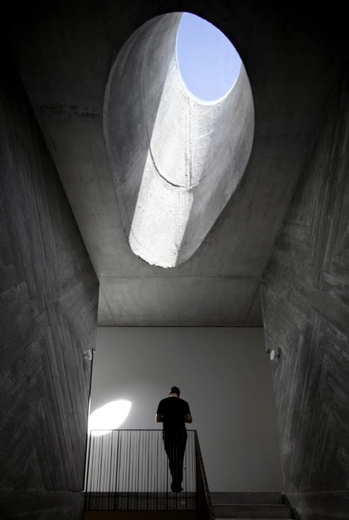
For most people, modern living requires spending most of the day in interior spaces - in fact, according to a report by the Environmental Protection Agency, the average person spends around 90% of their life indoors. As a result, this implies missing out on health benefits associated with sunlight exposure, such as vitamin D absorption, regulation of circadian rhythms, higher energy levels and even improved mood. Thus, one option is to increase the amount of time we spend outdoors. But because most daily functions are carried out inside buildings, it is crucial to incorporate and prioritize natural lighting in interiors.
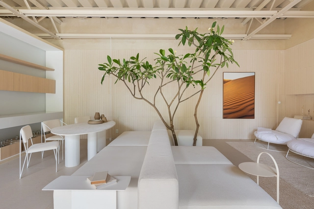
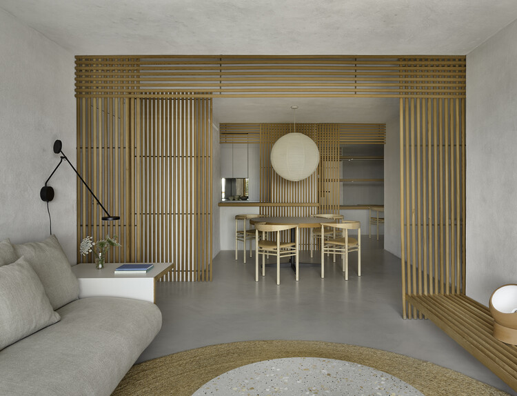
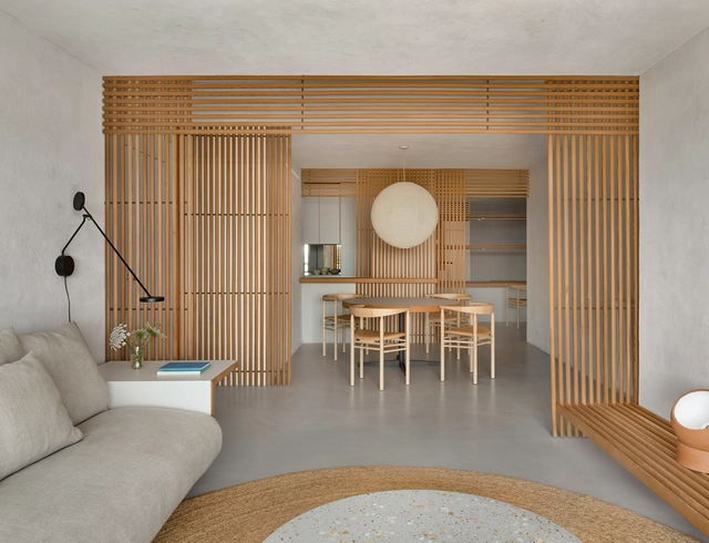
The history of 'neutral colors' is a fascinating journey through the evolution of human aesthetics and design sensibilities. Closely related to the makeup of materials organically found in nature, the color chorus of whites, grays, and earthy brown tones has played a pivotal role in artistic expression, fashion, interior design, and architecture for millenia. From the understated hues of early clay, straw, wood, or brick architectural structures to the now prevalent contemporary interior style, neutral colors have transcended cultural boundaries and continue to hold a special place in our visual landscape – offering a sophisticated elegance and versatility that has stood the test of time.
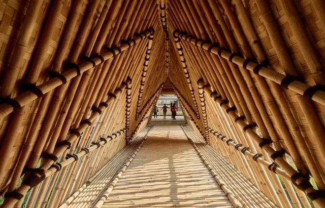
For architects, schools are often complex structures to design. They must provide a variety of spaces for education, and also consider sports and recreational activities. But beyond its size or surface, the greatest challenge is to design an area that fosters a positive pedagogical environment for children. Below, a selection of +70 school projects with their drawings to inspire your proposals for learning campuses.