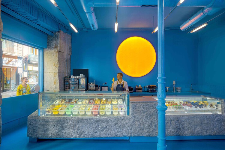
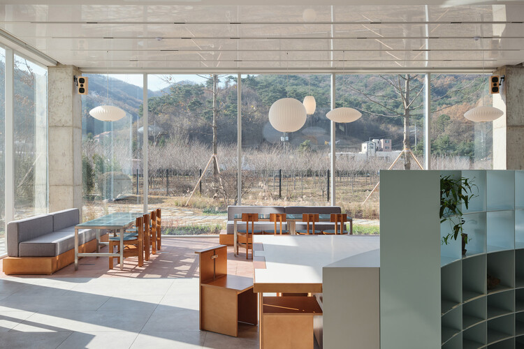
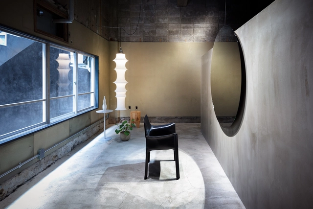
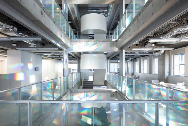
"Coffee or tea?" is one of those phrases that follows you across contexts: asked on airplanes, after a meal, in hotel lounges, and in meeting rooms. It sounds like a small question—mere preference, a quick fork in the service script. Yet it also carries a quiet cultural inheritance. Tea arrives with the long history of ritual and domestic pacing, tied to older geographies of trade and everyday etiquette. Coffee arrives with a different lineage of circulation, later industrialized into the modern café and its public-facing rituals. In both cases, the drink is never only a drink; it is a practiced relationship to time and space.
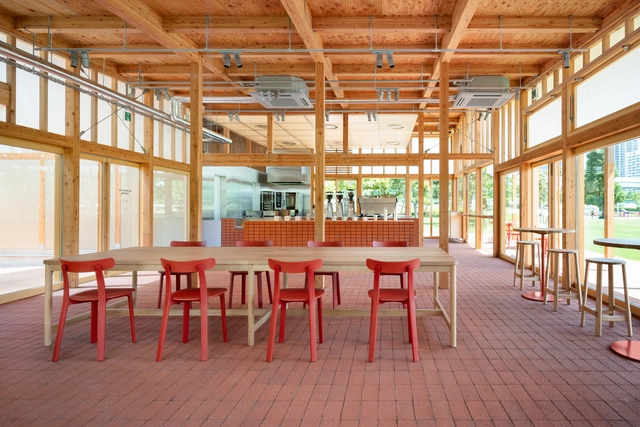
In contemporary East Asia, however, "coffee or tea" increasingly reads as something else: imperceptibly or subconsciously, it is becoming more of a choice about where you want to be. Each beverage now carries a spatial expectation. Coffee implies a room you can occupy—often a place to pause, work, meet, or cool down. Tea, despite being culturally pervasive, appears more diffusely across the city—sometimes as a dedicated destination, sometimes as a high-frequency kiosk, and very often as an embedded default within dining typologies. The result is that a question posed as taste has begun to operate as a subtle indicator of spatial preference: whether you are seeking duration or velocity, enclosure or flow, a third place or a quick node on the street.
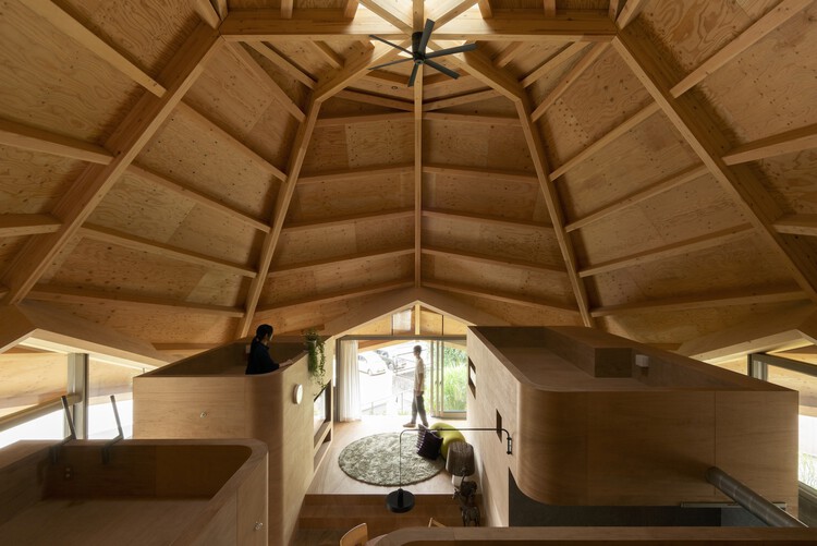
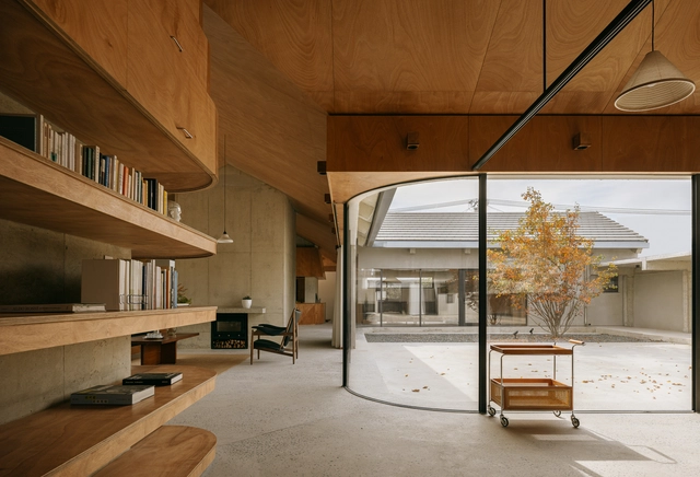
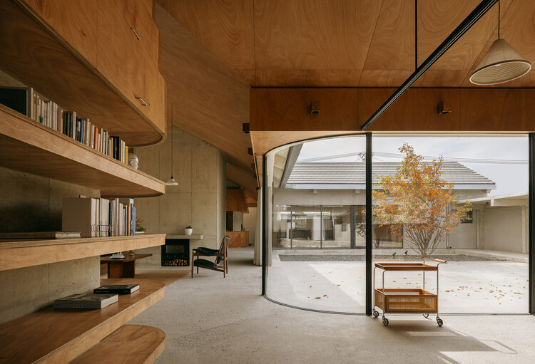
Contemporary Japanese architecture continues to demonstrate how to adapt the evolving needs of modern residents to a rich building tradition and artisanal legacy. Wood has always been the soul of Japanese architecture. In many recent residential projects, this material transcends its structural role to become the primary finish for various surfaces — ranging from floors and ceilings to furniture and architectural elements. These environments strike a delicate balance between elegance and coziness.
The use of natural, unpainted finishes highlights the material's inherent honesty while also celebrating the unique character of each piece, its natural grain, and the diversity of the overall composition. While some houses feature sober, dark-stained timbers to create a grounded atmosphere, others utilize lighter woods like pine to foster a bright, airy, and ethereal feel. This versatility proves that wood can adapt to any aesthetic, from the rustic to the ultra-minimalist.
The pursuit of stronger, lighter, and more durable materials has guided architecture long before polymers or carbon fibers existed. One of the earliest large-scale examples of composite materials can be found in the Great Wall of China, where stone, clay bricks, and organic fibers such as reeds and willow branches were blended to create a resilient and lasting structure. These early techniques reveal a timeless intuition: distinct materials, when combined thoughtfully, produce properties unattainable by any single element. As the construction sector faces urgent ecological pressures, this intuition is being revisited through the lens of sustainability, with architects and engineers exploring bio-based, recycled, and hybrid composites designed not only for performance but also for circularity and environmental responsibility.
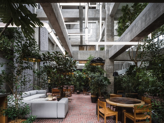
There is not enough that can be said about the benefits of incorporating plants in interiors or Plantscaping. Integrating vegetation indoors serves many purposes, whether practical, aesthetic, or psychological. Although there are basic requirements for incorporating greenery into Homes, well-thought-out plant selections and placements are characteristically different across the world. By going over recent interior works, a few recurrent plantscaping design patterns arose, each reflective of distinctive climates, building styles, and traditional building techniques.
While the type of the chosen plants varies depending on favorable conditions for growth and local availability, the main distinctions are related to the direct environment and display method in which the vegetation is set, as well as its intended purpose. While plants are there to offer mental wellness to some, they are essential for cooling to others, or could even be meant for small-scale farming.
Chimneys are among the most quietly persistent elements in architectural history. Yet their presence persists in nearly every cultural and climatic context, serving as a technical feature and a spatial, atmospheric, and symbolic device. It populates dense city skylines and anchors rural horizons alike, its vertical silhouette as ordinary as a window or a doorframe. This apparent ordinariness is deceptive. The chimney is one of the few architectural components that links the intimate scale of interior life with the expansive forces of the environment. For architects and designers, the necessity of the chimney presents a choice: to let it recede quietly into the building's functional fabric or to amplify it as a central, expressive element that shapes a project's identity.
Interior design has been characterized by infinite alternatives in coatings, finishes, and furniture to achieve unique and unrepeatable spaces. Designers are constantly coming up with innovative solutions and materials specifically created for a distinctive spatial perception. However, there is also a trend that seeks the warmth of the interior spaces by exposing the raw building materials as they are. The richness of materials such as wood and concrete gives that feeling of durability and low maintenance that, combined with an attention-to-detail design, makes spaces look warm yet stay true in essence. See below for 35 examples of interior spaces where concrete and wood appear in their almost purest state.
When creating exhibition spaces, the design of the experience, the proposed route, and the transmission of certain perceptions and senses contribute to establishing different bonds and connections between the displayed objects and their visitors. Understanding a showroom as a space designed to creatively and experientially showcase products and services, what design strategies could enhance users’ interior experiences? How does interior design engage in dialogue with exhibition architecture?
In my 2008 interview with Kengo Kuma in Manhattan—the Tokyo-based architect was in town for a lecture at Cooper Union and to oversee the construction of a house renovation in nearby Connecticut— he summarized the intention of his work for me, "The closest image to the kind of architecture I try to achieve is a rainbow." The architect designs his buildings as a chef would prepare a salad or a florist arrange a bouquet of flowers—by carefully selecting ingredients according to their size, shape, and texture. He then tests whether they should touch, overlap, or keep a distance to let the airflow pass through. The process is closer to a trial-and-error scientific experiment rather than an artistic exercise in projecting visionary forms and images. Although his buildings surely look strikingly artistic and utterly breathtaking. They are both precise and loose, primitive and refined, material and transient. The architect's fascination with materiality is startling, and despite having completed many dozens of buildings all over the world over the course of his distinctive career, in our conversation last month over Zoom, Kuma told me, "I stand at the beginning of a long process of material exploration."
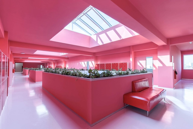
In recent years, pink has evolved beyond its traditional associations to become a sophisticated and versatile element in architecture and interior design. Defined by a broad spectrum of shades, pink encompasses both warm and cool tones, ranging from pure red tints (R) to blends with yellow (Y80R, Y90R) or blue (R10B, R20B, R30B), as classified by the Natural Color System (NCS). While difficult to define by a single shade, this color balances vibrancy and softness, making it adaptable across different materials and contexts. As pink continues to gain prominence in contemporary interiors, its role extends beyond being a mere color choice—it is a design strategy. The recent transition from the bold, playful pinks of the "Barbiecore" trend to softer, powdery hues seen in fashion and design in 2025 fashion collections, highlights the color's adaptability. Its presence in Pantone's 2025 color palettes, also reinforces its appeal across disciplines. When applied thoughtfully, pink can transform spaces, making them feel inviting, expansive, or timeless.