-
Architects: Ruhaus Studio
- Area: 177 m²
- Year: 2026

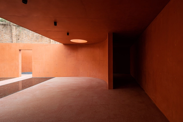
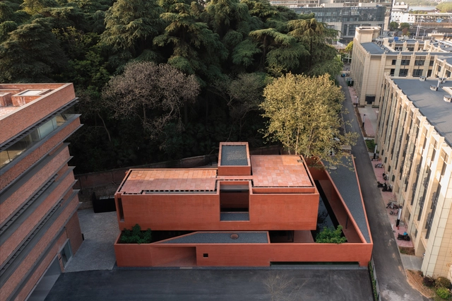
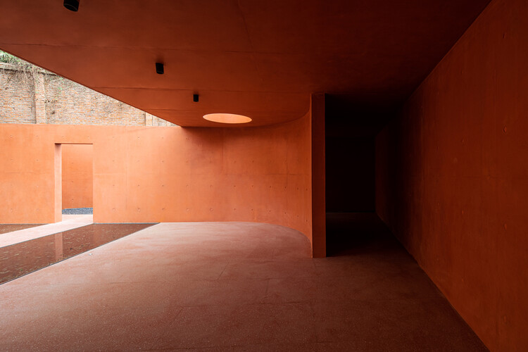
Concrete is often seen as the material of modernity, defined by its structural strength, raw finish, and unmistakable gray tone. It became the default palette of 20th-century architecture, a symbol of functionality and permanence. Yet, concrete is not bound to this chromatic identity. Its color is a byproduct of the cement, aggregates, and chemical composition used in its mix, and it can be intentionally altered through pigmentation. Among the many hues explored, red stands out — not only for its visual intensity, but for its ability to root buildings in place, evoke cultural references, and imbue architecture with a material presence that feels both elemental and expressive.
Pigmenting concrete involves the addition of mineral-based colorants — usually iron oxides — during the mixing process. Unlike paints or coatings applied to the surface, these pigments are integrated directly into the concrete mass, ensuring the color permeates the material and remains stable over time. Red pigments in particular are often derived from iron oxide (Fe₂O₃), a naturally occurring compound found in clay, hematite, and other iron-rich minerals. Their deep, earthy hue connects contemporary construction with ancient techniques — from Roman pozzolana mortars to the red earth buildings of West Africa and South America.
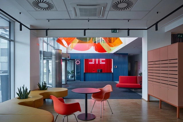
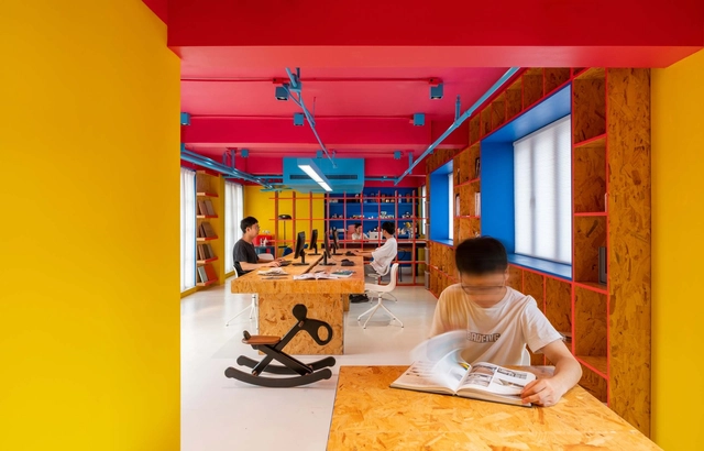
When a brief to design a new office space asks for something fresh, energetic, and modern – a space where employees enjoy being and, crucially, enjoy working in, which helps them to focus on individual tasks but also to relax, collaborate, and create – there are few better places to begin than a color wheel. As the world of work and the varied environments it takes place in become less formal and restricted in their design, architects, designers, and, more importantly, their clients are handing the boring, monotone office its redundancy papers and looking outside the establishment at more expressive colorful options.
While blue’s ability to improve concentration, stimulate thinking, and provide mental clarity helps to increase productivity, the human body needs regular periods of rest and relaxation, too. For this, warm colors like yellows provide relaxation through warmth and comfort – perfect for break-out areas. Meanwhile, reds and oranges promote creativity and expression, meaning they can be useful for areas designated for social collaboration, whilst green encourages a calmer, more balanced approach, for a different kind of meeting.