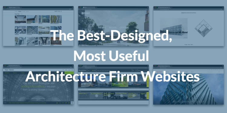
These Are the Best-Designed, Most Useful Architecture Firm Websites

Our editors look at hundreds of websites per week. What do they admire and appreciate the most? Organization and simplicity. Sites that are not only clean, but fast. We actively search for projects to include on our platform, so it’s crucial that when we visit a website we not only know where to look, but how to access information. Filters and facets are our best friends. Typological differentiation is important, but perhaps not as important as distinguishing between built and un-built projects (“Is that a render?” is a question that comes up at least once a day).

On our own website, ArchDaily has worked very hard towards organizing the tremendous database of projects we’ve amassed over the past 8 years. In 2015 we revamped our platform to make searching much more efficient. If you haven’t tried it yet, our projects search functionality allows you to filter by architect, year, country and project type. Need to find office buildings built in 2011 in Spain? We’ve got you covered.

If you’ve ever published on ArchDaily, we therefore serve as a pretty decent site alternative ;). But if you do choose to set up your own website, we’ve selected a list of 18 firms whose lead you might be able to follow, and provided some pointers on things you should avoid.

1. Gluck +

GLUCK+

Their website is clear and easy to navigate, and they provide really great instructional, informative videos and interactives on different aspects of their design-build process. The website also offers a choice between viewing projects as thumbnails, a list, or large images.

2. Olson Kundig

Olson Kundig

The video on their landing page is a nice touch, not just showing their projects as specific constructions but giving an impression of what it’s like to be there. It’s a very sensitive interpretation of the interaction between material and people.

3. John Pawson

John Pawson

Well known for ''minimalism and purity'' in their projects, their website reflects their work as architects. “Less is more.”

4. MMBB

MMBB

This is what getting straight to the point looks like. MMBB's website opens not with an artistic landing page, but with an extensive array of projects immediately laid out before the viewer, accompanied by a series of filters to narrow down your search.

5. SOM

SOM

SOM's website has a lot of information, and is thus an exercise in best practice so that the excess of information doesn't become a problem. It has several filters for searching (location, markets, services, date, alphabetical), and when you enter into a project, it has all the information (data sheet, news, description, and so on).

6. Foster + Partners

Foster + Partners

Given the firm’s reputation for efficient and sophisticated design, it’s no surprise that Foster + Partner’s website is one of the easiest to navigate around. The menu is perfectly organized, and the huge number of projects and other information is presented in a way that is easy to comprehend.

7. Pattersons Associates

Pattersons

The layout of Pattersons Associates’ home page is very visual and simple, using just an image and the project name. But once you click on a project you see the biggest strength of the site; the format of the presentation is beautiful with large images and drawings, which can be viewed either by simply scrolling or in a well designed gallery.

8. El Equipo de Mazzanti

El Equipo Mazzanti

With big photos and a menu that sticks to the top of your browser window without being intrusive, the website of Colombian practice El Equipo de Mazzanti is very easy to use.

9. OFFICE Kersten Geers David Van Severen

OFFICE KGDVS

The projects of OFFICE Kersten Geers David Van Severen are presented using what is effectively two image galleries side-by-side, with one dedicated to photographs and one dedicated to drawings. In this way, the practice ensures that they are always showing the substance behind their designs and not just the eye-candy offered by photographs.

10. 6a architects

6a architects

6a architects’ website is clearly visual-first, with text only appearing when absolutely necessary—for example when hovering over an image. The effect of this is a clean, minimal site with plenty of visual interest.

11. Bunker Arquitectura

BNKR

With its combination of a well-designed menu in the top right and large-format, plentiful slideshows and galleries throughout, Bunker Arquitectura's website offers a great balance between usability and visual impact. A nice touch is the section of the menu prominently dedicated to their "Bunkertoons," giving a glimpse into the practice's personality.

12. Rogers Stirk Harbour + Partners

Rogers Stirk Harbour & Partners

The best thing about RSH+P’s website: their project fact sheets are available in multiple languages! It’s not only useful but fun to browse. A good dose of simplicity and thorough information on projects.

13. EFFEKT

EFFEKT

This website is an excellent example of limiting choices to increase effectiveness. On the main page, you see a large, beautiful image accompanied by just three link options. It’s only once you get closer to what you want that more information is given, aided by some very slick menus and filters.

14. FXFOWLE

FXFOWLE

The homepage of the FXFOWLE website is flashy, with a captivating 3D scrolling effect. But importantly, they also know when to drop the fancy effects, as the pages on their website that contain more information are simply organized with detailed submenus and filters.

The Jury's Out

Many of the firms already listed above are large international operations—big practices, unsurprisingly, are more likely and able to invest in their online presence. But in addition to these exemplar designs, there are many that are more polarizing; websites that, while technically flawed in some obvious ways, have designs that some people can't resist. Interestingly, these also usually belong to large, internationally renowned firms, who have a strong enough profile to break the rules and make a statement with their web presence.

1. OMA

OMA

The layout of OMA’s webpage really isn’t the easiest to use, with densely packed information throughout. With the amount of information included in the website though, this is somewhat understandable, and a variety of filters and other techniques are on offer to help you process things, with varying success. A nice touch, though, is how they display recent Instagram images from their built projects using the location's geotag. It's refreshing to see a firm give that much presence to the way people are actually using their buildings.

2. BIG

BIG

You either love it or hate. Either way, the personality of BIG shines through, simultaneously making it so good (and, on the other hand, so hard to use).

3. Diller Scofidio + Renfro

DS+R NY

DS+R’s project presentation looks great and has some convenient filters to help you search through their large number of projects. However, loading times may vary.

4. Herzog & de Meuron

Herzog & de Mueron

After waiting until 2011 (yes, 2011, seriously) before launching a website at all, Herzog & de Meuron decided to keep it old-school with a website design that clearly references early-1990s digital technology. The stark, text-based browsing system and succession of pop-up windows are certainly unique and interesting, but is your website really the place to make such a conceptual statement?

Things to Avoid

Finally, if there’s one thing our editors know more about than what makes a good website, it’s what makes a bad website. It’s often said that bad design is much more noticeable than good design, and that’s certainly true when all you want is an email address or the completion date of a project and can’t find it. Now, you may notice that some of our “best-practice” examples above occasionally make use of the techniques to avoid below--the important thing is that breaking the rules is ok in moderation, and while doing one of the things below for creative may be ok, multiple infringements start to become frustrating. So without further ado, here are a few things we truly hate to see in websites:

  • Flash.
  • If your site loads slowly, it means it’s broken.
  • Sites where the navigation menus aren’t clearly worded, so it’s not clear where you need to go.
  • Sites that look busy, have densely packed information, or too much information.
  • On the other hand, sites that lack basic information such as completion dates or locations.
  • Sites with poor quality or pixelated images.
  • Slideshows with no gallery preview.
  • Slideshows and other objects in popups.
  • When designs attempt to be too creative and you have to guess where to click.
  • An “Intro” Button. So 90s.
  • Fonts like Century Gothic on a black background. It’s too thin.
  • And finally, websites that put personality before work. We’re sure you’re a lovely person (or group of people). But social media is for personalities; your own website should focus on what you do.

About this author
Cite: AD Editorial Team. "These Are the Best-Designed, Most Useful Architecture Firm Websites" 12 Sep 2016. ArchDaily. Accessed . <https://www.archdaily.com/795078/these-are-the-best-designed-most-useful-architecture-firm-websites> ISSN 0719-8884

设计最精良最有用的建筑公司网站

You've started following your first account!

Did you know?

You'll now receive updates based on what you follow! Personalize your stream and start following your favorite authors, offices and users.