
Fantastic Frank Stockholm Showroom / ASKA


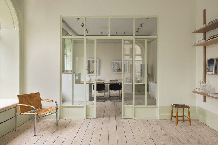
https://www.archdaily.com/1042878/fantastic-frank-stockholm-showroom-askaNina Vuga
Villa JJ / Metropolis Arkitekter


https://www.archdaily.com/1010893/villa-jj-metropolis-arkitekterPaula Pintos
Pastel Colors in Architecture and Their Lasting, Calming Appeal
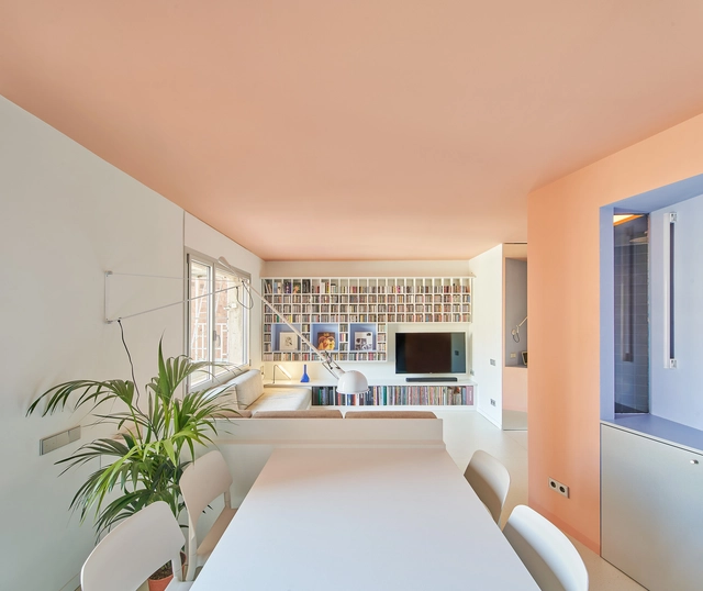
With a high proportion of white mixed with a small amount of colorful pigments, pastel colors provide a range of pale, subdued tones. Related to soothing and calming environments, these colors have a timeless quality and can be seen throughout different architectural styles, such as rococo, art déco or the mid-century modern years. Applied in exteriors, interiors, or both, pastel tones make rooms feel more light, airy and spacious.
From subtle accents to taking the spotlight in a project’s overall strategy, pastel colors are a versatile alternative that can be used in multiple ways and varying degrees. Following Ricardo Bofill’s color proposals, Paulo Mendes da Rocha’s interiors and Michael Graves’ buildings, contemporary architecture plays with soft colors for aesthetic and functional purposes, as well as providing a sensory experience. Analyzing different examples of their application in architecture and design, we showcase how four prevailing colors –mint green, pale pink, lemon yellow and light blue– are currently taking the stage.


https://www.archdaily.com/999215/pastel-colors-in-architecture-and-their-lasting-calming-appealCamila Prieto


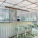
AkzoNobel selects "Wild Wonder" as the Color of the Year 2023, Inspired by Nature and Harvested Crops
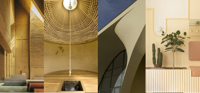
Inspired by the warm tones of harvested crops, Wild Wonder was selected as Color of the Year 2023 by AkzoNobel. Extensive research conducted by AkzoNobel, including color experts and international design professionals, identified the "Wonders of the Natural" swatch at the heart of global social and design. This trend is inspired by nature as people are re-evaluating their relationship with the environment as the source of everything in their lives. # d0c599, or pale yellow/ olive green, captures the moment's mood and conveys serenity and positivity after these recent years of uncertainty and despair.



https://www.archdaily.com/989353/akzonobel-selects-wild-wonder-as-the-color-of-the-year-2023-inspired-by-nature-and-harvested-cropsPaula Cano
Interior Design Aesthetics: 22 Projects that Explore Trending Interior Styles
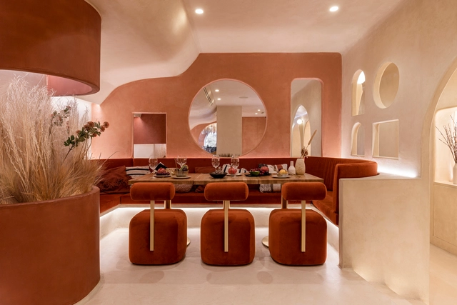
"The details are not the details. They make the design." – Charles Eames. Creating attractive spaces that anticipate the needs of users relies on several factors: scale, circulation, functionality, and comfort. However, the past few decades have proved that the visual appeal of a project is also greatly important, and can make or break the interior space. In this interior focus, we will explore the aesthetic side of interior design, looking at popular styles across the world and how architects and designers use elements such as color, furniture, accessories, and finishes to define their spatial identity.


https://www.archdaily.com/982222/interior-design-aesthetics-22-projects-that-explore-trending-interior-stylesDima Stouhi
MBS Beauty Clinic / ASKA


https://www.archdaily.com/976353/mbs-beauty-clinic-askaPaula Pintos
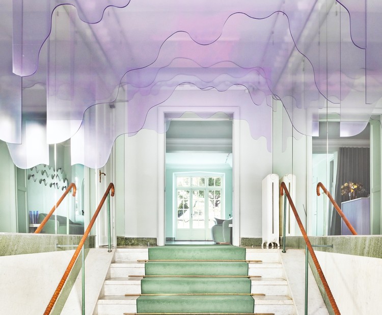
Maria Nila Head Office / ASKA


https://www.archdaily.com/963016/maria-nila-head-office-askaValeria Silva