Islands are an essential part of any larger kitchen layout, increasing counter space, storage space, and eating space as well as offering a visual focal point for the kitchen area. Serving a variety of functions, they can be designed in a variety of different ways, with some incorporating stools or chairs, sinks, drawers, or even dishwashers and microwaves. To determine which elements to include and how to arrange them, designers must determine the main purpose or focus of the island. Will it primarily serve as a breakfast bar, a space to entertain guests, an extension of the kitchen, or as something else? And with this function in mind, how should it enhance the kitchen workflow vis-à-vis the rest of the area? These considerations, combined with basic accessibility requirements, necessitate that the design of the island be carefully thought out. Below, we enumerate some of the essential factors of kitchen island design.
Just as the colors of an abstract painting or photograph can produce a certain mood, so can the colors of a building or room profoundly influence how the people using it feel. Physiologically, study after study has shown that blue light slows the production of melatonin, keeping people more alert or awake even at night. Psychologically, people associate certain colors with certain feelings due to cultural symbols and lived experiences – for example, they might perceive the color red as menacing or frightening because of its connection to blood.
Altogether, the way a room is colored can have complex effects on how its users feel, while a façade can be perceived in dramatically different ways depending on how it is colored. Below, we summarize the emotional associations of every color, assessing their differing effects as each is used in architectural space.
https://www.archdaily.com/930266/how-color-affects-architectureLilly Cao
Stephanie & Kevin / Atelier Vens Vanbelle. Image Courtesy of Atelier Vens Vanbelle
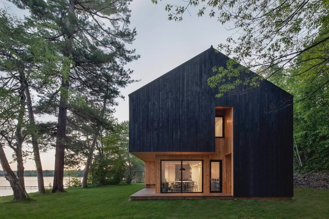
On December 9, Pantone announced its color(s) of the year for 2021: PANTONE 17-5104 Ultimate Gray and PANTONE 13-0647 Illuminating. Selecting two colors for only the second time in 22 years, Pantone described the chosen yellow and gray as independent but complementary, representing a theme of unity and mutual support. Whereas PANTONE 13-0647 Illuminating is bright and vivacious, PANTONE 17-5104 Ultimate Gray is firm and dependable, the marriage of which represents strength, optimism, and fortitude following a markedly challenging year. In architecture, this palette combining playfulness and solemnity has been used in social spaces, domestic spaces, care spaces, and more to communicate similar themes of resilience and positivity.
Below are 14 examples of projects using Pantone’s 2021 colors of the year.
https://www.archdaily.com/953768/pantones-color-of-the-year-2021-yellow-and-grey-in-architectureLilly Cao
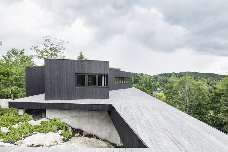
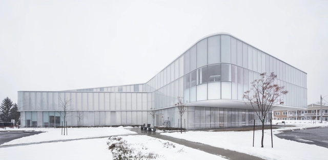
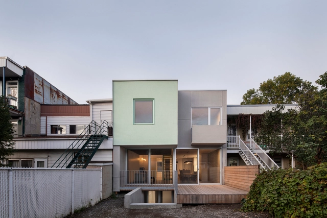
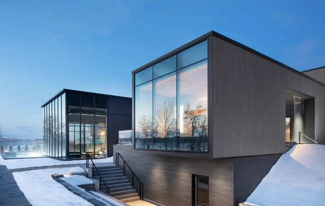
Few cities combine architecture and culture like Montréal. Canada’s second largest metropolis, the City of Saints has become a leading center for design, technology, and international events. With close ties to its natural context, the island city was named after the triple-peaked hill located at its heart, Mount Royal. Today, contemporary designs continue to emerge, new structures that are transforming the cityscape and its urban fabric.
The incorporation of the human figure is one of the most effective tools used in architectural photography: it helps the viewer decipher the scale of work and assess its amplitude. While it successfully communicates a rough idea of the measurements of the elements in the picture, it also helps architecture become more relatable and accessible. People engage better with the built environment when it is populated, mainly because the human sense of society and community is the cornerstone of our civilization. With this in mind, we are showcasing a selection of our favorite photographs where the human figure takes center stage, enhancing our reading of architecture.
A monochrome environment is a space in which most architectural elements are of a single color. Although it is common for architects to design black or white monochromatic spaces due to its neutrality, it is possible to use almost any color to design a space, taking advantage of their infinite tones, undertones, and shades.
We spoke with Beat Guhl, CEO of Sky-Frame, during the Swiss Bau fair – one of the largest events in the materials industry. Sky-Frame produces frameless sliding window systems; vital components to achieve an effective and efficient transparency in architectural projects. The company is constantly pushing for technical innovation and works closely with architects to help achieve fluid spatial concepts.
Hospitals and projects related to healthcare must follow specific guidelines based on the rules and regulations of their country. These standards help us to design complex spaces, such as those located in areas of surgery, hospitalization, diagnostics, laboratories, and including areas and circulations that are clean, dirty, restricted or public, which create a properly functioning building.
There are a few spaces that we, as architects, can develop with great ease and freedom of design: waiting rooms, reception areas, and outdoor spaces. These are spaces where architects can express the character of the hospital. To jump-start you into this process, we have selected 43 projects that show us how creativity and quality of a space go hand-in-hand with functionality.


.jpg?1591644193&format=webp&width=230&height=230&crop=true)