Vakko Headquarters and Power Media Center / REX

By David Basulto — Filed under: Featured ,Institutional Architecture ,Selected , , , , , ,
 

Last year we presented you this interesting project by during its construction stage, where you could see how an unused structure was converted into the new headquarters for Vakko, integrated with a new complex structure. The project is now completed, and we can see the final result with photos by Iwan Baan and a complete set of drawings and diagrams courtesy of REX.

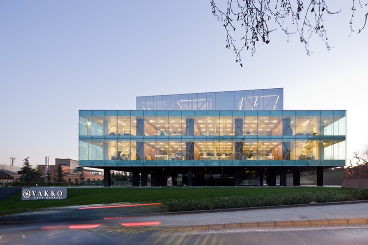
Despite the mix of the existing concrete structure with the new additions and the complex inner core (dubbed the “showcase”), the exterior of the building is read as a whole. The structural “X” of the panels on the facade break the monotony of the box on the outside, contrasting with the mirror like finish of the volume on top.

The “showcase” fills the central void with a mirror finish that turns the volume into a sculpture (as seen on the photos and on the showcase elevations below), while housing different programs that benefit from the arrange of the boxes, such as the auditorium, meeting rooms and showrooms.

once again shows innovative structural solutions in relation with the program, together with new uses of materials as we previously saw on the Wyly Theatre in Dallas.

After the break, the architect’s description:

Location: ,
Clientes: Vakko and Power Media
Architect: REX
Key personnel: Erez Ella, Tomas Janka, Mathias Madaus, David Menicovich, Tsuyoshi Nakamoto, Joshua Prince-Ramus, Ishtiaq Rafiuddin, Tieliu Wu
Consultants: ARTE, Autoban, Buro Statik, Cedetas, Dora, Eleksis, Front, Gurmen Muhendislik, Lamglass, Norm Tecnic, Say Yapi, STEP, Superpool, Cem Mimarlik
Area: 9,100 sqm (98,000 sqf)
Completion: 2010
Program: Headquarters for a Turkish fashion house—including offices, showrooms, conference rooms, auditorium, museum, and dining hall—as well as the television studios, radio production facilities, and screening rooms of its media sister-company
Photography: , Iwan Baan

©

When Caltech’s senior administration suddenly changed ’s design for the Annenberg Center for Information Science and Technology was canceled.

Two months later, the CEO of Vakko (’s pre-eminent fashion house) and Power Media (’s equivalent of MTV) approached with plans to design and construct a new headquarters by the year’s end using an unfinished, abandoned hotel. The requested timetable would normally have been absurd. However, the unfinished building fortuitously had the same plan dimension, floor-to-floor height, and servicing concept as the Annenberg Center’s “Ring” (the so-called “Sheep”).

Program distribution ©

By adapting the Construction Documents produced for the Annenberg Center to the abandoned concrete hotel skeleton, construction on the perimeter office block commenced only four days after Vakko/Power first approached . This adaptive re-use opened a six-week window during which the more unique portions of the program could be designed simultaneous to construction. Speed became the design’s most significant parameter.

Whereas the Annenberg Center’s Ring was a fragile, post-tensioned concrete structure which depended upon the robust, interior for support, Vakko/Power’s existing Ring is painfully over-designed, the byproduct of numerous, deadly earthquakes in .

The design problem is therefore reversed: Vakko/Power’s unique interior must remain detached so as not to disrupt the structural integrity and waterproofing of the in situ skeleton. Dubbed the “Showcase,” this unique interior houses the auditorium, showrooms, meeting rooms, and executive offices, as well as all vertical circulation and restrooms.

Meanwhile, the upper floor of the skeleton’s subterranean parking houses Power Media’s television and radio studios, which require acoustic damping and light control.

Showcase structure ©

only had two weeks to submit the mill order after starting the project. Therefore, a concept for the Showcase was developed that established the general shapes and quantities while still allowing the design to evolve significantly.

To this end, and its engineers devised boxes that could be assembled in myriad configurations while retaining the Showcase’s structural self-sufficiency.

Ultimately, program adjacencies and code/exiting requirements dictated the final stacking of the boxes.

The slopes of the auditorium, showrooms, and meeting rooms create a circulation path that winds from bottom to top of the Showcase.

The Showcase is clad in mirror-, creating a “Cabinet of Dr. Caligari” that both repeats and fractures the image of the occupant.

Creating an exceptional new headquarters was critical to maintaining Vakko/Power’s public image; yet, absorption of the clumsy, existing structure was impossible to hide given the time constraints. therefore proposed to make the façade as thin and immaterial as possible, such that the existing hotel skeleton is exposed, not hidden.

Facade calculation ©

By slumping a structural “X” into each pane, the ’s strength is increased, its need for perimeter mullions is eliminated, and its thickness is reduced.

The result is an ultra-thin sheath of that wraps the existing skeleton. This ethereal “Saran Wrap” subtly reveals the pre-existing concrete skeleton and suggests the Showcase behind.

Facade detail ©


Thumb up Thumb down 0

To my oppinion, this building is more attractive inside than outside… I like this kind of structure brainteaser.

 
# April 13, 2010 at 02:37
Thumb up Thumb down 0
vibenade says:

this is awesomely elegant! drooling~

 
# April 13, 2010 at 03:13
Thumb up Thumb down 0
ktanleysubrick says:

Wonderful using of glass and mirror make this building special. I havent seen something like this. Simply amazing building with abstract touch.

 
# April 13, 2010 at 06:32
Thumb up Thumb down 0
joninberlin says:

I’m pleasantly confunsed…

 
# April 13, 2010 at 07:08
Thumb up Thumb down 0
qqdre says:

i think they are trying to be oma-like and they are ending up being like a mix of libeskind with som…and this building is…very kitsch

 
# April 13, 2010 at 07:13
    Thumb up Thumb down 0
    dev says:

    rex is god..getting this kinda result in less than an year is just amazing..

     
    # April 13, 2010 at 07:24
    Thumb up Thumb down 0
    drewski says:

    Joshua Prince Ramus [Partner in charge at REX] actually worked for OMA in Rotterdam for several years after studying under Rem at the GSD. JPR was the founding partner of OMA New York. He later bought Rem out of his stock in the company and changed the name to REX. So, they are not trying to be like OMA…a lot of what REX is and does, is the processes of OMA taken a step further. Maybe you should do some research to understand this. Don’t give Libeskind or SOM that amount of credit, by saying what they do comes even close to the quality or sophistication of this project. Especially not Libeskind of all people…and this building is…very elegant, beautiful and quite ingenious in it’s solution that was accomplished in a year.

     
    # April 13, 2010 at 14:31
Thumb up Thumb down 0
joninberlin says:

@qqdre:

rex is a product of oma. he left oma to start his own office, taking most of the staff and projects with him.

i find it more ironic than kitschy – i’m quite sure there is a difference between the two words.

liebeskind mixed with som – thats a very interesting interperation.

 
# April 13, 2010 at 08:18
Thumb up Thumb down 0
ktanleysubrick says:

joninberlin has right. QQdre, You probably have seen http://www.archdaily.com/37736/dee-and-charles-wyly-theatre-rex-oma/. Maybe it’s not far from OMA, but still very inspiring/surprosing/fresh/original/confusing/contemporary/elegant…

I see NO Libeskind here. Can’t imagine why this could be his building. The same situation with this unique mix with SOM;)

 
# April 13, 2010 at 09:15
Thumb up Thumb down 0

There’s no Libeskind here.

It’s rational and elegant. It has an aesthetic which is derived from ideas and concepts which are based on sound reasoning.

Also, unlike SOM, the result is sexy.

 
# April 13, 2010 at 10:15
Thumb up Thumb down 0
Jason says:

Libeskind? Are you guys nuts?

 
# April 13, 2010 at 10:42
Thumb up Thumb down 0

Mustafa Alkan /breath>: Vakko Headquarters and Power Media Center / REX | ArchDaily http://bit.ly/cpJgTq

 
# April 13, 2010 at 10:52
Thumb up Thumb down 0

Vakko Headquarters and Power Media Center / REX – http://bit.ly/cgnp4R) I want this as my office: http://bit.ly/dc1VzS #architecture #design

 
# April 13, 2010 at 10:56
Thumb up Thumb down 0
Ryan says:

Thanks for saving this comment thread “Ornament and Crime”.

This building and REX’s work in general goes well beyond any discussion of style, so to say it is a combo of Libeskind and SOM is just absurd.

Their process never fails to create elegant solutions to the site and program at hand.

 
# April 13, 2010 at 10:57
Thumb up Thumb down -1
sandra says:

I do like the interiorspace with the mirrors and the facade looks owkay. But what bothers me is the huge amount of structure this building needs. It shows how irrational this building really is. Architecture is about combining concepts and spacial quality WITH logic structure and techniques.

greetz

 
# April 13, 2010 at 11:33
    Thumb up Thumb down -1
    sandra says:

    the pictures inside the boxes let the concept fall apart. almost No daylight – almost no view – to claustrophobic – so much structure around you – the “terraces” inside the boxes just makes it look so “function follows form”. If the concept would be to create quality office space you would NEVER end up with spaces like this. these spaces will be used as storage rooms…

     
    # April 14, 2010 at 03:31
Thumb up Thumb down 0
isla says:

this is so good, elegant but conceptual. In my opinion, all OMA good projects, are the ones that had been design with REX ceo Joshua Prince-Ramus, what an architect.

 
# April 13, 2010 at 11:42
Thumb up Thumb down 0
dados says:

that slumped glass is NICE

 
# April 13, 2010 at 12:46
Thumb up Thumb down 0
OPA says:

GREAT WORK!

vakko must be a fckn pretty rich company..

 
# April 13, 2010 at 14:28
Thumb up Thumb down 0
b says:

too overdone and complicated structure without any real reason for that. i’m surprised people are using the word elegant in describing this building. can you please explain what is particularly elegant here?

 
# April 13, 2010 at 16:27
    Thumb up Thumb down 0

    REX have worked with an existing structure designed for something completely different and then created a solution like the one you see here within a frankly ridiculous timeframe. That is an elegant solution.

    Did you even read the text or just look at the pretty pictures ?

     
    # April 13, 2010 at 20:30
Thumb up Thumb down 0
Miguel says:

Vakko Fashion Center por el despacho neoyorkino REX-Architecture http://tinyurl.com/y4gnwy2 en Istanbul

 
# April 13, 2010 at 17:01
Thumb up Thumb down +1
Lovin it! says:

Style?! Elegance? I can’t believe some of us are having a discussion about style in reference to REX. They are the anti-style. Libeskind? Give me a break. Any formal similarities are purely coincidental.

Yes, I think the building looks absolutely ridiculous. I also think it’s sexy as hell.

The tilting boxes in the courtyard make good programmatic use of what would have otherwise been a large void without sacrificing the spatial connections. Tilt the auditoriums and meeting rooms; makes perfect sense to me. What would some of you prefer instead? Some plants, a fountain, and a nice little walkway?

Yes, there’s a lot of structure, but look at all that glass. Judging from the pictures there seems to be good deal of transparency (the glass works well on the solid surfaces).

REX is hands-down THE most exciting architectural practice making buildings.

 
# April 13, 2010 at 19:33
    Thumb up Thumb down 0
    Lovin it! says:

    By the way, keep in mind that this scheme was based on re-using the existing concrete structure which you can see in the middle picture.

     
    # April 13, 2010 at 19:41
Thumb up Thumb down 0

a master piece created as it was been designed keeping in mind the existing structure.
architects must have found it deficult as well as interesting due to the existing frame work.thatz the way architecture goes…..
cheers guys….

 
# April 13, 2010 at 22:22
Thumb up Thumb down 0

esta más rico el Vakko HQ http://bit.ly/c3en7b

 
# April 13, 2010 at 22:57
Thumb up Thumb down 0
dino indra says:

Wooooww very nice! Building design by REX http://bit.ly/bbJpJQ via@NOTCOT #goodarchitecture

 
# April 13, 2010 at 23:59
Thumb up Thumb down 0
+++ says:

Nice, but the 5th image down shows people ducking down their heads to walk through???

 
# April 14, 2010 at 00:20
Thumb up Thumb down 0
sam says:

It is a remarkable demonstration of design prowess under unique circumstances; however a lot of the interiors and the mirror ‘showcase’ seems straight up gaudy and like it would get old really fast. Sweet use of of slump glass though.

 
# April 14, 2010 at 00:25
Thumb up Thumb down 0
qqdre says:

elegant?
what is elegante here
over structured
being ex oma doesnt make you koolhaas
mr ramus is not kolhaas and rex is not oma
he should develop his style
and the theather was designed by oma
that he took it up and rip it off is other thing this building is not even close to being good
you are all brainwashed by the media
everytime somebody puts ex oma this ex oma that you all start drooling over nothing
spatially this building have nothing interesting and the use of glass is totally kitsch
a mimic of good architecture
shape without content of thought
just lame

 
# April 14, 2010 at 06:16
    Thumb up Thumb down 0
    franklin says:

    you should read the architectural elements more…

     
    # April 15, 2010 at 01:03
Thumb up Thumb down 0

Vakko Headquarters and Power Media Center. http://bit.ly/aUZ0l6

 
# April 14, 2010 at 08:31
Thumb up Thumb down 0
miesosoup says:

this is the sweetest project i’ve seen in months, maybe more!

 
# April 14, 2010 at 18:18
Thumb up Thumb down 0
franklin says:

someone said something about “the 5th image down shows people ducking their heads to walk through”
It’s almost like the box wants to be noticed.. lol (going along with concept pretty well)

very funny

 
# April 15, 2010 at 01:07
Thumb up Thumb down 0

Wie es wohl ist in diesem stylischen Gebäude in #Istanbul zu arbeiten http://bit.ly/a7bZa3

 
# April 15, 2010 at 07:25
Thumb up Thumb down 0
VinceD says:

Admire the design process and execution,but it seems REX quite keen on repeating the stacking strategy same as in their kentucky and seattle project,,ignoring some formal issues.

 
# April 15, 2010 at 21:18
Thumb up Thumb down 0
yucki says:

I do like this building. It increases a perfect atmosphere for people inside.

 
# April 17, 2010 at 10:00
Thumb up Thumb down 0
Andrew Carr says:

Nothing could justify that structure for me. Didn’t read the text, don’t need to.

 
# April 21, 2010 at 10:34
Thumb up Thumb down 0
Steve says:

Reading: "Vakko Headquarters"( http://twitthis.com/t4mdgz )

 
# April 22, 2010 at 21:37
Thumb up Thumb down 0

=O Que espetáculo! http://www.archdaily.com/56149/vakko-headquarters-and-power-media-center-rex-2/ #arquitetura

 
# April 27, 2010 at 15:48
Thumb up Thumb down 0
mike says:

rex should be careful that it doesn’t get caught up in replicating itself over and over, eg. stacking boxes, or manipulating levels in a way that looks too much like OMA.. however, the exterior is extremely well done, but the interiors could look outdated in a few years….it would have been good to see the exposed interior have the same cleanness that r.rogers displayed with lloyds, still i like the thought process that they are displaying here….

 
# July 14, 2010 at 19:44

1:13 AM Apr 14th

Impressive: Vakko Headquarters and Power Media Center by REX. http://www.archdaily.com/56149/

Leave a Reply »

Want to have your own avatar? Get yours at Gravatar.

Latest Comments »

the kind of thing I’d like to build, almost a sculpture. OK...[+]
i just love it.[+]
Hey NURU, nice to see your work here, good job![+]
@Billy : “i love hayball” is quite a statement !!!!! guessed you work...[+]
I love this soooo much! I fell deeply in love with this house and...[+]

Architecture Books & Magazines »

Newly Drawn: Emerging Finnish Architects

Newly Drawn: Emerging Finnish Architects

There are certain publications that capture a unique moment on a certain architectural scene, becoming a must have for your bookshelf. And trust me, Newly Drawn is one of those.
Aalto and Saarinen marked some points along the modern…


eVolo Magazine #2

eVolo Magazine #2

The latest issue of eVolo Magazine is focused on tall buildings.
As with the previous issue, the magazine is divided in two parts. The first includes news and opinion, featuring projects such as MahaNakhon by Ole Scheeren + OMA,…


Interactive Architecture / Michael Fox and Miles Kemp

Interactive Architecture / Michael Fox and Miles Kemp

When we received the book Interactive Architecture by Michael Fox and Miles Kemp (published by PA Press), I thought it would be just another compilation of interactive installations and responsive façades… but this book is goes beyond that. A…


Our partners »

Browse by date »

Friends »