


- Area: 3987 m²
- Year: 2009
-
Photographs:Cristobal Palma & Luis Izquierdo
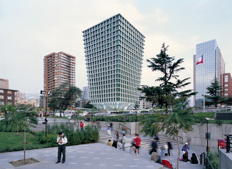
Text description provided by the architects. The project consists of an office tower with a commercial complex in the base, located at the intersection of Apoquindo Av, main axis of Santiago, and Americo Vespucio Av, the capital’s circular beltway. This place is poorly laid out despite its urban importance as a cloverleaf intersection surrounded by several buildings of varying height and quality, many of which were shaped by a disastrous old regulation of gradients nicknamed “the shoe shine box".
The site has immediate access to Escuela Militar Metro Station, which has the highest daily traffic flow in the entire subway network. It has an approximate area of 4,000 sqm resulting from the merging five lots purchased by the architects. The largest part of the layout is roughly square shaped.
The site is opened on three fronts: to Apoquindo Av to the north, to Cruz del Sur St to the west and Felix de Amesti St to the east. Given its location, the tower is facing Apoquindo Av. axis coming east from a mile away, as visual culmination for an emerging sub-center whose business park is developing rapidly throughout the avenue.
The applicable regulations allowed to raise towers up to 21 floors, with a buildable area of 18,738 m2 (cornering was necessary, considering the impact of land value in market selling price), with square shaped plants averaging approximately 1,000 m2 each, and a vertical circulation core containing a battery of eight elevators plus two enclosed double stairwells and services, occupying an area of approximately 15 x 15mts. In addition, regulations required a two storey commercial complex, with a continuous facade on the property’s perimeter facing the three streets, whose allowed floor area was approximately 4,000 sqm -if we don’t count the tower’s entry points and parking lots.

Finally, it was also required to provide 600 parking lots, whose total surface area was 18,000 m2, which divided by the available land area, resulted in five underground floors. Thus, the volume of the building is quite constrained by the application of the regulations.
Given the high pedestrian density and scarcity of public space in the sector, the project's first decision was to clear the ground level as much as possible, freeing up the site’s inner surface as an extension of the public space. This was made possible by hiding underground a major part of the program’s commercial area and withdrawing the rest of the complex’s structure to the borders at the back of the property, so as to allow an interior corner square. Furthermore, it was deemed possible to structure the tower in such a way that only the shaft of the vertical elevator system rests on the ground, considering the ratio between height and base of the maximum allowable building volume and the fact that it is placed in the center of square floor plans, hence avoiding torque reactions of the structure under seismic stress.
Initial structural analysis confirmed the possibility of having the shaft itself to resist both baseline shear stress and torsional moment of the estimated volume’s mass. Moreover, matching tower-underground structural module was unnecessary by having only basic vertical circulations inside the underground shaft. This way, an optimum result of 27m2 per lot was achieved on these parking floors.
We had already emphasized in prior office tower projects that the essence of this architectural type lays on the vertical overlapping of several reproductions of the ground surface, just like land plots linked by a vertical street -a fact that indeed poses a structural challenge. This certainty is radically exposed by concentrating vertical circulations, services and the tower’s supporting structure into one single central core.
Therefore, floor plan surface starts to increment above 4th floor in order to offset the reduction of the volume’s base surface and to corner the total allowable built area. This allows us to: -Reduce shaded areas produced by the suspended tower over its base, thus improving the ratio of covered outdoor space.
Reduce the angle of diagonal bracing attached to the perimeter structure supporting several overlapped slabs.
Increase the sellable area in the upper floors, whose price is higher.
And to define the outline of a memorable landmark facing the axis of Apoquindo Av. On the other hand, it also allowed open floor plans by reducing the slabs’ supporting elements to one single shaft plus a set of perimeter columns.

Continuous floor to ceiling windows are shaded by columns and a full perimeter eave, standing upright with a set back distance of 90 cms. from the outer edge of the slabs and pillars, thus expressing the supporting structure through the volume exterior. Glazing setback plus screen printing and differentiated reflectivity according to lighting and thermal requirements for each different area of the facades together resulted in a reduction in energy consumption of up to 25% in comparison to nearby buildings of the same category.
Building costs turned out to be inferior to initial estimates related to towers of similar characteristics. This is very important because we believe that a design with economic results demonstrates wit while purifying the rethorics of architecture; after all, the efficient use of available resources is an infallible condition for achieving beauty.

Seeing the towers from below, the closer we get to the elevated volume, the more clear and evident is the triumph of supporting structure over gravity; afterwards, our visual range is unable to grasp totality, shifting scale and perception into a sense of danger, like vertigo. Both the trapezoid shape of the facades and the distorted grid of overhanging columns supporting the edges of the slab perimeter aim to heighten stillness and immobility as part of the essence of architecture:
The perception of the facing surface and its subsequent mental assimilation induces an equivocal adjustment due to its distorted orthogonal grid, varying according to the shifting reference of the subject in approaching the building. This project sought to integrate the consideration of mass, gravity and weight with the perspective condition of perceived space, both decisive aspects in the experience of architecture.


