1. ArchDaily
  2. trend

trend: The Latest Architecture and News

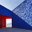
Color in Architecture: 11 Projects that Use the Pantone 2020 Tone

Color in Architecture: 11 Projects that Use the Pantone 2020 Tone - Image 1 of 4Color in Architecture: 11 Projects that Use the Pantone 2020 Tone - Image 2 of 4Color in Architecture: 11 Projects that Use the Pantone 2020 Tone - Image 3 of 4Color in Architecture: 11 Projects that Use the Pantone 2020 Tone - Image 4 of 4Color in Architecture: 11 Projects that Use the Pantone 2020 Tone - More Images+ 7

Pantone Color Institute™ has announced the color that would set the trends of 2020: a tone that "inspires calm, confidence and connection" in a process of transition to a new era. The PANTONE 19-4052 Classic Blue Color, which was described as "timeless and durable," is reminiscent of the sunset sky and "helps focus thoughts."

Subscriber Access

13 Reasons Why We Love Millennial Pink

Millennial Pink has broken into the design consciousness of more than its named generation. Though hugely successful in fashion and pop-culture (and Instagram), the playful color has established a presence across design products and the built environment like never before. Colour is a fundamental tool in our perception of architecture, with architects like Ricardo Bofill and Luis Barragan having baptized pink into a high-impact contributor through their works. With that in mind, check out these 13 projects showing why pink is here to stay: