Colors have played an essential role in the history of modern architecture - from Le Corbusier's theory of polychromy to the aesthetic conceptions of the Bauhaus. However, we find ourselves at the beginning of an era where the interpretation and implementation of colors in architecture are undergoing a transformation based on their impact on the built environment.
One way to employ color is through monochrome, a design technique that involves using a single tone or color in a space. In architecture, monochrome is a powerful tool where different shades can be created through the play of lights and shadows, generating spaces that offer unique experiences to their inhabitants.
Earthy tones, from those used in traditional vernacular constructions to contemporary interior design trends, are instrumental in crafting inviting, organic, and harmonious environments. These tones encompass a spectrum of shades reminiscent of natural elements such as earth, clay, sand, and stone, fostering a deep connection with nature. They are readily available in various construction materials, paints, and coatings, allowing for captivating texture combinations. In the following section, you'll find inspiring projects that exemplify the potential of these color palettes.
https://www.archdaily.com/1006046/how-to-use-earthy-tones-in-architecture-from-the-vernacular-to-the-contemporaryArchDaily Team
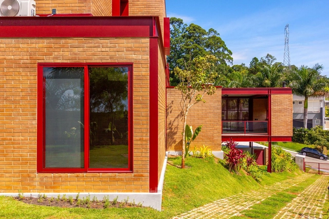
Although the use of color can be employed to hide or disguise a specific characteristic, it can also be used to highlight them. Within the Latin American territory, we can observe that shades of red, green, and blue have predominated in residential architecture, aiming to integrate a language appropriate to the context in which it is implemented.
The use of pigmented concrete in Latin American architecture is growing - and influencing contemporary architectural expression. This can be seen in recent built works ranging from the INES Innovation Center designed by Pezo von Ellrichshausen in Chile to the Teotitlán del Valle Community Cultural Center by PRODUCTORA in Mexico.
The Wizard of Oz (director Victor Fleming, cinematography Harold Rosson, 1939). Print Screen
Colors evoke specific feelings; therefore, they are used to elicit particular effects on the surface they appear on or in the minds of observers contemplating them. In architecture, color plays a fundamental role in defining shape. Materials in their natural state already possess inherent coloration, which is perceived in a specific manner. However, when dyed, the observer's perception is altered, giving rise to associations between different sensations related to the same object. This transformation brought about by color occurs in various visual mediums, spanning from three-dimensional contexts like architecture to static and mobile two-dimensional forms such as engravings, photographs, paintings, and films.
Videos
Sto distribution centre in Hamburg, Germany. Designed by Michael Wilford & Associates, 1994-1995. Photographed by Richard Bryant, image courtesy of Sto
Contrary to popular belief, Roman buildings were not as monochrome as previously thought. Recent discoveries indicate that statues and structures were, in fact, richly adorned with bright colors and exuberant decorations, following the tradition established by their Greek predecessors. This may be surprising, but it shows the presence of color in architecture much earlier than imagined. Color has always played a significant role in shaping the perception and experience of a space, and was prominent in the works of seminal architects such as Le Corbusier and Luis Barragán, for example. Another master of the use of color was Michael Wilford, who, together with his former partner James Stirling gained international recognition with notable public buildings, art centers, museums, and libraries located worldwide. The volumes present in Wilford's architecture are often remembered for their careful use of color, which highlights certain elements and adds other dimensions to the structures.
Our daily lives involve constant communication with the city. As we move through different spaces, we ask ourselves questions like "Where am I now?", "Where am I headed?", "What am I looking for?", "What is this building for?", and "How do I experience this space?" While spatial encounters may feel intuitive, environmental graphic design (EGD) provides the answers by serving as an important interface between us and the built environment. It involves the design of graphic elements that merge with architectural, landscape, urban, and interior designs to make spaces more informative, easier to navigate, and memorable. EDG comprises three major elements: text, shape, and color. Text and shapes typically encapsulate the graphic information, but color projects it, amplifies it, and helps communicate it within the packed scenes of the city. In spatial experiences, we perceive colors first, since our senses mostly register visual sensations. Therefore, the strategic use of color is critical for environmental graphics to provide a layered experience of identity imagery, sense of place, and emotional connection.
With the proper know-how, readily available earth, sand, chalk, lime, or gravel can yield a versatile, strong, and durable construction material. Its colorful results vary from region to region, depending on the natural soil component, climate, and treatment. While some prefer to minimize any added processing, others relish the exploration of rammed earth surfaces. Different textures and mesmerizing layers of multitoned or multicolored earth can be used to create a solid surface that enriches the visual quality of a space and carries a sense of warmth to any project.
Colors are much more than just aesthetics. They can tamper with the sensations a space conveys, how we perceive the environment, and even comfort issues. With so many factors that they can influence, using them is not an easy task, and that is why many architects choose to stick with the classic white, grayscale, or even exposed materials to avoid any possible visual conflict. However, some architectural practices dare to use bold color palettes and create unique works that stand out precisely because of how colors help compose the project.
https://www.archdaily.com/1005481/breaking-the-standards-10-architects-who-are-daring-in-their-color-palettesArchDaily Team
Among the many marks left by architect Lina Bo Bardi in Brazilian architecture is the use of red as a highlight in her works. Whether bringing lightness and vividness to the hardness of São Paulo's concrete at Sesc Pompeia or warming the whiteness of Solar do Unhão in Bahia, red transcended mere visual and aesthetic status to become a distinctive characteristic of the Italo-Brazilian architect, weaving connections between many of her works.
In the world of retail, competition is fierce. Brands find themselves in pursuit of distinguishing their presence and developing intimate connections with their customers. Amidst the array of products they offer, thoughtful brands recognize the value of curating immersive retail environments that empathize with the core of consumers' sentiments and desires. In retail design, color stands as a powerful instrument that affords brands the means to articulate their values, evoke emotions, and carve memorable shopping experiences into the minds of their patrons. Color transforms retail centers into more than spaces for transactions - it positions strategic interior design as a marketing tool to attract and retain customers.
African societies' cultures are intrinsically linked to color. From fabrics to clothing, products, sculptures, and architecture, various societies explore rich and vibrant colors that are vivid, expressive, and joyful. Through different shades, hues, contrasts, motifs, and ornamentations, colors are embraced as an unspoken language, a palette for storytelling, and a sense of cultural identity. Although the use of color in African societies may seem decorative on the surface, it is extremely symbolic, with a deep sense of history behind it. Traditional African architecture is a prime example. Ethnic societies have endowed their homes with color through ornaments and motifs, expressed it with religious and cultural patterns, employed it on facades to tell familial stories, and created labyrinths of communal architecture that not only celebrate color but explore its ethnic meaning.
Architects and designers are often looking for ways to make building facades and interior surfaces stand out from the crowd. But sometimes just the smallest change can have the biggest impact once you step back and see the whole picture. By employing an illusionary pattern such as dithering pixels or halftone dots, or by making subtle but intentional changes to the position or orientation of materials, flat surfaces can be transformed into curved, moving forms.
The Islamic Architecture style has a diverse history, spanning over a millennium, stretching from Western Africa to Europe to Eastern Asia. Beginning in early 7th century Arabia, this form of architecture emerged with the rise of the Islamic civilization. In fact, Al Masjid Al Nabawi, the first Mosque to ever be constructed was built in 622, in Medina, Saudi Arabia. Moreover, early Islamic architecture was influenced by the pre-existing styles around the region, such as Roman, Byzantine, and Persian qualities.
Materiality is a determining factor in shaping the character and experience of a building. Playing with the aesthetic and tactile qualities of materials, the design process encompasses their analysis, selection, and arrangement to create purposeful and sensory-rich spaces. Alongside textures and patterns, exploring materiality also involves the study of color possibilities. The versatile role of color in architectural materials extends beyond mere aesthetics, as it can broaden design opportunities and influence emotional responses, functionality, cultural relevance, and environmental performance.
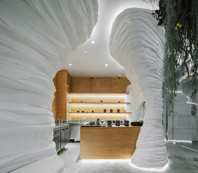
Given that the architects of modernity were in search of purity of form, it stands to reason that the image of this modern architecture is almost inevitably rendered in white in the collective imagination. Relieved of superfluous decorations, modern architecture became associated with the predominant use of white surfaces to highlight the volumetric composition. Combined with the concept of “material truth” first articulated by Victorian critic John Ruskin, white-colored architecture is often understood as straightforward, clear, and sincere.
In the face of a climate emergency, various fields are under pressure to reformulate their operations and actions, and architecture is no exception. After all, the built environment and the construction industry are responsible for a considerable percentage of carbon gas emissions into the atmosphere. Rethinking and restructuring the construction chain - from design to execution - is the order of the day for construction professionals.