1. ArchDaily
  2. Maps

Maps: The Latest Architecture and News

Why Google Makes Independent Mapmakers as Important as Ever

Subscriber Access | 

For most of history, mapmaking has been an incredibly specialized pursuit, the domain of either intrepid explorers or highly skilled cartographers, and the resulting maps were some of society's most important repositories of information. In the 21st century, internet-age services such as Google and Wikipedia have made this system largely obsolete - but that doesn't necessarily mean that mapmaking is dead. In this article from Architecture Boston's Summer 2015 issue, originally titled "Redrawing the Map," William Rankin argues that our age of information has instead sparked a new age of cartography; one that is different, but just as important as what came before.

Given the proliferation of GPS devices and interactive mapping online, it’s easy to declare the traditional map obsolete. Intuitive turn-by-turn directions have replaced road atlases, Google has upgraded the static map with everything from real-time traffic to restaurant reviews, and Wikipedia has taken the place of the hefty geography textbook. Is there any hope for a cartophile? Will the stand-alone map, lovingly produced and custom designed, be only a niche product for rich collectors and Luddites?

Win a Copy of Massimo Vignelli's Limited-Edition 2012 New York City Subway Diagram

UPDATE: Congratulations to Colin from Philadelphia and Guillaume from France - you've been randomly selected as the winners! Thank you everyone for participating. 

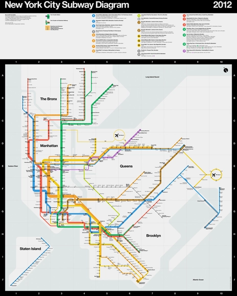
SuperWarmRed Designs has offered our readers a chance to win Massimo Vignelli’s limited-edition (unsigned) MTA New York City Subway Diagram. Designed in 2012 by Vignelli, in collaboration with Vignelli Associates Beatriz Cifuentes and Yoshiki Waterhouse, the diagram is the first Vignelli subway map to be printed by the MTA since the 1970s and is slated to be made part of the Museum of Modern Art’s permanent collection this year.

Using concepts from Vignelli’s iconic Subway Map design of 1972, the new diagram was informed by satellite data and rebuilt for greater clarity and legibility. Revised to reflect the current subway system, colors and nomenclature, the poster has been printed in vivid Pantone and Hexachrome inks on acid-free archival cover-weight paper.

SuperWarmRed has agreed to giveaway one 36” x 45” Subway Diagram and one 16” x 24” Subway Diagram Detail Series. Read on after the break for the official rules.