Yannis Drakoulidis

BROWSE ALL FROM THIS PHOTOGRAPHER HERE

What Is Metamodern Architecture? Between Postmodern Irony and a New Sincerity

Subscriber Access | 
Audio available

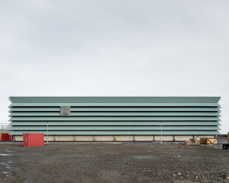
In a slim volume with a yellow-edged cover, recently published by the Porto-based imprint Circo de Ideias, the architect Paulo Martins Barata (a founding partner of Promontório) makes a deceptively bold claim that the architecture produced in Europe since the Great Recession belongs to neither of the two camps that structured the twentieth century's fiercest disciplinary debate.

The Language of Metamodern Architecture borrows its title, with evident irony, from Charles Jencks' 1977 The Language of Post-Modern Architecture, the book that famously declared modern architecture dead at 3:32 pm on July 15, 1972, with the demolition of Pruitt-Igoe. His wager is that another death, never officially certified, occurred somewhere around 2008, and that architecture has been living, mostly unaware, in what grew up around the grave.

What Is Metamodern Architecture? Between Postmodern Irony and a New Sincerity - 1 的图像 4What Is Metamodern Architecture? Between Postmodern Irony and a New Sincerity - 2 的图像 4What Is Metamodern Architecture? Between Postmodern Irony and a New Sincerity - 3 的图像 4What Is Metamodern Architecture? Between Postmodern Irony and a New Sincerity - 4 的图像 4What Is Metamodern Architecture? Between Postmodern Irony and a New Sincerity - More Images+ 13

Vibrancy and Utility: Embracing Color in Urban Apartment Kitchens

Subscriber Access | 

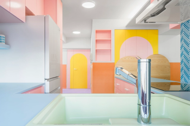
Urban apartments are frequently praised for their clever use of space, but what of their approach to color? Thoughtfully incorporating color is more than an aesthetic decision; it has the potential to shape emotional responses, influence mood, and create spatial illusions. Research in color psychology shows that colors affect our social, cultural, and psychological reactions, making them powerful design tools. Variations of blue, for instance, have been shown to slow melatonin production, keeping people more awake and alert, while shades of green relieve strain on our nervous systems, helping us feel calmer and more grounded. Color in architectural spaces can even alter our perception, creating illusions of depth, movement, and texture that influence how we experience space. Warmer hues like oranges and reds tend to make a room feel more intimate and cozy, while cool whites and blues lend a sense of openness, making spaces appear taller and more expansive.

Vibrancy and Utility: Embracing Color in Urban Apartment Kitchens - More Images+ 29

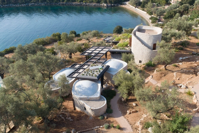
Meganisi House / Hiboux ARCHITECTURE

Meganisi House / Hiboux ARCHITECTURE - More Images+ 39

Katomeri, Greece

Pelosof Bar / Post-Spectacular Office

Pelosof Bar / Post-Spectacular Office - Interior Photography, Coffee Shop, Facade, Table, Chair
© Yannis Drakoulidis

Pelosof Bar / Post-Spectacular Office - More Images+ 43

Thessaloniki, Greece
  • Area Area of this architecture project Area:  600
  • Year Completion year of this architecture project Year:  2021
  • Manufacturers Brands with products used in this architecture project
    Manufacturers:  Afrokoptiki, BRIGHT, Custom Light Now, Damon Sidiropoulos, Fanis Manglaras, +10
  • Professionals: Post-Spectacular Office

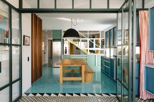
Nadja Apartment / Point Supreme

Nadja Apartment / Point Supreme - More Images+ 18

  • Architects: Point Supreme
  • Area Area of this architecture project Area:  270
  • Year Completion year of this architecture project Year:  2014