Dwellings can be understood as the most significant and primary form of architecture, as the house is intimately related to the idea of shelter, one of humanity’s basic needs. In the words of architect Mario Botta, “As long as there is a man who needs a house, architecture will still exist.” Yet, in spite of its ubiquity, or perhaps because of it, an exact definition of a home is difficult to find. Throughout history, different functions and spaces have been added and subtracted from this unit, reflecting directly the character of the society that produced it.
The list of expectations that a house has to fulfill is long and ever-evolving: to provide intimate and safe spaces where one can recharge their energy, but at the same time to allow for interaction, welcoming friends and family to join in; it is the purveyor of leisure and relaxation, but also the site of most labors of care, while also providing a small incubator for starting entrepreneurs. This tendency to demand a residential unit to fulfill multiple roles was heightened to unprecedented levels during the pandemic. Health concerns led to the closing of most workspaces, the second place where people spent most of their time, and of cafes, restaurants, cinemas, and malls, the “third places.” Suddenly, the home had to become an all-purpose space.
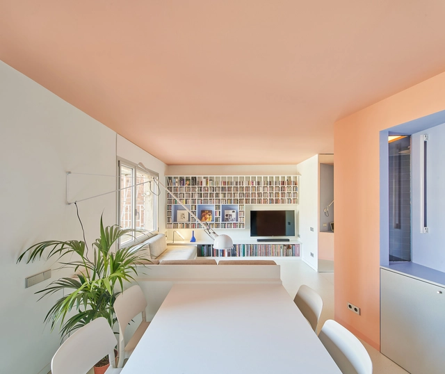
With a high proportion of white mixed with a small amount of colorful pigments, pastel colors provide a range of pale, subdued tones. Related to soothing and calming environments, these colors have a timeless quality and can be seen throughout different architectural styles, such as rococo, art déco or the mid-century modern years. Applied in exteriors, interiors, or both, pastel tones make rooms feel more light, airy and spacious.
From subtle accents to taking the spotlight in a project’s overall strategy, pastel colors are a versatile alternative that can be used in multiple ways and varying degrees. Following Ricardo Bofill’s color proposals, Paulo Mendes da Rocha’s interiors and Michael Graves’ buildings, contemporary architecture plays with soft colors for aesthetic and functional purposes, as well as providing a sensory experience. Analyzing different examples of their application in architecture and design, we showcase how four prevailing colors –mint green, pale pink, lemon yellow and light blue– are currently taking the stage.