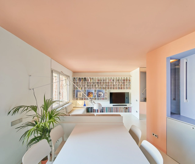
With a high proportion of white mixed with a small amount of colorful pigments, pastel colors provide a range of pale, subdued tones. Related to soothing and calming environments, these colors have a timeless quality and can be seen throughout different architectural styles, such as rococo, art déco or the mid-century modern years. Applied in exteriors, interiors, or both, pastel tones make rooms feel more light, airy and spacious.
From subtle accents to taking the spotlight in a project’s overall strategy, pastel colors are a versatile alternative that can be used in multiple ways and varying degrees. Following Ricardo Bofill’s color proposals, Paulo Mendes da Rocha’s interiors and Michael Graves’ buildings, contemporary architecture plays with soft colors for aesthetic and functional purposes, as well as providing a sensory experience. Analyzing different examples of their application in architecture and design, we showcase how four prevailing colors –mint green, pale pink, lemon yellow and light blue– are currently taking the stage.





