In our global society, the movement of humans from one country to another has had extraordinary impact, changing our perceptions through the the exchange of ideas and introduction of new cultures. This can be seen in the adoption of traditional architectural techniques in contemporary architecture, as well as in the dissemination of contrasting architectural philosophies such as the International Style and Critical Regionalism.
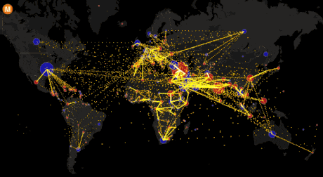
Now, in this new interactive map produced by Max Galka of Metrocosm, these movements have been tracked in a eye-catching, easy-to-read infographic.
To create this map, Galka tracked down immigration statistics from the UN Population Division’s estimates for Total Migrant Stock from 2010 to 2015, searching to answer the questions: “How many migrants are there? Where are they coming from? And where are they going?”
Check out the interactive map below, and visit Metrocosm for a full analysis. Click on the dot for each country to see individual country statistics – red means a net loss of population, blue a net gain.
Click here for a full screen version of the map.