Fast Food Restaurant – KFC / PK Arkitektar

Uploaded by — Filed under: Hotels and Restaurants ,restaurant ,Selected , , , ,
 

1251752302--raf0162

Architects: PK Arkitektar ehf
Location: Keflavík, Iceland
Client: KFC Iceland
Design team: Pálmar Kristmundsson and Fernando de Mendonça
Consultants: VSB Engineers
Constructed area: 530 sqm
Project year: 2005
Photographs: Rafael Pinho

1251752278--raf0115 1251752283--raf0141 1251752297--raf0159 1251752306--raf0176

Fast food restaurants like Kentucky Fried Chicken are usually known for the standardized look. The architecture in these places seems to never take much consideration on the specific location and surroundings. In Keflavík the intention was to make a design that would brake with these aspects.

1251752269--raf0111

The building volume is a play with black boxes. The main body is a horizontal box lying on the pitch black pavement and two vertical ones who stretch up and out, catching both the customers in their cars on the ground and the skylight from above into the building. The outside is clad with semi matte black tiles sparingly cut out for vertical ribbons of windows, which underlines the cool and sophisticated appearance. The west end of the building is surprisingly sheer glass, which mirrors the big space and opens the building to the street and sea view.
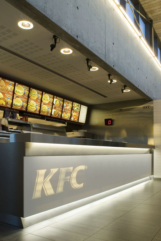
1251752293--raf0148

The inside is kept in raw in-situ cast which invites for some interesting play with sincere light, shadow and surface. The fine detailing and light fixtures designed by the architect are a dialog to the standardized menu billboards and brand furniture as they come in brightly coloured synthetic materials.

Dinning area

Dinning area


Thumb up Thumb down 0
mec1 says:

jeez must me a slow day at Arch Daily.
its a KFC!! FFS!!

 
# September 2, 2009 at 07:35
Thumb up Thumb down 0
archilocus says:

The location and the architecture make it look like a warehouse. I know it’s a fastfood restaurant and people eat s**t, but why do the architects think people also want to see some ?

 
# September 2, 2009 at 08:43
Thumb up Thumb down 0
Chan says:

Why this super-ordinary design can be here in Archdaily?

 
# September 2, 2009 at 08:56
Thumb up Thumb down 0
Leo says:

in defense of Archdaily.com, this building might not be attractive, but it is unusual for a KFC (or any fast food joint), and thus is worthy of a discussion…

 
# September 2, 2009 at 09:25
    Thumb up Thumb down 0
    ygogolak says:

    Yes, it is different, but in this case, surprisingly, different is not better.

     
    # September 2, 2009 at 10:23
Thumb up Thumb down 0
john says:

…its finger lickin good.

 
# September 2, 2009 at 09:32
Thumb up Thumb down 0
qingtong says:

一般般吧

 
# September 2, 2009 at 10:53
Thumb up Thumb down 0
Dan says:

I would prefer to see this as a big red, goofy looking chicken. It is a fast food restaurant, why must it try to look like a museum?

 
# September 2, 2009 at 11:00
    Thumb up Thumb down 0
    Leo says:

    check out the “Big Chicken” in Marietta, Georgia, USA

     
    # September 2, 2009 at 13:34
Thumb up Thumb down 0
Dustin says:

I believe it is important for architects to become more involved in changing the everyday buildings around them. KFC, Mcdonalds, home depot, walmart, etc… all these places are what ordinary people think of as architecture, they are not interested in a new house in Japan or a Bridge in Norway or who Legorreta is, they care about the places they visit everyday, places that normally present a terribly commercial architecture. this project is refreshing as a concept. I think its great that the architects have ventured to destroy the standarized look of this building. Having said that though, what a horrible result. It does look more like the chiken lab than a place I would enjoy eating. I feel like the architects really wanted to make a museum or something and ended up with a KFC project and just kind of made the same building. It is a very Powerful statement, but an equally mediocre outcome.

 
# September 2, 2009 at 11:07
Thumb up Thumb down 0
rabbit says:

i completely agree with Dustin… why is there so much negativity towards this project. it’s detailed quite well, better than many office buildings where i live. if anything, there should be more sophisticated work on this scale and economic level.

like Dustin said, most people care only about what they see and visit on a regular basis… they have no connection with amazing spaces and structures that they only see or visit once every five years or longer.

 
# September 2, 2009 at 11:11
Thumb up Thumb down 0

Dear readers,

Would you rather never know about this building? I think that is very interesting that fast food chains always try to “localize” something when entering other countries, this being a specific food or adapting to local architecture. Clearly, Iceland is a small, quiet and cold country, with its own codes. And in my opinion, you can´t build something that contrasts with this bucolic landscape.

Don´t close yourselves from what is happening, even if it´s something small or subtle.

We have very interesting projects from this office that we are processing for publication in the next days. Stay tuned ;)

 
# September 2, 2009 at 11:22
    Thumb up Thumb down 0
    Knok Knok says:

    Dear Basulto: I gotta say I’m a follower of AD publications. I appreciate the hard work AD puts on keeping us architects daily inform. But, as a professional advise keep your content in line, not out of it. To quick answer your awkward question: YES! I would rather never know about this building……WHY? There are far more interesting projects than this one, happening right now!!!, this is where AD should be focus, instead your suggesting we buy this counterfeit, which reminds me just because it looks, smells & taste like real chicken, means you’re actually eating chicken. Same as just because it looks, sounds & feels like “real architecture”, means you’re in presence of it. This delusion is very well achieved on today’s “branding architecture” which is no different than “KFC Box with Real Chicken Inside”.

    P.S. on your comment “that fast food chains always try to “localize” something when entering other countries, this being a specific food or adapting to local architecture”
    The only thing they might try hard to “localize” is the possible consumer, once this consumer enters the “chicken box” is like been at all KFC stores around the world at the same place an time, this “hyper-presence” is a “generic architecture side effect.” Variations within stores becomes calculated distinctions of the same thing, not intended pro-adaptation of a social, economic, urban localities.

     
    # September 2, 2009 at 17:39
Thumb up Thumb down 0
Dan says:

go to thearchitect’s website and look at the museum of design and applied arts – mudesa. This is almost identical in style to the KFC. The style is fitting for the museum and is beautiful, but for a fast-food chain I feel that it is not appropriate.

 
# September 2, 2009 at 11:35
Thumb up Thumb down 0
Peter says:

Dear David
I think is great to see this type of solution to get a short lesson on what not to do on a similar situation
this reminds me of the typical warehouse building in Long Island, NY..yes Long Island!
so for me the problem with this building is that is neither KFC or a restaurant but more of a re-designed ikea building

 
# September 2, 2009 at 11:44
Thumb up Thumb down 0
patentpolice says:

What’s missing is a photo of the dinig area, it’s odd why it’s not included. The project should be about a better dining experience, so where is the dining room?

As for comments about this looking like an industrial warehouse, it’s perfectly fitting for the food being served here. Read “Ominvoire’s Dilemma” and you’ll understand. With that, and after reading that book, I’m not sure I’d feel comfortable desiging a building for a fast food chain.

 
# September 2, 2009 at 11:46
Thumb up Thumb down 0
Euan says:

Looks like most come here looking for architectural porn. I guess that reflects an abandonment of the ordinary by designers which is a shame as it makes up the bulk of our environment. This is a fast food outlet superior to most and it’s good to see ArchDaily including it. Warehouses, factories and business estates often seem to fly under the radar but we have to look at them as we drive along motorways/interstates. I’d rather see this than the usual banal efforts.

 
# September 2, 2009 at 11:51
    Thumb up Thumb down 0
    amflores says:

    Euan, you just nailed it. We´re accustomed to think of architecture looking for the next Parthenon and forget the banality of our regular surroundings. Working for a firm that specializes in commercial projects, I´ve done my couple of fast-food restaurants and know how restrictive are they on their image. I can do nothing but amaze at the results on this building and the risk taken. Can it be better? Sure, but to criticize it you should also be aware of the corporative environment in which is involved and applaud the result.

     
    # September 4, 2009 at 14:23
Thumb up Thumb down 0
alejandro says:

Although it has some nice details it´s a sad place to eat!
In Mexico must KFC are bright red with lots of architectural makeover gimmicks – it may be that they reflect the nations character perhaps in Iceland they find this building cheerful.

 
# September 2, 2009 at 12:07
Thumb up Thumb down 0
Roberto says:

It’s a competent architecture. It’s correct. It don’t have to look like a comon restaurant to looks like a restaurant. I belive that the problem is mor the tipe of visual communication than the architecture.

 
# September 2, 2009 at 12:47
    Thumb up Thumb down 0
    Syl says:

    If people here on this site can’t read a project predented without strong visual communication means, or are easily manipulated by these, than we have a problem.

    This project have some strong qualities in my opinion, hence more subtle, wichh is harder to graphically express and to actually physically achieve in a build project.

     
    # September 3, 2009 at 12:17
Thumb up Thumb down 0
lester says:

I wouldn’t mind living in that building (adapted to housing, and a bit smaller) at all.

As a fast food joint its a lot more interesting than those colorful shacks. In this case such taste does not go well with the food… =)

 
# September 2, 2009 at 12:54
Thumb up Thumb down 0

What is the problem with you people? Why should it be ‘cheerful’? Why is it ‘not appropriate’? What kind of ‘critical view’ is that?? Btw, it is located in Iceland, not in the US or Mexico. It is no doubt way better than the usual built fast food stuff. A beautiful building, with fine details and nice and well located openings to the views. What is really missing are photos from the dinning area with PEOPLE on it. Apparently, they didn’t want to show the “brand furniture… in brightly coloured synthetic materials” in contrast with the sober building materials. It must be interesting, reflecting the opposing qualities of space and the food served in it. Why do architects tend to show their work as empty shells?

 
# September 2, 2009 at 13:03
Thumb up Thumb down 0
etty says:

only in iceland they build a kfc that looks as good as this.

 
# September 2, 2009 at 13:26
Thumb up Thumb down 0
cad says:

Where’s the spinning bucket?

 
# September 2, 2009 at 14:19
Thumb up Thumb down +1
n-ICE says:

the thing with this building that it’s in Iceland, Iceland (not like most other countrys) is that Iceland is trying NOT to damage the beautifull nature that Iceland has. And so instead of having it in bright red colors, they have it in blackish stone color and all nature colors. Yes I agree it is a little “boring” on the inside but they didn’t show you the kid section wich is ,without doubt, a more colorful place. They chose a beautifull landscape and made the building in style with the land. Plus, it’s alot better looking then other fast-food restaurants.

p.s. sorry for all my spelling errors if there are any, I’m only Icelandic

 
# September 2, 2009 at 14:53
Thumb up Thumb down 0
Dan says:

so by making the building in style with the land, they chose to surround it with an enormous paved parking lot? Just because it is different from the typical fast-food restaurant doesn’t mean that it is good.

 
# September 2, 2009 at 16:02
    Thumb up Thumb down 0
    Syl says:

    just because it is a fast-food rewstaurant doesn’t mean it’s bad. Why is simple, straightforward, subtle, clean and well detailed and executed architecture is so much often bashed?

     
    # September 3, 2009 at 12:22
Thumb up Thumb down 0

I don´t see why the parking is a problem.

 
# September 2, 2009 at 16:35
    Thumb up Thumb down 0
    Dan says:

    David, it was a response to n-ICE’s comment that the building is trying to fit into the beautiful landscape. If this was the case, the architect could have made a better effort to fix the problem of paved parking lots and the damage they cause to the landscape.

     
    # September 3, 2009 at 17:01
Thumb up Thumb down 0
VW says:

I’m okay with the building – I suppose…

What I’m wondering is why is ArchDaily sporting retreads? http://eyecandy-webcandy.blogspot.com/2007/11/pk-arkitektar.html

 
# September 2, 2009 at 16:47
    Thumb up Thumb down 0

    Dear VW,

    I don´t read that blog.

     
    # September 2, 2009 at 19:08
      Thumb up Thumb down 0
      VW says:

      perhaps you should…

       
      # October 5, 2009 at 00:48
Thumb up Thumb down 0
hi says:

there’s a KFC in Los Angeles with an over the top design: http://commons.wikimedia.org/wiki/File:KFC_bucket_restaurant.jpg
also, you spelled “break” wrong

 
# September 2, 2009 at 18:57
Thumb up Thumb down 0
brianbuchalski says:

I dig the KFC. Thanks for posting it Archdaily.

 
# September 2, 2009 at 19:17
Thumb up Thumb down 0
laBOMBA says:

It’s interesting to see that KFC is putting its branding aside to make architecture the predominant statement in this building. Architects can only applaud this! But it does have a surrealistic feel at the same time.
Good work of posting it Archdaily, it is sure worth discussing.

 
# September 2, 2009 at 19:42
    Thumb up Thumb down 0
    Mickey Mao says:

    I am also glad that AD has posted this project. Look at the debate it has generated!

     
    # September 3, 2009 at 02:44
Thumb up Thumb down +1
Sai says:

Good change from a tyiaclly ‘loud’ and attention seeking retail/ food retail design.
I like it. Question is, how did they get KFC to agree to the colour scheme that certainly do not speak of their logo?
Interesting.

 
# September 2, 2009 at 20:23
Thumb up Thumb down 0
james says:

I dont understand the objection to posting this.

Its certainly interesting, but the language seems inappropriate. I think its abit heavy. It’s one thing to consider site, but what about program? the economic or social connotations of the industry- a far more worthy study i think.

A much more successful example of fast food architecture is the mcdonalds by njiric + njiric.

 
# September 2, 2009 at 21:51
    Thumb up Thumb down 0

    thanks james for your comment on mcdonalds of sept. 02 ! check our new web site in november !

     
    # October 4, 2009 at 12:08
    Thumb up Thumb down 0
    VW says:

    I totally agree with James… Can’t wait to see the new njiric site! (the guy slamming his computer was getting old.)

    Coincidentally this project is also a retread via the chap at eye candy (eyecandy-webcandy.blogspot.com) through AMNP… http://architecture.myninjaplease.com/?p=2651

     
    # October 5, 2009 at 00:57
Thumb up Thumb down 0
THOM says:

JUNK ARCHITECTURE

 
# September 3, 2009 at 02:48
Thumb up Thumb down 0
tommy says:

junk space

 
# September 3, 2009 at 06:23
Thumb up Thumb down 0
pollex says:

KFC architecture :P

 
# September 3, 2009 at 13:09
Thumb up Thumb down 0
mark says:

I would like to agree with quingtong.never seen a site get soooo dumped!!

 
# September 3, 2009 at 14:09
Thumb up Thumb down 0
alejandro says:

Interesting debate: ARCHITECTURE vs. BRANDING vs. what we expect of BRANDed SPACE.
Nevertheless above all (nice clean modern box with cool concrete details and Alucobond type facade) I wouldn’t like to eat there.
Perhaps I would have vodka drink or visit my dentist or solve some administrative problem in a government office but never eat.

 
# September 3, 2009 at 17:05
Thumb up Thumb down 0
sheeeeep says:

it is so boringgggggg. looks like a factory outside, and the interior is just like any other kfc, but more boring.

 
# September 3, 2009 at 21:52
Thumb up Thumb down 0
everett says:

it located in iceland!!!
so it is amazing, cause everything in iceland is amazing!!!

 
# September 3, 2009 at 23:32
Thumb up Thumb down 0
n-ICE says:

F-YEAH!!!

 
# September 4, 2009 at 06:37
Thumb up Thumb down 0
jp says:

Industrial

 
# March 10, 2010 at 03:29
Thumb up Thumb down 0
Priyanka says:

plz advice if any1 knows how to approach KFC franchieses

 
# May 3, 2010 at 00:22
    Thumb up Thumb down 0
    Philip says:

    “plz advice if any1 knows how to approach KFC franchieses”

    WITH EXTREME CAUTION!

     
    # May 3, 2010 at 07:17
Thumb up Thumb down 0
Earl says:

for me, this design is not appropriate for a fast food restaurant and even the location you can see its little far from the city premises. The design seems to be unattractive to the costumers and the brand’s signature look cannot be easily identified. I thought this is only good for warehouses or offices.

 
# January 6, 2011 at 20:16
Thumb up Thumb down 0
ariana roberts says:

nice…but kinda bland

 
# March 12, 2011 at 16:11

Leave a Reply »


Latest Comments »

The best chance of making the UK a...[+]
Architects have no use for cutesy, valueless generalizations about their...[+]
He said it himself…”Architect s are not funny.”[+]
is this an attempt at humor? i must be missing something.[+]
I like it as it challenges our western view of what a school should be. Even...[+]

Upcoming Architecture Events »

got events? invite us! click here

Architecture Books & Magazines »

Reverse Effect: Renewing Chicago’s Waterways / Jeanne Gang

Reverse Effect: Renewing Chicago’s Waterways / Jeanne Gang

Our friends from Studio Gang Architects recently sent us their new book Reverse Effect. ”The culmination of a yearlong collaboration between Studio Gang Architects and the Natural Resources Defense Council (NRDC), Reverse Effect is dedicated to exploring the importance of


Made to Measure: The Architecture of Leers Weinzapfel Associates

Made to Measure: The Architecture of Leers Weinzapfel Associates

Made to Measure is a monograph showcasing the work of Leers Weinzapfel Associates, an architecture firm based out of Boston, Massachusetts. Leers Weinzapfel Associates first gained prominence by taking on infrastructure projects that are often left to engineers. Where…


A Peripheral Moment

A Peripheral Moment

This book is an account of the highly productive decade of architectural experimentation in Croatia lodged between the violent break-up of Yugoslavia and their slow integration into the EU. Ivan Rupnik guides the reader through the emergence of this


Our partners »

AD on iPad via Pulse

Browse by date »

Browse by category »

Friends »