We made it to the top 5 contenders! support and vote us for Best Online Magazine at the Open Web Awards! [close]
Visit our Products section to learn more about architectural products.

Parrish Art Museum / Herzog & de Meuron

By Karen Cilento — Filed under: Museums and Libraries , News , , ,
 

1250207138-herz

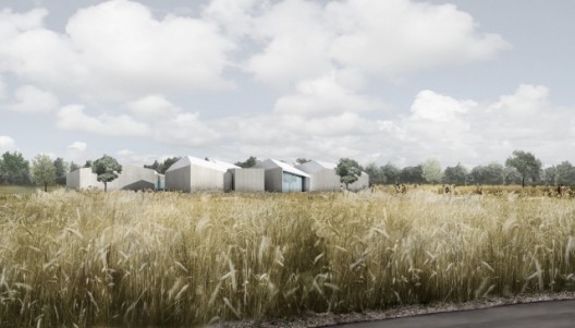
The internationally acclaimed Herzog & De Meuron unveiled their re-conceptualized design for the Parrish Art Museum on the 14-acre Hampton site.  The new design replaces the firm’s original idea which featured a villagelike cluster of pavilions scattered throughout the site.  When the museum could not seem to raise the $80 million necessary to realize the project, they approached Herzog & de Mueron for a more modest proposal.  The architects took the challenge and created a new building for less than a third of the original budget.   The new museum’s long profile, which measures 94 feet wide and 634 feet long, houses galleries arranged in two long rows along a central corridor.  The temporary walls allow the room sizes to be adjusted to account for the changing sizes of the temporary exhibits.

More about the new museum after the break.

Original design for the Parrish Art Museum, by Herzog & de Meuron

Original design for the Parrish Art Museum, by Herzog & de Meuron

“The new project is in a way a more radical and simplified version of our original design for the Parrish,” said architect Jacques Herzog. “Its clarity in concept, in combination with straightforward construction details and building materials, can be seen as a process of purification in immediate response to the Museum’s newly defined brief. Our proposal to collaborate from the beginning with local contractors on the realization of our ideas proved to be an extremely efficient and rewarding process for us as well as for the project.”

1250207139-herz04

The building will provide more than 37,300 square feet of gallery space, which is nearly twice the size of the existing museum.  The museum also includes educational and multi-purpose spaces, a spacious and light-filled lobby, and a café and kitchen.   A shaded porch wraps around the entire building and opens to a large covered terrace for a public gathering area.

The building’s strict north-south orientation takes advantage of natural northern light to fill the lobby and certain gallery spaces.  The poured-in-place recessed concrete walls teamed with the elegant white corrugated metal roof help the design fit gracefully into the surroundings as the “agri-industrial” look connects it to the area’s farmland history.

Herzog & de Mueron’s design still provides a successful gallery space for a fraction of the cost of the first; yet, as the current economy is forcing architects to downsize projects, it is important to find a middle ground that balances cost without sacrificing the level of architectural ambition.

As seen on Hamptons.  All images courtesy of Herzog & de Meuron.


9 comments »

a sphere says:

the old one looks more interesting
which is already be BIG’s tattlin

 
# August 14, 2009 at 13:55
cad says:

forget the paintings, check out the ceiling…wow

 
# August 14, 2009 at 14:55
Matt says:

A great professor once told me, “Simplify, simplify, simplify.” Similar to some other recent projects that are facing financial challenges, this project is forced to simplify its form but I think this was a gift. The same could be said for Herzog’s design for the Tate Modern addition. The first scheme was so ostentatious and the redesign is SIMPLY magnificent.

 
# August 14, 2009 at 16:22
a sphere says:

agreed with MAtt

 
# August 15, 2009 at 03:01
Fran says:

In other world crisis = minimalism
exacly like when they started.

One say architecture is a testimony of his time. We’re living very horizontal times.

We can also see it in term of thermical efficiency. For the Tate it was obvious. For this project, we’re now dealing with much more compacity.

Doe’s that mean that the “”"green révolution”"” makes many systemes, compositions, details obsolete ?
Is it a new field, a new paradigm ?
Like the modernism made obsolete ornementation and clacissism and used new materials (concrete) and was interested in new progammes (social housing)

And last, is it better now than it used to ?

 
# August 15, 2009 at 04:09
Fran says:

Oh i forgot.
That kind of project is not new (the first one). Before Big they were Mansilla + Tunon and before Raphael Moneo, Luis kahn, and of course Aldo van Eyck among others.
We also see it in traditional housing in Africa.
Some kind of cluster

The only thing BI invented is the celebration of himselm.

 
# August 15, 2009 at 04:19
CRISTIAN says:

TOO FEW INFO , MORE !

 
# August 15, 2009 at 19:05
utq says:

fu*king sh*t!!

 
# August 16, 2009 at 16:11
Nikola says:

God bless the economy crisis. It will cure us form the formalism virus. Architects will come back to the real pragmatism and rationalism in the designing process.

 
# August 17, 2009 at 06:58

Leave a Reply »

Want to have your own avatar? Get yours at Gravatar.

Latest Comments »

wow why is everyone wowing? yes, it snows in australia...[+]
That’s my guess![+]
hmm not the worst but that’s not saying...[+]
no, this isn’t good. murcutt cooked the...[+]
Those...[+]
Very nice landscape![+]
That’s amazing![+]
XD[+]
What`s the idea with the round...[+]
Very cool atmosphere… I would love to work...[+]
I agree with u arquipablo…[+]
This World Expo seems to be inspired by...[+]

Browse by category »

Our partners »

Browse by date »

Friends »

Proudly hosted at »