


-
Architects: Tadao Ando Architect & Associates: Tadao Ando Architect & Associates
- Year: 1984
Text description provided by the architects. Tadao Ando’s design for the Koshino House features two parallel concrete rectangular confines. The forms are partially buried into the sloping ground of a national park and become a compositional addition to the landscape. Placed carefully as to not disrupt the pre-existing trees on the site, the structure responds to the adjacent ecosystem while the concrete forms address a more general nature through a playful manipulation of light. More about the Koshino House after the break.

The northern volume consists of a two-storey height containing a double height living room, a kitchen and a dining room on the first floor with the master bedroom and a study on the second floor. The southern mass then consists of six linearly organized children’s bedrooms, a bathroom and a lobby. Connecting the two spaces is a below grade tunnel that lies beneath the exterior stairs of the courtyard.

Ando used the space within the two rectangular prisms as a way to express the fundamental nature of the site. This space reveals a courtyard that drapes over and contours to the natural topography.

A wide set of stairs follows the sloping land into the enclosed exterior space and allows the light that penetrates through the canopy of trees into the sunken courtyard. This self-governing space represents the fold of nature that has been bound by the conditioned structures and become synthetic.

Narrow apertures have been punched through the façades adjacent to the exterior staircase and manipulate complex crossings of natural light and shadow into the interior spaces. The patterns provide the only amount of ornament to the simple rooms. Other slots are cut from various planes of the two modules to produce the same effect of complexity throughout the entire house.

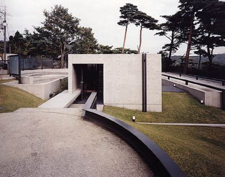
Four years after the original construction, Ando designed a new addition to the compound. Placed to the north of the existing structures, the new cave-like space rests within the upward sloping piece of land. The study features a bold curve in contradiction to the rectilinear organization, initiating a completely new rhythm.

Separate from the original courtyard design, the space between the addition and the original mass allows nature to remove the forms from each other. A patch of grass weaves its way between the concrete structures, while the curved wall extends from the building to define the exterior space. Similar to the other boxes, a slice of the ceiling plane along the curved wall is removed to add that bit of complexity and ornamentation to the interior; however, the curved patterns of light greatly differ from the linear patterns in the former building.


