Support on the -- Click here to nominate us for Best Online Magazine!Close
Have you seen our interviews in High Definition?

Saxo Bank / 3XN

By David Basulto — Filed under: Institutional Architecture , Selected , , , ,
 

Danish architects 3XN just sent us their latest finished project, a building for an online bank. This building was finished 4 years after winning an international competition back in 2004.

I like how the central stair adds dynamism to the interior, enhancing vertical relations.

Architect´s description, photos and drawings below:

Architect: 3XN
Engineer: Rambøll
Address: Philip Heymans Allé, 2900 Hellerup, Denmark
Client: Carlsberg Properties / Saxo Bank
Award: 1st prize in invited international competition 2004
Size: 16,000 m2 + 6,700 m2 basement
Completion: 2006-2008
Budget: DKK212m / €28,4m

Saxo Bank is a young dynamic internet bank with focus on online-trade with currencies, shares and futures on the bank’s self-developed platform, Saxo Trader. Saxo Bank was founded in 1992 in Denmark and counts around 850 staff members of 35 nationalities who serve customers from 115 different countries.

Saxo Bank’s new headquarter in Copenhagen is designed by 3XN. Although the customers primarily encounter the bank in cyberspace, the physical premises of the head office is of great importance to the management of the bank who participate actively and are highly dedicated to the development of the building. The building is of great iconographic significance, and there is a strong conviction that architecture and design affect each staff member’s performance and awareness of the company.

The architectural design is based on Saxo’s cutting-edge profile and branding. The lines of the building design define a sharp balance between reliability and dynamic expressivity in dialogue with the local plan. The building is shaped like two blocks with the end walls pointing towards the canal, joined together by facades that are withdrawn from the end walls. The facades are shaped like double curved glass that wave like a piece of textile.

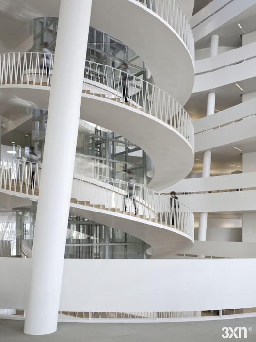
The interior of the building is open and transparent with a large sense of community. The open plans centre round a softly shaped atrium with a glass roof. In the atrium, the main stair case winds up to the top. However, the main room and largest attraction of the building is the so-called Trading Floor where share prices are monitored intensely and resemble scenes from American movies about stock exchanges. Furthermore, the building encompasses a large number of rooms for technical support, kitchenettes and recreational areas.


16 comments »

Fino says:

Very nice. Not too loud, and very ethical in the terms of providing sunlight and framed views for a corporate workspace. I am a fan.

that is all.

 
# April 28, 2009 at 13:59
Bo Lucky says:

“sharp balance between reliability and dynamic expressivity in dialogue with the local plan”(?)… I do not feel any balance… no harmony, just chaos… symbol of the today’s financial markets(?).. It would be good to hear the bank emploees opinions on their work environment.

 
# April 28, 2009 at 14:02
Bernie Madoff says:

Bo Lucky, I work in that building, and the work environment feels just great. I almost feel sad at the end of the day when it’s time to go back home.

 
# April 28, 2009 at 15:06
Bo Lucky says:

Bernie,
And this is what counts… the rest is just a form which sooner or later will grow in the streetscape.

 
# April 28, 2009 at 15:52
archdork says:

loving it loving it loving it

 
# April 28, 2009 at 21:52
mo says:

lol

 
# April 29, 2009 at 02:24
Wyatt says:

Gotta love 3XN!

 
# April 29, 2009 at 12:33
Lucas Gray says:

That twisty staircase elevator contraption is fantastic.
I’m not completely enthralled by the facade – its pretty busy for my taste.

 
# April 29, 2009 at 13:32
Marcus says:

Nice geometry.

 
# April 29, 2009 at 15:43
Van says:

Nice stairs and interior sculpting, really like it. It’s just sad we can’t see the expression these outside.

 
# April 29, 2009 at 22:23
INawe says:

The interior is nice. Unfortunately the exterior diagonal window and wall cladding… makes me throw up in my mouth a little. Its like a graphic elevation gone wrong. Next time remember this… cool elevation in drawing does not equal good looking in real life. Spend that time in section drawings next time… promise the outcome will be better. ;)

 
# April 30, 2009 at 00:25
vibenade says:

everything fall into right place, have to agree with Fino, luvly piece of architecture..a masterpiece!

 
# April 30, 2009 at 21:27
Abdullah says:

thunderstorm façade, but really nice and original

 
# May 28, 2009 at 03:35
TriART says:

Great concept, this project truly lets one have a unique experience of space. Kudos!

 
# June 14, 2009 at 15:14
ivy yi says:

i love the staircase and internal verticality but somehow i am not a fan of the skin… it is a geometry that, well, not so harmony from my point of view.

 
# June 14, 2009 at 22:56
Luciano says:

What a charming interior… Very nice place to work. Truly a great work from 3XN.

 
# June 14, 2009 at 23:10

Leave a Reply »

Want to have your own avatar? Get yours at Gravatar.

Latest Comments »

The form is pleasant, but that’s all that’s...[+]
its’ symmetry confuses me when i look at the...[+]
What basic rules of the eye perspective?[+]
I liked much this project… It’s true that...[+]
This is certainly a mixture of styles but somehow it feels quite...[+]
What an innovative, unique yet modest project this...[+]
you are a true knower of contemporary architecture, i...[+]
i actually quite like it! because the material was kept...[+]
l.a. w.e.a f.e.a[+]
Why waste space by not giving it to people?[+]
At least you would add some...[+]
A linear plan that works. Access to full...[+]

Browse by category »

Our partners »

Browse by date »

Friends »

Proudly hosted at »