Projects
Images
Products & BIM
Professionals
News
Submit a Project
Advertise
Architonic
World
Brasil
Hispanoamérica
México
中国
Articles
News
Interviews
Videos
City Guides
Folders
Topics
Sustainability
Materials
Technology
Metaverse
What is Good Architecture?
Projects
Residential Architecture
Hospitality Architecture
Interior Design
Cultural Architecture
Public Architecture
Landscape & Urbanism
Commercial & Offices
Educational Architecture
Top 100
Project Images
Products
Applications
BIM
Construction Materials
Equipment
Finishes
Furniture
MEP & HVAC
Technology
Manufacturers
Professionals
Architecture Offices
Interior Designers
Urban Planners
Landscape Architects
Engineers & Consultants
Project Managers
Construction Companies
Competitions
Events
Publications
Store
Awards
Building of the Year
Holcim Awards 2023
Pritzker Prize
EU Mies Van Der Rohe Award
German Design Council
Exhibitions
World Design Capital Valencia
Venice Architecture Biennale
Venice Art Biennale
Chicago Architecture Biennial
✕
Projects
Images
Products
BIM
Professionals
News & Topics
Competitions
Events
Store
About
Contact
Submit
Subscribe
Architonic
Change country
Settings
Log out
Back
News
Articles
Monthly Topics
Refurbishment
Top 100
Brasil
Hispanoamérica
México
中国
Projects
Images
Products
Folders
Feed
Dorfmüller/Kröger/Klier
•••
www.dorfmuellerkroegerklier.de
BROWSE ALL FROM THIS PHOTOGRAPHER HERE
↓
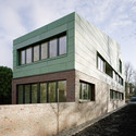
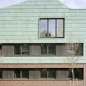
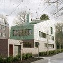
JWS 2b / KBNK
June 12, 2014
© Dorfmüller/Kröger/Klier
Houses
•
Lübeck,
Germany
Architects:
KBNK
Area
Area of this architecture project
Area:
941
m²
Year
Completion year of this architecture project
Year:
2013
Manufacturers
Brands with products used in this architecture project
Manufacturers:
TECU®
+ 4
https://www.archdaily.com/512924/jws-2b-kbnk
Cristian Aguilar
Save
Read more »
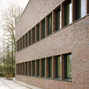
Administrative Headquarters RBSUM / KBNK
June 06, 2014
© Dorfmüller/Kröger/Klier
Institutional buildings
•
Trittau,
Germany
Architects:
KBNK
Area
Area of this architecture project
Area:
2675
m²
Year
Completion year of this architecture project
Year:
2014
+ 4
https://www.archdaily.com/512856/administrative-headquarters-rbsum-kbnk
Cristian Aguilar
Save
Read more »