
In Luis Barragán’s poetic imagination color plays as significant a role as dimension or space. Rough textures and water reflections heighten the impact of bright sunlight in his colorful buildings. But where does such vibrancy come from and how is it heightened by the architecture itself?


Protecting Walls
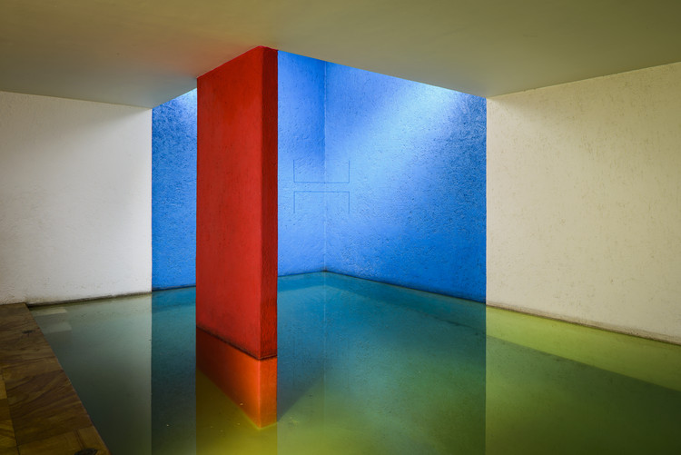
The walls in Barragán’s architecture not only carefully frame views, but also cast shadow or render the play of shadows by trees. His compositions include walls with both rough and smooth textures. The rough texture originates from pea-gravel mortar applied to brick and creates vivid, irregular patterns and emphasizes a tactile dimension. By contrast, the smooth texture comes from a regular mortar surface and forms a silent, abstract scenery, offering a contemplative canvas for light beams moving across the wall. While the overall structure of his walls is kept minimalist, the element of texture and color create a poetic experience. This relationship was recently explored in an installation by American artist Fred Sandback, as seen in the images accompanying the article.

The Need for Half Light
Especially in regions with cloudless skies, people look for shaded areas to avoid the hot and harsh sunlight. Walls providing shade and smaller or screened windows contribute to a comfortable atmosphere in these areas. This spatial strategy is apparent in many of Barragán’s projects, such as the chapel for the Capuchinas Sacramentarias or the Casa Gilardi, where he minimizes any direct view to the sky. He criticized designs without dimmed areas: “Architects are forgetting the need of human beings for half-light, the sort of light that imposes a sense of tranquility, in their living rooms as well as in their bedrooms. About half the glass now used in so many buildings—homes as well as offices—would have to be removed in order to obtain the quality of light that enables one to live and work in a more concentrated manner, and more graciously. We should try to recover mental and spiritual ease and to alleviate anxiety, the salient characteristic of these agitated times, and the pleasures of thinking, working, conversing are heightened by the absence of glaring, distracting light.”
Moritz Bernoully, a German photographer and architect, confirms this attitude after visiting several projects: “How Barragán plays with light became more essential for me than the so-called Mexican colors. Instead of large windows for bright spaces, Barragán reduces daylight to a minimum. Light is filtered with yellow opaque glass for the corridor at the Casa Gilardi or windows are even moved to the very corner of rooms in his own house.”

Gardens and Colors
Meeting the French landscape designer Ferdinand Bac opened Barragán’s eyes to the beauty of gardens. Barragán felt deeply inspired by Bac’s relation to gardens and his views, quoting Bac's words in his 1980 Pritzker Prize acceptance speech: "the soul of gardens shelters the greatest sum of serenity at man's disposal." After seeing photographs of Barragán's houses, Bac sent his book Les Colombières about the garden in Menton on the French Riviera with the inscription: “To Mr Luis Barragán, whom I would like to call my godchild for the perfect comprehension you have of my renovation of a Mediterranean-Spanish style.”

As Barragán went on to explain in his Pritzker acceptance speech, the combination of mystery and serenity was one he considered vitally important in his works. His imagination ran free in the haciendas and gardens of Mexico, inspiring the spacious and colorful designs throughout his career.
When asked about Barragan’s color scheme many critics refer to brilliant colors of indigenous buildings in Mexico. For the Japanese architect Yutaka Saito it is clear that the colors derive from the flowers of his living environment: “Thus, his pink comes from the bougainvillea, his red-rust color is extracted from the flowers of tabachin, and his light-purple is the color of the jacaranda flowers. Blue is the color of the sky and yellow ochre that of the earth. What a revelation when I took the flowers and checked the coordination with the buildings: they matched perfectly.” These colors build a strong contrast to the green trees and plants. Sometimes Barragán also used blue walls to extend the cloudless sky in patios or for interior spaces. But the intense colors cannot be taken for granted. Mexico’s harsh sunlight requires the walls to be periodically repainted to preserve the quality of the space.

Barragán’s legacy lies in creating a set of counterpoints to the starkly white aspirations of the Modernists. The most significant deviation from his peers was that, as modernists sought to highlight advances in steel construction with wide expanses of glass, he reduced the sizes of windows to protect against harsh direct sunlight. The second aspect derives from his color palette which possesses a much lower reflectance than the modernist white cubes typical of the time. Finally, the roughly textured walls of his structures generated finely nuanced patterns of shadow, shifting and evolving over the course of the day.
The three elements are carefully arranged: Barragán’s unique color and texture design introduces a poetic dimension to balance his monumental sets of walls.
For further reading: Proyectos Monclova (Editor), Daniel Garza Usabiaga, Federica Zanco, contributions by Roger Duffy, Amavong Panya, Lilian Tone, Edward Vazquez: Luis Barragán, Fred Sandback. Las propiedades de la luz / The Properties of Light. Hatje Cantz, Berlin. 2018.
Light matters, a column on light and space, is written by Dr Thomas Schielke. Based in Germany, he is fascinated by architectural lighting and works as an editor for the lighting company ERCO. He has published numerous articles and co-authored the books “Light Perspectives” and “SuperLux.” For more information check www.erco.com, www.arclighting.de or follow him @arcspaces.