Three decades ago the Hongkong and Shanghai Bank (HSBC) Headquarters by Norman Foster emerged onto the architectural seen as an exemplary product of industrial design. The open layout with its exposed steel structure generated a powerful corporate identity for the bank. But the restrained atmosphere of white architectural lighting and the lack of distinctive façade lighting has lost its attractiveness after sunset. Now the colorful and dynamic relighting presents a remarkable example of how an architectural icon has shifted from a productivist ideology towards a scenographic image. To the western observer the multicolored light language may give off a playful impression, but to the local culture the transformation evokes grandiosity.


The briefing for Norman Foster was ambitious when the Hongkong and Shanghai Bank asked him to create “the best bank building in the world.” To add to the complexity the client requested a short timescale, which led to the pragmatic solution of a high degree prefabrication and the suspension structure which allowed the contractors to build efficiently both downwards and upwards. The architecture therefore embodies a functional product, as Kenneth Frampton characterizes this style: an open undecorated system with a flexible network and articulated structure characterized by industrial production.
Foster’s structure enables a generous daylight-filled atrium with a 50 meter-high glass wall and a large mirrored sunscoop that reflects sunlight down through the atrium to the public plaza below. For Chris Abel, the British born architectural theorist, the financial institution emanated a sense of a sacred building, as he wrote for The Architectural Review: “There is a lot more that is Gothic than Classical in all this structural and spatial magic, contrary statements about Foster’s work notwithstanding. If the ‘medieval’ services towers, ‘flying braces’ and ‘incomplete’ appearance of the building had not already promoted the idea, then the soaring proportions of the atrium … and the great translucent eastern window, easily justify the building’s popular description as a ‘cathedral of commerce.’”[1] But the productivist attitude suppressed the use of colorful stained glass windows—or any modern light-based equivalent—typical of gothic cathedrals and focused on white for daylight and illumination.

Foster and his lighting designer Claude R. Engle abstained from any decorative or expressive lighting effects in order to achieve a clear architectural message, with lighting as a servant for performance. Regarding the office lighting Engle used only three components: daylight, cool florescent lighting and warm halogen-tungsten lighting. This strategy allowed an easy conversion from a cool lit office area into a warm lit meeting zone for clients without a new installation. In that way the lighting design revealed a very pragmatic approach without losing a representative expression. For the high atrium, the recessed downlights seemed to vanish in the mirror ceiling thereby working with light and not luminaires as a design parameter. Special downlights with narrow beams minimized the glare for a discreet look. Hence when viewed as part of the city the HSBC skyscraper appeared to be softly glowing from within with a nice transparency for detecting interior patterns.

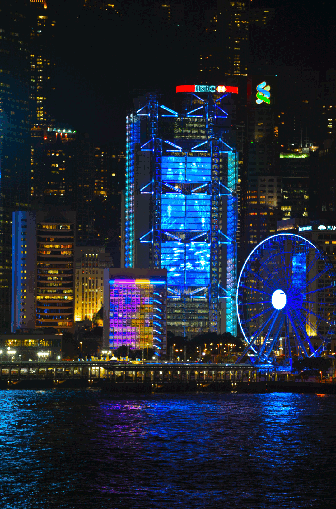
However, 30 years later the atrium lighting no longer fulfilled the bank’s expectations regarding their visual identity. In the meantime, Hong Kong had become much brighter, more colorful, and dynamic concerning lighting. The relighting of the HSBC atrium, designed by Simon McCartney & Peter Kemp from illumination Physics and installed in 2015, now presents a distinct counterpoint. The subtle contrasts of cool and warm color temperatures have been substituted by saturated colored light. The LED and lighting control technology have opened an unprecedented flexibility to change hue and saturation. Clean lines emphasize the horizontal structure of the floors and the sunscoop mirror ceiling. They add spectacle and drama to the grand hall. In contrast to the original design the luminaires are clearly visible now.

The large opaque eastern façade, which fills the atrium at daytime with diffuse daylight and which did not have a representative illumination in the original concept, is turned by the new lighting into a colorful pixel screen. Here, invisibly installed luminaires and light sequences are synchronized with the atrium edges and the mirror ceiling. The expressive static building structure vanishes in the evening in favor of a bright, dynamic spectacle of colored lines and pixels to reflect a modern corporate identity for clients and employees. In contrast, the relighting of some executive areas in the HSBC building were more conservative regarding the relighting and luminaire design, with downlights and pendant elements.
However, the first major lighting change at HSBC was even more extravagant than the atrium lighting, and was already installed about a decade earlier, in 2003, for exterior branding. Thus the façade illumination has changed from a discreet glow from within into colorful light lines and bright search lights to create a beacon of light for the Hong Kong skyline, designed by Simon McCartney for Laservision. Since 2004 the Hong Kong Tourism Commission has tried to become a benchmark for city marketing in Asia with the largest sound and light show in the world. With globalization, rising economic competition and political changes, the city has looked to tourism to increase business and to mark a strong, modern and dynamic identity. For the nightly 14 minute show, called “Symphony of Light,” the team from Laservision analysed the skyline and its buildings in regard to the visibility of structures to select significant architectural forms and textures. The show has already undergone five phases of upgrades and now incorporates 45 buildings located on both the Hong Kong and Kowloon sides of Victoria Harbour. Without the façade lighting update, the HSBC building would not have been recognizable as a relevant player for the urban light show.

Nevertheless the 2003 façade lighting did not cover the new expectation of higher visibility and more explicit messages of brand communication. For that reason the façade lighting was amplified with a media wall for the 150th HSBC anniversary in 2015. The new sophisticated media screen, designed by Simon McCartney & Peter Kemp at illumination Physics, enables a legibility from a distance of 100 meters, as well as from the opposite side of Victoria Harbour 2-3 kilometers away. Small vertical LED strips, applied to the inside of the façade, enable a high transparency for the façade and yet the strips appear invisible from outside at daytime. Additionally, the old façade lighting was completely updated with LED technology, which led to an increase of possible hues, more saturation, far less energy consumption and longer lamp life for less maintenance. Synchronized with the façade lighting, the media walls offer a very flexible infrastructure for independent content or echoing the effects of the architectural lighting on the screen or vice versa. The triangular animations and kaleidoscopic patterns refer clearly to the HSBC logo for luminous branding. There's even a smart phone application which enables people to follow the scenography in real-time on their phone wherever they are. With this new media content the HSBC strives again for visual leadership in Hong Kong´s skyline.
Erected on the ground of a British colony as a distinctive British high-tech office tower, localized with a feng shui geomancer, the HSBC building resides now on an autonomous territory of China. The search for a new identity, significantly influenced by globalization, has led to a new luminous mask to conceal a tough and cold finance building. This colorful overlay of pattern, made of light, has turned the HSBC into an obvious dualism: at daytime it conveys the cool rational image of productivism, but at night the explicit scenography demonstrates a soft emotional character. The brightness of the façade has induced a loss of transparency in favor of luminous decoration, where light has become a brand message. For the western observer this multi-colored and dynamic attention-seeking might embody a loss of clear identity for a respected bank. However, the grand light gesture at HSBC, in combination with the city-wide Symphony of Light show, has positioned Hong Kong as one of the world’s most visited cities, where people regard the colorful scenery at night as more beautiful than at daytime.
But not everyone is excited about the luminous prosperity of Hong Kong. Environmentalists and astronomers have already pointed out the negative effects of light pollution. Jason C.S. Pun, Astronomer at the University of Hong Kong, has found that the night is on average 1000 times brighter in his city than a natural night due to the light used for advertisement and decoration. This loss of the night makes seeing stars impossible.

The trend of global urbanization will bring more buildings into our cities where owners will not tolerate a modest visual identity at night, but seek to send explicit luminous messages into the urban environment. Hence, conflicts will intensify with the public and environmentalists about nocturnal lighting. This 30 year review of the HSBC's lighting history may even appear small when compared to contemporary skyscraper developments. For instance the super-tall Shanghai Tower by Gensler from 2015 has already set a new benchmark for monumental urban scenography. Its media facade was implemented from its opening, covering the entire 632-meter skyscraper, and appears as an urban movie screen. It is a challenge to imagine how this building and its environment will look in 30 years: Will the latest LED technology last without a larger relighting within this time? Which lighting language will create an appropriate meaning and icon? Will the citizens be able to appreciate the beauty of the urban night and gaze at stars again?
References
- Abel, Chris, A building for the Pacific Century. The Architectural Review, July 1986
Light matters, a monthly column on light and space, is written by Thomas Schielke. Based in Germany, he is fascinated by architectural lighting and works as an editor for the lighting company ERCO. He has published numerous articles and co-authored the books “Light Perspectives” and “SuperLux”. For more information check www.erco.com, www.arclighting.de or follow him @arcspaces.


