1. ArchDaily
  2. Data Visualizations

Data Visualizations: The Latest Architecture and News

A Brief History of Maps and Their Role in Urban Development

Cartography, or map making, has played a critical role in representing spatial concepts for thousands of years. While the earliest forms of maps displayed geographic information carved into clay tablets and etched onto cave walls, the maps we use today have significantly evolved to creatively show a range of different information. These visualizations draw conclusions about population sizes, historical events, cultural shifts, and weather patterns to help us understand more about our world and how we impact it.

Manuel Lima on How Data Visualization Can Shape Architecture and Cities

Manuel Lima is a designer, researcher and author well known for his work on visualizing and mapping complex networks. A Fellow of the Royal Society of Arts, he was named one of the "50 Most Creative and Influential Minds" by Creativity magazine, and is both the founder of VisualComplexity.com and a Senior UX Manager at Google.

We talked with Lima to find out his thoughts on the connection between data visualization and architecture. The following conversation explores his inspirations and process, as well as his views on how data visualization can help improve the quality of our cities.

These GIFs Compare Cities' Metro Maps to Their Real Life Geography

Metro and subway maps can tell us a lot about cities. For example, by comparing metro maps from different cities, you might be able to understand those cities' relative size or level of development. Or, by comparing a metro map to an earlier version from the same city, you can learn about the pace of development being experienced in that city. What these "maps" rarely tell you with any reliability, though, is the actual geography of the city itself.

In a fascinating series of posts over at /r/dataisbeautiful earlier this year, Reddit users created GIFs comparing the official metro maps of cities around the world with the real geography those maps correspond to. The results show the incredible changes that cities are subjected to in the name of visual clarity: in cities such as London, Tokyo, and Berlin, transit maps expand the urban core, masking the density at these regions' centers; in other cities such as Washington DC, shortened lines hide the extent of the city's suburbs; while in some cities, entire neighborhoods are moved to the other side of the city to make the map layout more attractive (we're looking at you, Prague). Read on to see 11 of the best creations by Reddit users.

The Numbers Behind the Top 300

Last week, Architectural Record released their list of the top 300 Architecture Firms in the US, based on architectural revenue from 2015. But what can we learn from those numbers and the firms generating them? In this post for ArchSmarter, Michael Kilkelly dives deeper into the figures that have made these firms so successful, comparing numbers based on firm type, firm location and project location.

Interactive Infographic Tracks the Growth of the World's Megacities

With more than 7 billion people now alive, the greatest population growth over the last century has occurred in urban areas. Now, a new series of interactive maps entitled "The Age of Megacities" and developed by software company ESRI allows us to visualize these dramatic effects and see just how this growth has shaped the geography of 10 of the world’s 28 megacities. Defined as areas with continuous urban development of over 10 million people, the number of megacities in the world is expected to increase, and while Tokyo still tops the list as the world’s largest megacity, other cities throughout Asia are quickly catching up. Find out more after the break.

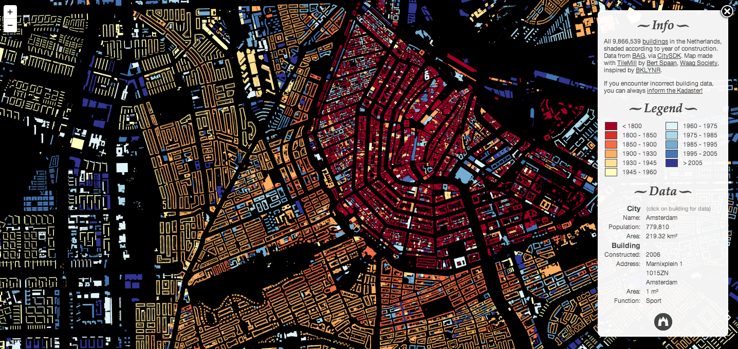
Software Engineers Map All the Buildings in the Netherlands

The Waag Society, together with designer and software engineer Bert Spaan, have put the Netherlands back on the map - the data map. After several months of coding and design, the partnership has managed to account for all 9,866,539 buildings in the country, visualized in varying colors to identify old and new buildings. After a user clicks on a specific block, additional building and city information displays square footages, addresses, populations and programs, among other stats. Users can navigate from Amsterdam to the Hague experiencing hundreds of years of urban development along the way, from the pre-1800s to post-2005 buildings, indicated by the red to blue gradient.

Visualizing How People Utilize Cities, data analysis by Schema Design

Atlantic Cities recently wrote about this project by Schema Design that was initially produced as a result of a call for projects for the Urban Data Design Challenge. The intention of the challenge was to use various methods of data visualization to develop insight into public transit in three cities: Philadelphia, Zurich and Geneva. Join us after the break to watch the videos.