Guy Horton

BROWSE ALL FROM THIS AUTHOR HERE

The Indicator: Why the Solar Decathlon Should Enter the Real World

I don’t mean to poo poo the US Department of Energy’s Solar Decathlon project, but the more I hear about it the more I wonder if this isn’t an indication of just how far behind the United States is in terms of energy policy and the design of smart environments. Are we really that far behind that we need a program like this to prove this stuff really works? Are people still disbelieving? Do they really need demonstration homes to show how photovoltaics produce electricity or how sustainable principles can be applied to architecture? I suppose it makes sense in a country that still obsesses about the Case Study Houses and has debates about climate change.

The purpose of the Solar Decathlon is primarily to educate the public on high-performance building practices. Since 2002 when the DOE held the first one, it’s been putting “green” building in front of people who otherwise would not get to experience it—or, in reality, a self-selecting population of people who are probably already into such things.

The Indicator: Is Architecture Addicted to Adjuncts?

In the 1970s roughly 20 percent of all US college courses were taught by adjuncts. In recent years, especially since the global financial meltdown, the number of adjunct professors has exploded to the point where they might be considered a floating population of migrant laborers. According to a report from the National Education Association (NEA), currently more than half of all US college courses are taught by adjuncts, or what Sarah Kendzior calls “Academia’s Indentured Servants.”

The 2013 American Association of University Professors annual report paints an even bleaker picture, finding that 76 percent of the academic workforce is made up of adjunct, part-time faculty, teaching graduate students, and non-tenure track, full-time professors. 

We have entered an era in higher education where many alarming forces are converging. 

The Indicator: Toward a New NCARB

The Indicator: Toward a New NCARB - Image 4 of 4
Despite never formally becoming a licensed architect, Le Corbusier would for ever alter the profession with his writings (including "Towards a New Architecture") and designs. Le Corbusier and Pierre Jeanneret, c. 1950. Image © Sureh Sharma

A few days ago I took part in an AIA-organized Twitter discussion (#aiachat) focused on the subject of IDP, or what we here in the US call the Intern Development Program, administered by the National Council of Architectural Registration Boards (NCARB).

I periodically get sucked into these Twitter discussions when I’m busy procrastinating and not writing what I’m supposed to be writing. Call it a weakness for provocative questions thrown out on Twitter by faceless moderators: 

Q1: What advice do you have for interns getting started with IDP?

Q2: Many states allow concurrent completion of IDP and ARE4. What are the benefits of participating in both at the same time?

Q3: What resources have you used to help navigate IDP?

And so forth. 

The discussion brought back painful memories of my own tortuous IDP experience. By the time we got to Q7 or Q8 I came to a conclusion: IDP needs to be radically overhauled and re-conceptualized.

Toward A Fourth Architecture

When New York City architect Curtis B. Wayne first started talking about “The Fourth Architecture,” it was clear he was not doing so to make friends. You do not write manifestos to make friends. You write them because of some perceived urgency, because the time is right. 

As a long-standing practitioner, radio host, and graduate of Cooper Union and Harvard’s Graduate School of Design, he already has a lot of friends. What he’s interested in is saving architecture from the current orthodoxy of form-making over substance, or “sculpture you can live in.” “We are too wise for this,” writes Wayne.

In fact, I can go further. Judging from the little red book that has finally emerged from Wayne’s brain, appropriately titled, The Shape of Things that Work: The Fourth Architecture, I’m almost certain he set out to piss people off. But not without a purpose.

P-A-T-T-E-R-N-S' Latest Expressive, Experimental Pavilion: Textile Room

This article originally appeared in Metropolis Magazine's Point of View Blog as "Working at the Crystalline Level."

Los Angeles-based P-A-T-T-E-R-N-S is among the most intriguing and progressive firms working in architecture today. They seem relentless in pushing boundaries in areas like ultra-light-weight high-tech materials and immersive media. They are also very thoughtful and patient in the way they approach design.

This is good because what they are engaged in and the way they work takes time. By collaborating with engineers and innovators in different industries they are slowly changing the way architecture is carried out and conceived on material and ontological levels. They don’t do spec homes, they do what’s new, and sometimes try to do what hasn’t been done yet.

Founder and co-principal Marcelo Spina and co-principal Georgina Huljich both teach, he at SCI-ARC and she at UCLA, where they pursue research interests with students and then reflect that back into their small but energetic practice tucked away in one of Los Angeles’ rustic urban edges, Atwater Village.

One thing to recently emerge from this office is the experimental carbon fiber pavilion they call Textile Room.

Why Good Architectural Writing Doesn’t Exist (And, Frankly, Needn’t)


The Architects’ Journal recently announced its call for entries for the “AJ Writing Prize,” its annual search for “the best new architectural writer.”

Back in 2011 (how did I miss this?) they published a treatise on the qualities of good architectural writing penned by one of the prize’s judges, architect Alan Berman.

Now, please consider that I am butchering his essay by removing this quote from the stream of his thinking, but, that being said, this paragraph stands out:

Architectural writing should aid everyone’s understanding of buildings and assist architects to design better ones. This is not to say that it should be an instruction manual or ignore the importance of the myriad intellectual endeavours which explore the human predicament –about which architects should always be conscious. Rather it is to say that architectural commentary should aim for clarity and precision of expression by means of lucid terminology and simplicity of structure.

This strikes me as a very technical and precise way of producing writer’s block. If this is the extent of good architectural writing, or writing that is in the service of architecture, then “Abandon all hope, ye who enter here.”

The Indicator: Two Shows, Many Cities: “A New Scuplturalism” at MOCA and “Never Built” at the A+D Museum

Here in Los Angeles we have a complicated relationship with architecture and two con-current museum exhibitions demonstrate this in ironic and puzzling ways. This came into clear relief when, on Saturday, August 03, 2013, something amazing and unprecedented happened: architecture was on the front page of a major US newspaper, the Los Angeles Times.

This, it must be said, is a very unusual thing for architecture. Moreover, it was not the type of architecture you might expect to grab the spotlight. It was the un-built original plan for Los Angeles International Airport by Pereira and Luckman, c. 1952. If you’ve been to LAX you’ve seen their Theme Building. They also did the plan for LAX that was finally accepted—the less visionary, less ambitious plan. This was being re-presented to the world in the context of “Never Built” a show about the unrealized architectural dreams of Los Angeles currently showing at the A+D Museum.

The Indicator: China in 4D

The problem with articles like “China’s Great Uprooting: Moving 250 Million Into Cities”, recently featured in The New York Times, is that they contribute to a misleading and simplistic narrative about China’s economic development, casting it as a story of “good” versus “evil”.

This was recently highlighted by a critique authored by the NYU Stern Urbanization Project in which The New York Times article in question was called out for being overly sensational and reductive in how it covered China’s policies concerning internal migration from the countryside to urban areas.

The Indicator: The Lure of the Vernacular

There is something soothing, even easy about vernacular architecture. It’s the territorial and spatial equivalent to Muzak. It evades and pre-dates the self-conscious identity of glitzy, cutting-edge architecture we are so familiar with today. There is an innocence to the vernacular. These are the buildings and environments of childhood.

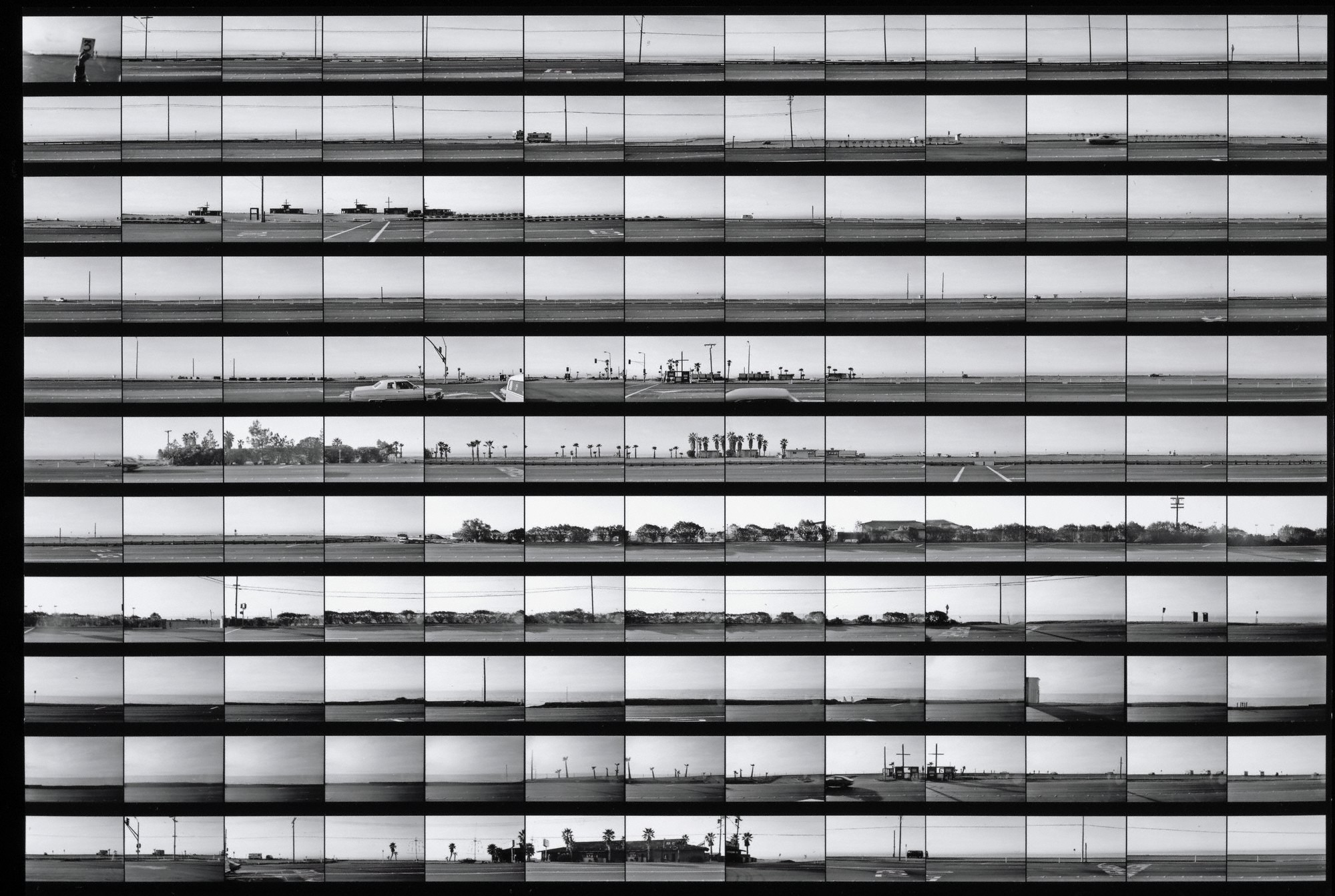
This is apparent in the exhibition, In Focus: Ed Ruscha, currently showing at the J. Paul Getty Museum at the Getty Center in Los Angeles. What captivates about the shots is that they dare to curate buildings that are usually just part of the background. They become objects of curiosity, spectacles, even.

The Indicator: Sheltering in Place

Last Sunday James S. Russell, architecture critic for Bloomberg News and a former editor for Architectural Record, mused on his personal blog about the possible influence Paul Rudolph’s Brutalist University of Massachusetts campus in Dartmouth may have had on Dzhokar Tsarnaev, the younger of the two Boston Marathon bombers who was also a student there.

Mr. Russell describes the campus as “a gigantic eerie, dozen-building concoction of grim ribbed-concrete hubris….” This is the sort of description that drives right to the heart of urban alienation. It’s Edvard Munch’s The Scream. This ability to sum up and drive the nail home is one reason he is the architecture critic for Bloomberg News. No side-stepping here.

The Indicator: The Pritzker’s Better Half

There’s been a lot of buzz going around about the Pritzker jury dissing Denise Scott Brown, wife and co-partner to Robert Venturi. Back in 1991 they awarded the prize to Mr. Venturi, singular…not plural to include his better half. Seems they, a different jury, also dissed Wang Shu’s wife and co-partner, Lu Wenyu way back in 2012 by granting the prestigious prize to Mr. Wang without acknowledging who holds up “the other half of the sky”, as they say in Mandarin.

The Indicator: Oblique Strategies for Architects

The Indicator: Oblique Strategies for Architects - Featured Image
Peter Schmidt with Brian Eno. What would it be like to sit at that table in that room. Via revelinnewyork.com

In 1975 Brian Eno and the artist Peter Schmidt came out with a deck of cards designed to help artists and musicians push through creative blocks by offering alternative scenarios, methods, and perspectives. They called the set Oblique Strategies.

Think of them as a way to Dada your brain from the everyday realism in front of you to something more abstract. But this then takes you back to an alternate reality you couldn’t have experienced otherwise. They are traveling without moving. They have also been compared to the ancient Chinese book of divination, the Yi-jing, or Book of Changes. They are to be used in cases of creative emergencies.

The Indicator: On Disappearance, Part 1

I remember February 27, 2013 because that was the day Aaron Betsky asked a good question on his Beyond Buildings blog at Architect Magazine. Not that he doesn’t ask good questions on other days…because he does…but this particular day presented architecture with the provocative title, “Architecture Beyond Work: Will Architecture and Work Disappear?”

The Indicator: Craft in the Digital Age

A few weeks ago there was a flurry of debate about one of Zaha Hadid’s designs being copied, or at least copied in terms of its outer form. Very soon after this I discovered an interesting article in the most recent issue of MIT’s Leonardo: Journal of the International Society for the Arts, Sciences and Technology.The article, "Hybrid Reassemblage: An Exploration of Craft, Digital Fabrication and Artifact Uniqueness” by Amit Zoran and Leah Buechley, raises some interesting points about the nature of originality, the subjective experience of making original things, and the potential for digital technology to impute this subjectivity to new and repeatable objects. In essence, the authors are discussing the position of craft, the hand-made, the personal, subjective act of making something that is singular and based on a personal process, the negotiation of decisions and risks with tools, materials, and design intentions.

The Indicator / Report: The Clinton Global Initiative Annual Meeting

The Indicator / Report: The Clinton Global Initiative Annual Meeting  - Image 1 of 4

The 2012 Clinton Global Initiative (CGI) annual meeting, which ran from Sunday, September 23 to Tuesday, September 25 in New York, was, on the face of it, one of those positive seminar-type experiences, with croissant breakfasts, plenary sessions, break-out groups, closing remarks, and all that. But there is a difference between a CGI meeting and the usual convention dynamic: At CGI there is a shared mission of achieving real and positive outcomes by leveraging the power of relationships. People and organizations across different sectors are brought together to realize what CGI calls “Commitments to Action”.

One of the best things about CGI is that it helps bring resources to bear on ideas in need of support. Sounds too good to be true and sort of like a love-fest of pie-in-the-sky, fairy dust optimism? It might sound like this at first, but the meeting is made up of people who have dedicated their lives and careers (same thing) to solving real-world problems. If Greenpeace’s slogan is Think Globally, Act Locally, then CGI’s is something like “If you can think it, you can do it.” Bill Clinton says he started CGI to “help turn good intentions into real action and results.” Toward this end, they basically help funnel money into good ideas that can change lives. They do this not by handing out cash, but by networking financing sources like foundations, philanthropists, and corporations with individuals and organizations who need backing to get their projects off the ground.

The Indicator: A Meditation on the Photographs of Ray K. Metzker

The Indicator: A Meditation on the Photographs of Ray K. Metzker - Image 5 of 4
© Ray K. Metzker. Valencia, 1961. Gelatin silver print print. 14.3 x 22.9 cm

I have been looking at these photographs for over a month now. I’m not certain why but they draw me in and I keep coming back to them. They hold me. And by hold I’m thinking of what Roland Barthes may have been suggesting when, talking about another photograph, he says, “Bob Wilson holds me, but I cannot say why…” (1) That’s the exact feeling I get when I’m looking at these images Ray K. Metzker.

Inkjet reproductions rest on my bedside table. I have not known what to say about them or what exactly they might be saying to me. Something about extremes. Something about sidewalks and saturated shadows. Something about walking in, toward, and around. Something about fracturing, dancing apart, even. But there is also something about play, something wonderfully naïve about them, as if they were taken with the eye of a child. But there is more. After the child grows up he discovers the long-forgotten roll of film and develops it. But now, with more life behind him, the process of developing them results in something darker, heavier.

Continue reading after the break

The Indicator: A Brief History of Balconies

The Indicator: A Brief History of Balconies  - Image 1 of 4
Sears Tower Glass Balcony / Jared Newman, DesignCrave.com

Commencing. A Brief History of Balconies entails the examination of subjectivities above ground, on little bits of buildings in air, looking down, at pennies on the sidewalk, oddly visible from the 34th floor, which appears to be the same level as jumbo jets coming into Logan from wherever they were coming from and above the sea. I once stood parallel with the jets as they banked and tipped their wingtips a little.

It’s an odd sensation to be in the air at such heights, stationary. It feels more natural to be in motion, to be flying. Chin on the warm aluminum extrusion of railing, I could fit my knees through the verticals. Just a slight web of metal anchored into concrete. I was once fearless at such heights and would sometimes stand on a patio chair to have the sensation of being clear of the rail. Was back a safe distance, or so assumed, with palms pressed to the balcony above. Holding myself in the in-between space like a jack, wedged between two floors and looking out over the rail to the vanishing point.

The Indicator: BTTB

The Indicator: BTTB - Image 2 of 4
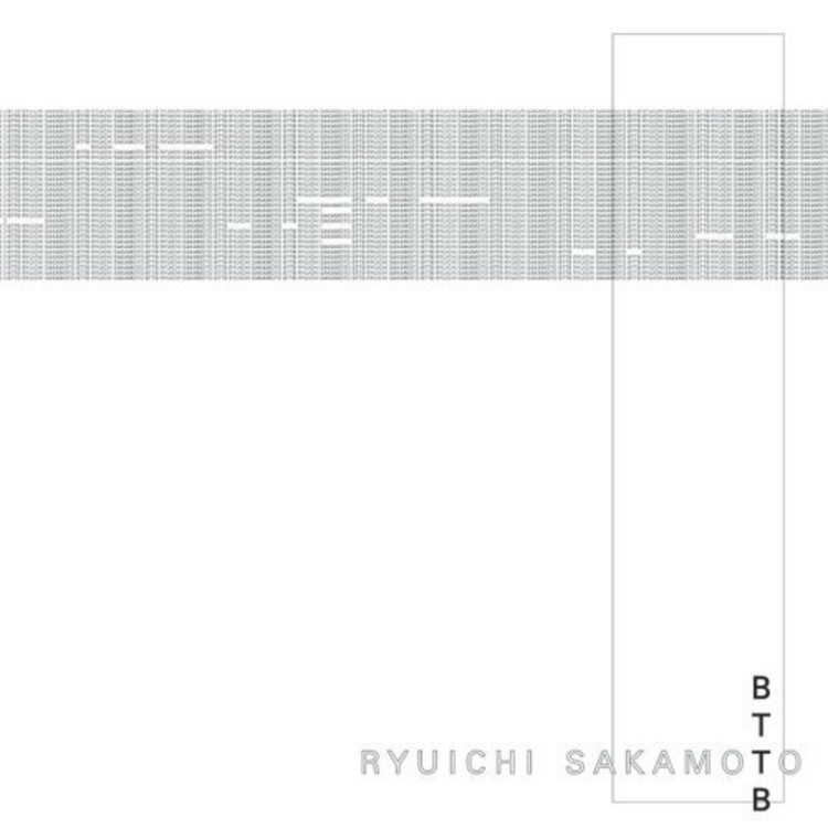
Courtesy of Discogs.com / Ryuichi Sakamoto, BTTB

I spent much of the nineties living in Tokyo, but it wasn’t until I had left that Ryuichi Sakamoto’s(1) music began to inform me about its complex environments.

His album, somewhat ironically (I think) titled BTTB, or, Back to the Basics, came out way back in 1999. Though post-dating my Tokyo Period, it sonically completed my memories of that city. Having leapt through time, it resolved my incomplete Tokyo soundtrack.

BTTB tries to be minimal, but, like the city it came from, struggles with complexity(2). Its opulent density made it seem like the piano had been miked on the inside, my ear forced down to the machinery of strings. The tension between richness and absence I perceived reminded me of trying to find my way in and around all of Tokyo’s jumbled systems.