
Have you ever been stuck for hours obsessing over a font that matched your work? Before starting a project, do you already think about which font you will use? Do you get annoyed when you read an important message written in Comic Sans? Or do you feel offended when a mundane sentence is written in all caps? Rest assured, you are not alone.
Architects and designers constantly use graphic elements as expressive means in the schematization of their works. Among them, the most common are the drawings, in a constant variety of techniques, styles, and patterns. But among the elements that make up the boards, panels and drawings, techniques and models, there is a particular fragment that helps them in composition and identity: the font.


Fonts establish one of the pillars of Graphic Design and can be defined as a set of systems to the impression of types. Types are the designs assumed by a particular family of letters in their pattern. Within the family, there are variations between the letters (light, italic and bold), by the type of box (high - upper and lower - lowercase), by source classification, including Sans - serif (without serif), Serif (with serif), Script (cursive) and Dingbat (ornamental), in addition to numerous other identity features of the same.

It is worth mentioning that the importance of fonts in the graphics schemes of designers and especially of architects is fundamental in graphic communication to nonverbal reading. The correct choice of typography leads to mental logic in reading certain graphics piece, whether a drawing, text or even a scheme, an inviting act the reader through imaginary bridges between the real and the imaginary.
In architecture, font models are not restricted to the papers and graphic presentations of architects, but also in the composition of facades, projects of visual identity of buildings and, above all, in the use of vernacular typography by the people as a cultural manifestation in approach to the popular, revealing the need for varied expression in the different layers and poles.

We have selected some font models used by architects, from technical drawings to diagrams. Many of them are paid fonts, there is also the option to find good free fonts here. Check out our selection below:
Futura
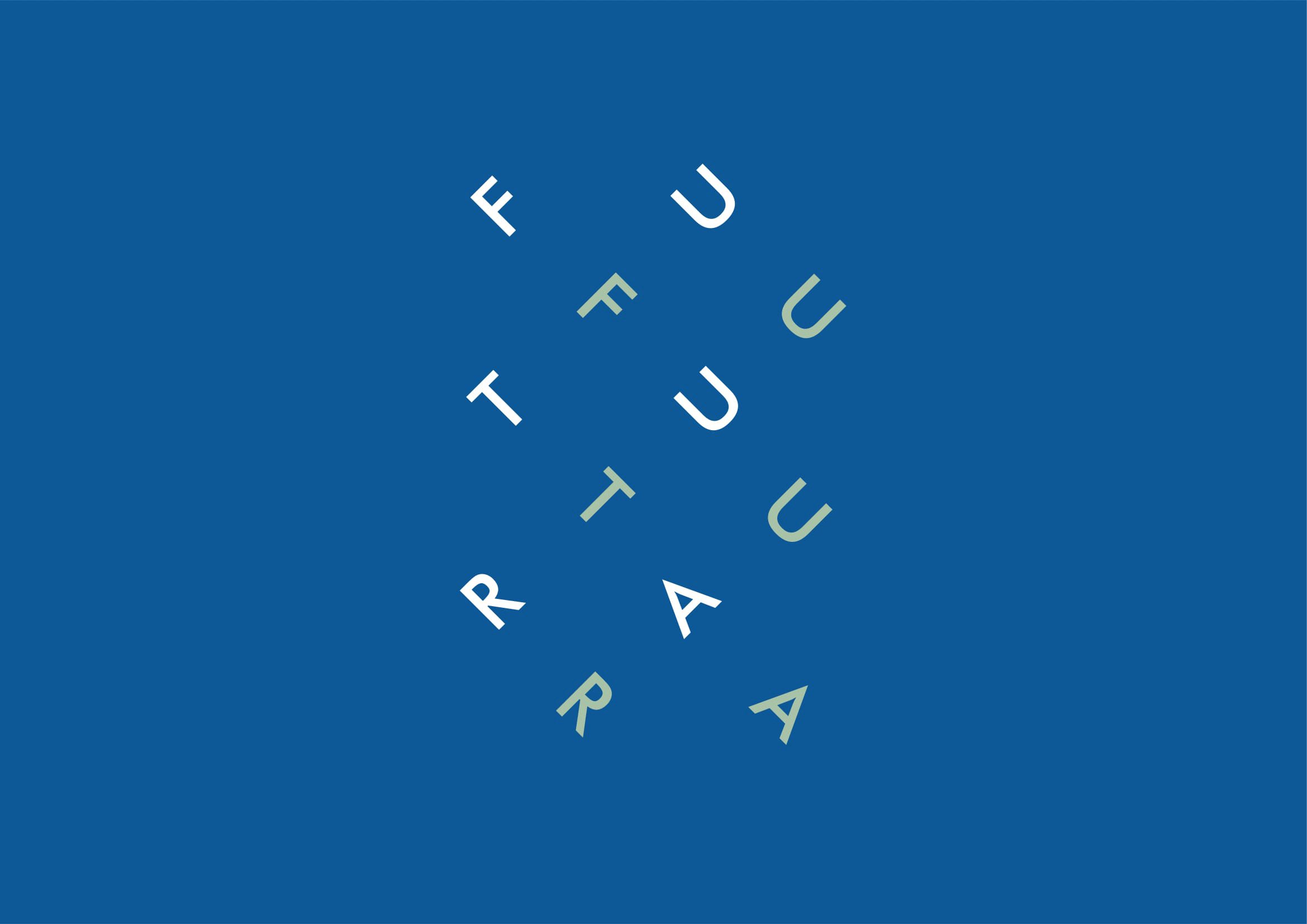
Created by Paul Renner in the 1920s, this font is a classic Modern Graphic Design. Inspired by Bauhaus techniques, it uses straight lines and curves in syntony, providing balance in the textual set. However, despite the visual cleaning, this font should not be used in long texts, due to the visual exhaustion provoked. Indicated to punctual texts in the architectural boards, such as titles and subtitles. It is highly used for visual identity in corporate buildings.
By this font here.
Bauhaus

Developed by the graphic designer Herbert Bayer, in 1925, its conception is perceived with, timelessness, transcending time. Its creator studied at Bauhaus between 1921 and 1923 under the direction of Kandinsky and Moholy-Nagy. Used until the present day, it is mostly attributed to titles and subtitles in the composition of boards.
This font is usually installed with Windows and can be purchased here.
Neutra
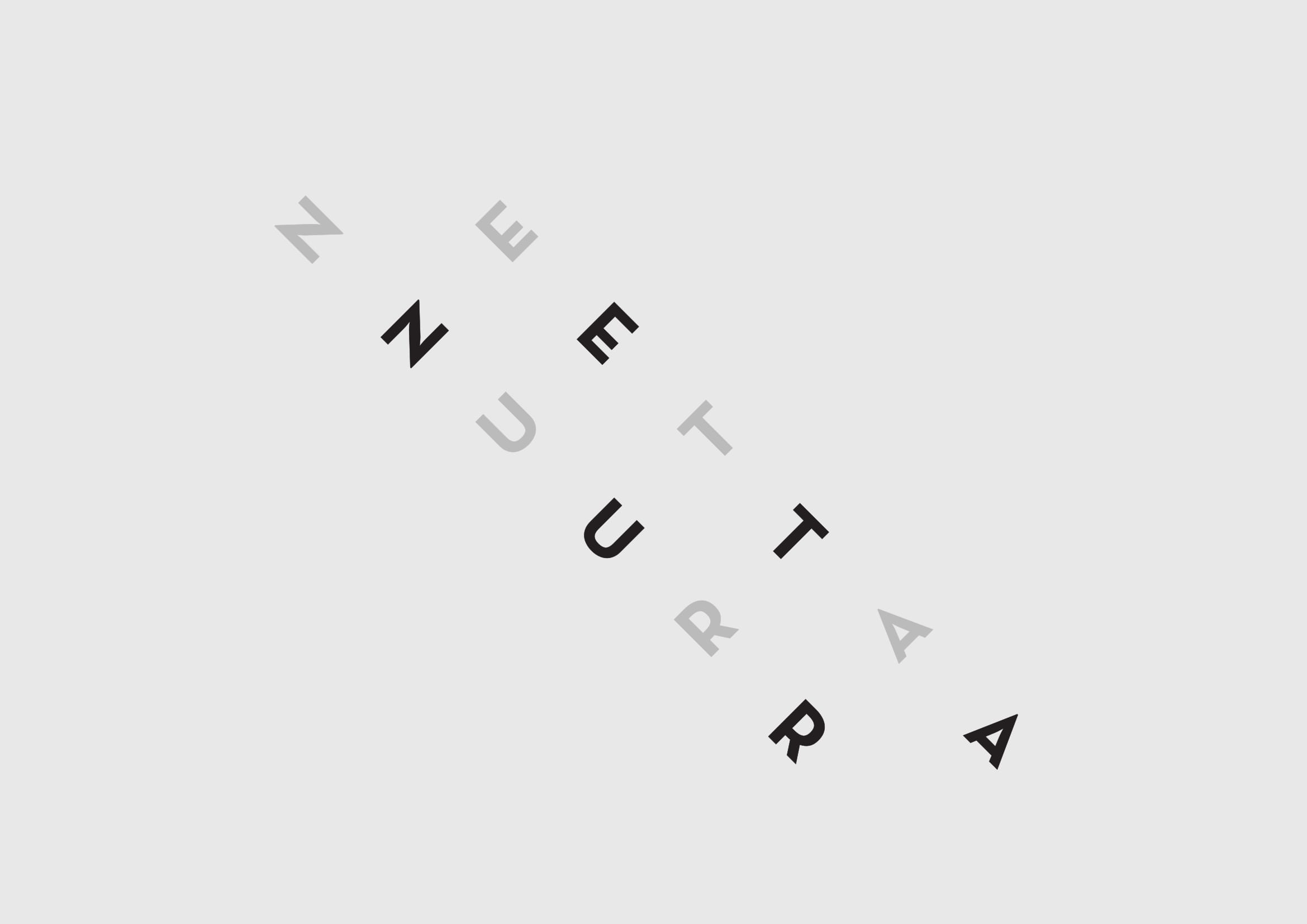
In honor of the important modernist architect Richard Neutra, graphic designer Christian Schwartz took care of designing the alphabet according to the architect's layout. Julius Schulman and Dion Neutra also participated in the process. It is highly used in the works of Architecture and Design as a competitor for Futura.
Buy the font here.
Bodoni

Created in 1767, by Giambattista Bodoni, this font is characterized by its high aesthetic strength and should be used with caution. Due to the set of lines and striking presence of its letters, it is not indicated for long texts, but for highlights, such as titles and details.
Buy the font here.
Gotham

Inspired by the typical letters used in signage and architectural visual identity, it was conceived in the 2000s by designer Tobias Frere-Jones. Widely used for publicity, due to the idea of credibility transmitted by its lines, in architecture, this font should be used in business cards and logos.
Download this font here.
Butler

Between Bodoni and Dala Floda, Butler consists of a modern typography along curvilinear lines. Due to its strong personality, it is indicated for titles and logos.
Download this font here.
Consolas

Widely used for long texts, this font is ideal for competitions and university boards, or even text boxes in graphic details, because of its clean aesthetics and proportion of lines allows long readings without tiring the reader. The typography, designed by Lucas deGroot, is also widely used in books and specialized Architecture magazines.
On Windows, this font along with other five (Cambria, Constantia, Corbel, Candara, and Calibri) are among the most used typologies, with no need for external acquisition.
Helvetica
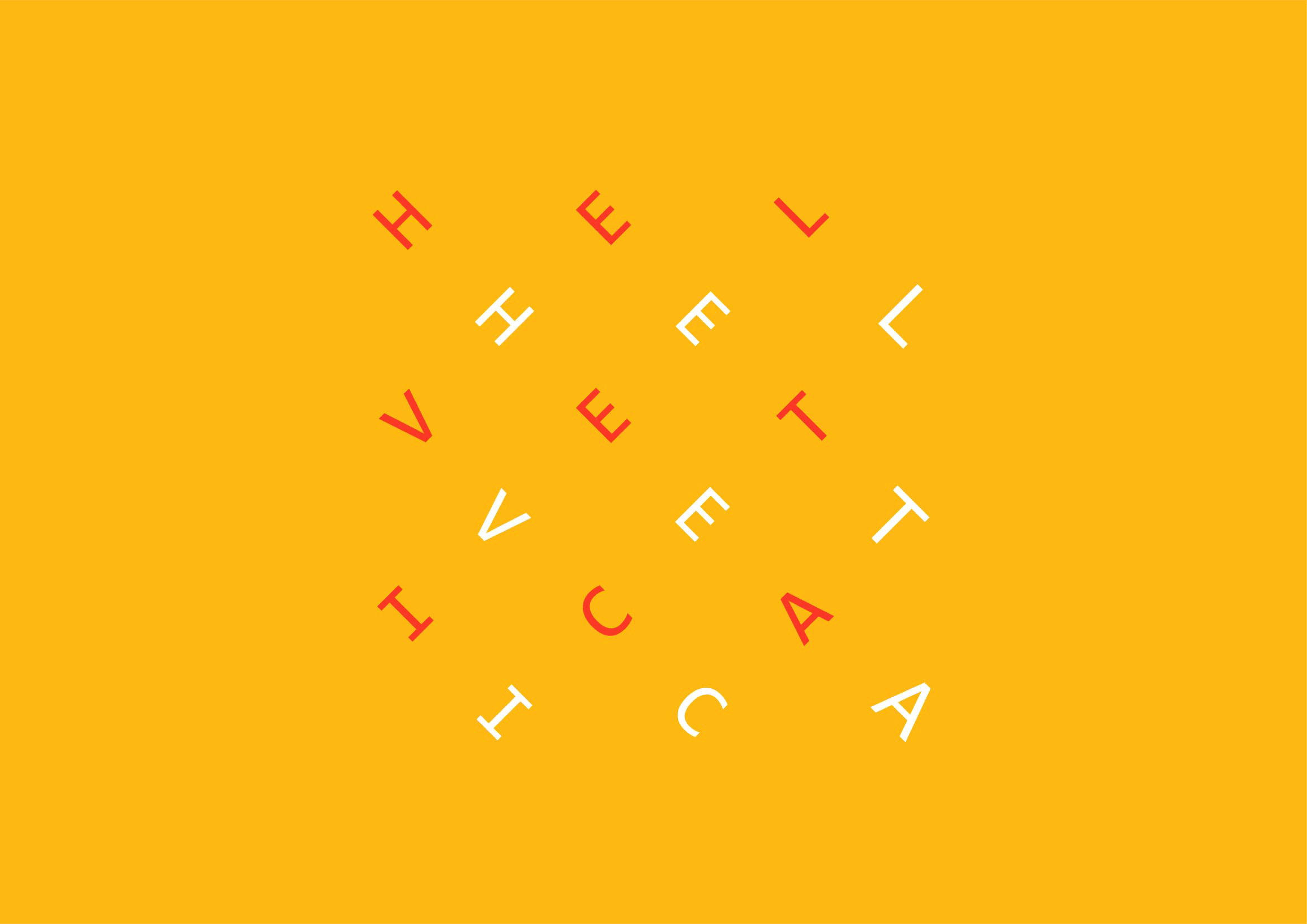
The majority of architects, even without advanced knowledge of graphic design, intuitively select sans serif typefaces, due to its minimalism and straight lines. Among the most used texts, as well as the previous case, Helvetica is notorious among professionals. Built in the twentieth century, by Max Miedinger and Eduard Hoffmann, it is strongly associated with modern graphic design, due to its set of lines and layout its designer sought a neutral and concise design.
Buy this font here.
Modeka
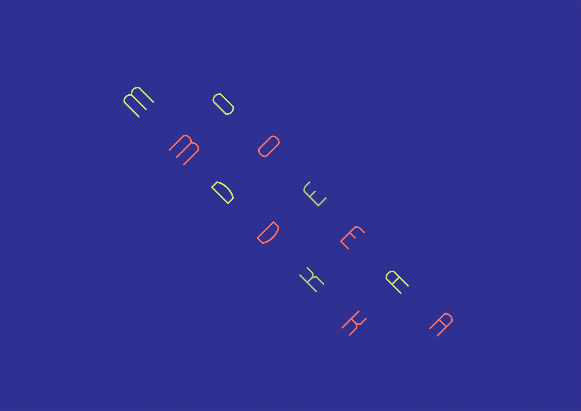
For those who like versatile and yet subtle fonts to compose their boards, this typography is ideal for that. In a system of hybrid lines, between rationalism of straight lines and the break of staticity of the curved line, this font created by Gatis vilaks, privileges a harmonious set. It is suggested for titles, subtitles and textual details in the graphic composition of boards and drawings.
Download this font here.
Poplar

Designed by Barbara Lind, this font is part of Adobe, its use presents personality and strength in its composition, ideal for a wide range of applications, such as boards, diagrams, and schemes. This font would be well used in titles, subtitles, and details.
This font belongs to Adobe. It can be purchased here.
Originally published on October 16th, 2017; updated on November 21st, 2019.
