


-
Architects: Carroquino Finner Arquitectos
- Year: 2008
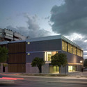
Text description provided by the architects. Located in the intersection of the streets Pedro Laín Entralgo and Gertrudis Gómez de Avellaneda, the Library appears before his immediate environment as an element with urban presence. Actur is a neighborhood in expansion from the 70-80`s, with a bland grid of big avenues and an intensive residential development. From the car, this neighborhood invites you to walk through it but due to the cold north wind, is not possible.

The library tries to conciliate the pedestrian-user with the urban grid. The building seduces the user with a game of crossed views in an apparent blind prism. The location offered an alignment retreat that we canalized in the entrance, visually crossing the plan. It offers a break in the outside walk and an invitation to enter. The program (library and center of leisure for major) is organized as a four storey Tetris around a central courtyard, taking advantage of the façades and orientations. From inside to outside the building generates panoramic views through the parking and taking advantage of the near trees.

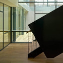
The program is developed in four plans through an open central courtyard scheme communicating the four storey plans giving great natural light and a visual relation between different spaces. The services have been concentrated in the same vertical line in the building with the aim to economize and facilitate the crossing of the installations.

The rooms defined for major persons have been located on the ground floor to facilitate the access to them. The main access is produced across a porch placed in the North corner of the Pedro Laín Entralgo Street, where the maximum opening of the project takes place. The foyer is proposed as a great crossing space which communicates the inside of the building with both streets, causing a prolongation of the public space of the street to the inside of the building. The main hall is located near to the access, close to a multi-use room which offers the possibility of housing activities related to the main hall.

The library, located in the north side of the building, guaranteeing a good natural lighting, occupies part of the first and the second floor, communicated through a double height space.
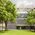
In the outside finishing, environmental criteria was followed, using reversed plain roof, ventilated façade with Ethernit boards with natural finishing and steel carpentries with thermal bridge break. The minimal number of external openings increases the perimeter control.


